Sélectionnez ce type de licence lorsque vous développez une application pour iOS, Android ou Windows Phone et que vous intégrez le fichier de fonte dans le code de votre application mobile.
St Marie™
par Stereotypes
Styles individuels à partir de $0.00
Famille complète de 8 polices: 299,00

St Marie Font la famille était
conçu par
Sascha Timplan et
publié par
Stereotypes. St Marie contient
16
styles et des offres familiales.
En savoir plus sur cette famille
- AaGlyphs
-
Meilleure offreOffres familiales
- Styles individuels
- Spécifications techniques
- Licences
Par style :
$24.87
Paquet de 8 styles :
$199.00
St Marie Pro Family
8 policesPar style :
$37.37
Paquet de 8 styles :
$299.00
A propos de la famille St Marie Police
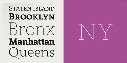
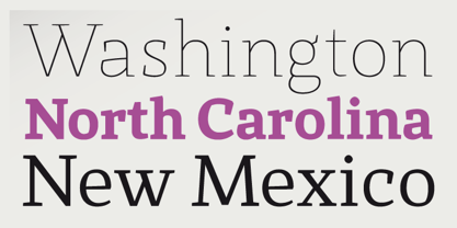
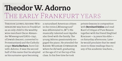
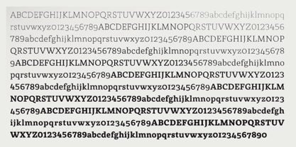
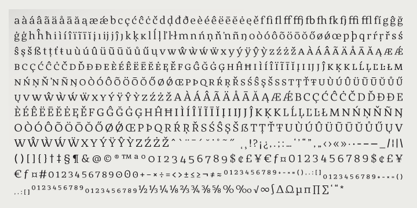
Marie est une police de caractères slab-serif de style ancien mais avec une touche d'humanisme, qui aime être utilisée dans les journaux, les livres et tout autre support imprimé avec beaucoup de corps de texte. Marie aime être utilisé en petites tailles et vous donne toujours la possibilité de lire votre texte sans problème. Les empattements forts, en particulier dans les graisses plus légères, donnent à Marie les caractéristiques nécessaires pour être utilisé en grandes tailles, par exemple dans les titres et les sous-titres. Caractéristiques de l'Opentype : Petites capitales, Toutes les petites capitales, Toutes les capitales, Ligatures, Chiffres proportionnels et tabulaires, Chiffres à l'ancienne et à la ligne, Fraction, Supérieur, Inférieur Langues supportées : Anglais, allemand, français, italien, espagnol, néerlandais, danois, suédois, finnois, norvégien, islandais, polonais, tchèque, hongrois, estlandais, turc, slovaque, estonien, letton, lituanien, albanais, croate, roumain, slovène.
Concepteurs : Sascha Timplan
Éditeur : Stereotypes
Fonderie : Stereotypes
Maître d'ouvrage : Stereotypes
MyFonts débout : 22 juillet 2010
St Marie™
est une marque déposée de Stereotypes.
À propos Stereotypes
Stereotypes est une fonderie individuelle basée dans le sud-ouest de l'Allemagne et dirigée par Sascha Timplan. DJ de longue date, Sascha s'est initié aux formes de lettres en visionnant des films documentaires sur la culture hip-hop et les graffitis. En fin de compte, c'est mon amour pour la musique qui m'a amené à la conception graphique", a-t-il déclaré dans son entretien de 2014 avec Les créatifs . "J'avais toujours des carnets de croquis avec moi. "J'avais toujours des carnets de croquis avec moi et mon principal intérêt, en dehors du DJing, était le graffiti. Je ne dessinais que sur du papier, jamais sur des murs. Je n'étais pas capable de dessiner des personnes ou des personnages de dessins animés, il ne me restait donc que le lettrage." Depuis qu'il a rejoint MyFonts en 2009, sa fonderie a produit une collection de caractères divers, originaux et très utilisables. "J'ai le sentiment que tous mes polices des premières années appartiennent à la catégorie des caractères d'affichage", a-t-il déclaré. "J'espère que le moment est venu de concevoir davantage de textes polices ou de systèmes de caractères tels que Christel, dont je suis très fier. Sascha a également connu un grand succès avec St Ryde, une police de caractères humaniste sans empattement qui a été classée parmi les MyFonts Top Polices l'année de sa sortie. Le nom de sa fonderie, Stereotypes, est un clin d'œil à sa passion pour la typographie et la musique - il n'a rien à voir avec des idées clichées. À propos de ses connaissances et de ses compétences toujours croissantes dans son art, il déclare : "Comme dans la plupart des disciplines créatives, une longue période d'auto-apprentissage dans le domaine de la conception de caractères est presque inévitable. Si vous voulez persister, vous devez travailler sur vous-même tous les jours. C'est l'école des coups durs".
En savoir plus
Lire moins