Sélectionnez ce type de licence lorsque vous développez une application pour iOS, Android ou Windows Phone et que vous intégrez le fichier de fonte dans le code de votre application mobile.
Ambiguity™
par Monotype
Styles individuels à partir de $50.99
Famille complète de 70 polices: $209.99


Ambiguity Font la famille était
conçu par
Charles Nix et
publié par
Monotype. Ambiguity contient
70
styles et des offres familiales.
En savoir plus sur cette famille
- AaGlyphs
-
Meilleure offreOffres familiales
- Styles individuels
- Spécifications techniques
- Licences
A propos d'Ambiguity Police Famille
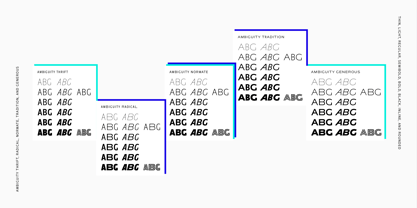
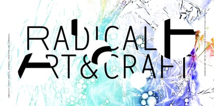
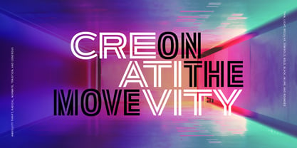
Ambiguity est une famille de caractères composée de cinq personnalités ou "états" distincts, créée pour inciter les designers et les marques à sortir de leur zone de confort. Elle englobe à la fois la tradition et la radicalité, ainsi que la générosité et l'économie, nous encourageant à remettre en question nos croyances sur l'intersection du style et de la signification. La famille est conçue par Charles Nix, qui décrit Ambiguity comme "une expérience de pensée autant qu'une police de caractères". Ses cinq états - Tradition, Radical, Économe, Généreux et Normal - expriment ou subvertissent chacun des aspects différents de la tradition typographique. La tradition est conservatrice et s'appuie sur les formes historiques des lettres. Radical rejette les idées de proportion héritées, en rendant les formes typiquement minces larges et les formes larges minces. "Il s'agit d'une approche contrariante", explique M. Nix. Thrift sélectionne les formes condensées de Tradition et de Radical, tandis que Generous fait de même pour les formes larges. Normate se trouve au centre, un mélange synthétique de toutes les autres. "La tradition est très réconfortante", déclare Nix. "C'est le masque du conservatisme. Elle est apaisante parce qu'elle fournit les proportions que nous attendons. Avec Thrift, plus de choses tiennent dans un espace plus petit, et c'est donc idéal lorsque les mots veulent prendre de l'ampleur, comme dans les titres gigantesques, ou lorsque le texte doit s'entasser, comme dans les caractères pour petits écrans. La coupe Generous donne une impression d'insouciance et de luxe. On pourrait s'attendre à ce que le Radical soit utilisé dans une sorte de dadaïsme, mais dans un contexte classique, il apporte une agréable secousse. L'ambiguïté est une épreuve décisive. Les concepteurs pourraient passer des heures à essayer des caractères qui n'offrent qu'une seule de ces voix. L'ambiguïté offre cinq personnalités différentes - idées, croyances - qui se complètent harmonieusement. "Il s'agit d'une palette, comme des cartes d'idées", explique-t-il. "C'est une façon de voir les choses différemment. J'espère que les traditionalistes essaieront des vêtements radicaux et vice versa. C'est une façon de sortir de sa zone de confort, de sortir du marasme, en passant par une variété de voix".
Concepteurs : Charles Nix
Éditeur : Monotype
Fonderie : Monotype
Maître d'ouvrage : Monotype
MyFonts débout : nul
Ambiguity™
est une marque déposée de Monotype Imaging Inc. et peut être enregistrée dans certaines juridictions.
À propos Monotype
La bibliothèque de Monotype est l'une des collections de caractères les plus vastes et les plus complètes au monde. Elle comprend des dessins originaux d'importance historique et une nouvelle gamme de caractères contemporains et à la mode : polices. La bibliothèque de Monotype comprend des milliers de classiques intemporels, des reprises artisanales et des dessins originaux provenant des créateurs de caractères et des fonderies les plus innovants de l'histoire. Cette bibliothèque distinctive et primée de polices offre aux marques et aux concepteurs une sélection large et fiable de caractères pour une typographie expressive à l'impression et à l'écran. La page Premium Foundry peut être consultée ici.
En savoir plus
Lire moins