Sélectionnez ce type de licence lorsque vous développez une application pour iOS, Android ou Windows Phone et que vous intégrez le fichier de fonte dans le code de votre application mobile.
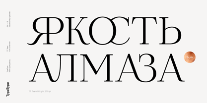
TT Tsars
par TypeType
Styles individuels à partir de $39.00
Famille complète de 20 polices: $189.00

TT Tsars Font la famille était
conçu par
Nadezhda Polomoshnova,
Marina Khodak,
Inessa Mitrozor,
TypeType Team et
publié par
TypeType. TT Tsars contient
20
styles et des offres familiales.
En savoir plus sur cette famille
- AaGlyphs
-
Meilleure offreOffres familiales
- Styles individuels
- Spécifications techniques
- Licences
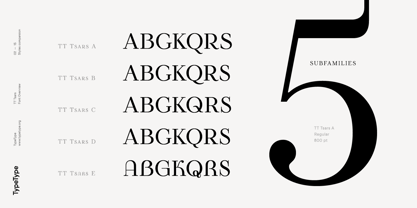
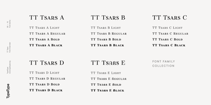
TT Tsars E Subfamily
4 policesPar style :
$24.75
Paquet de 4 styles :
$99.00
TT Tsars D Subfamily
4 policesPar style :
$24.75
Paquet de 4 styles :
$99.00
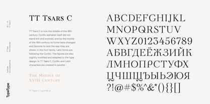
TT Tsars C Subfamily
4 policesPar style :
$24.75
Paquet de 4 styles :
$99.00
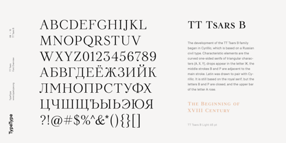
TT Tsars B Subfamily
4 policesPar style :
$24.75
Paquet de 4 styles :
$99.00
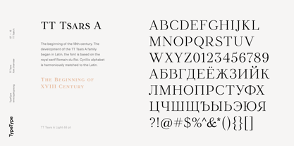
TT Tsars A Subfamily
4 policesPar style :
$24.75
Paquet de 4 styles :
$99.00
A propos de TT Tsars Police Family
Liens utiles de TT Tsars :
Spécimen | Présentation graphique | Options de personnalisation
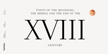
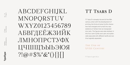
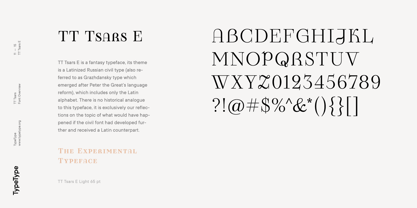
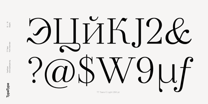
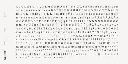
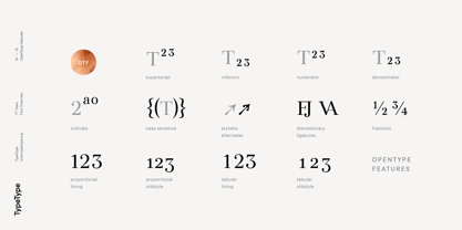
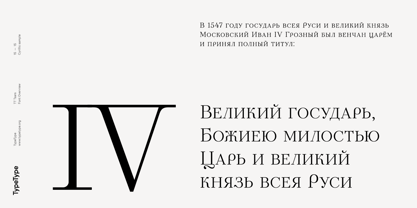
The TT Tsars font family is a collection of serif display titling fonts that are stylized to resemble the fonts of the beginning, the middle and the end of the XVIII century. The project is based on title fonts, that is, the fonts that were used to design book title pages. The idea for the project TT Tsars was born after a small study of the historical development of the Cyrillic type and is also based on Abram Shchitsgal’s book "Russian Civil Type". At the very beginning of the project, we had developed a basic universal skeleton for the forms of all characters in all subfamilies of the family, and later on, we added styles, visual features, artifacts and other nuances typical of the given period onto the skeleton. Yes, from the historical accuracy point of view it might be that such an approach is not always justified, but we have achieved our goal and as a result, we have created perfectly combinable serifs that can be used to style an inscription for a certain time period. The TT Tsars font family consists of 20 fonts: 5 separate subfamilies, each of which consists of 4 fonts. Each font contains 580 glyphs, except for the TT Tsars E subfamily, in which each font consists of 464 characters. Instead of lowercase characters in the typeface, small capitals are used, which also suggests that the typeface is rather a display than text one. In TT Tsars you can find a large number of ligatures (for Latin and Cyrillic alphabets), arrows and many useful OpenType features, such as: frac, ordn, sinf, sups, numr, dnom, case, onum, tnum, pnum, lnum, salt (ss01), dlig. Time-related characteristics of the subfamilies are distributed as follows: • TT Tsars A—the beginning of the 18th century (Latin and Cyrillic) • TT Tsars B—the beginning of the 18th century (Latin and Cyrillic) • TT Tsars C—the middle of the 18th century (Latin and Cyrillic) • TT Tsars D—the end of the 18th century (Latin and Cyrillic) • TT Tsars E—conditionally the beginning of the 18th century (only Latin) TT Tsars A and TT Tsars B families (both the beginning of the 18th century) have different starting points: for TT Tsars A it is Latin, for TT Tsars B it is Cyrillic. The development of the TT Tsars A family began in Latin, the font is based on the royal serif Romain du Roi. The Cyrillic alphabet is harmoniously matched to the Latin. The development of the TT Tsars B family began in Cyrillic, which is based on a Russian civil type. Characteristic elements are the curved one-sided serifs of triangular characters (A, X, Y), drops appear in the letter ?, the middle strokes ? and P are adjacent to the main stroke. Latin was drawn to pair with Cyrillic. It is still based on the royal serif, but somewhat changed: the letters B and P are closed and the upper bar of the letter A rose. This was done for the visual combination of Cyrillic and Latin and at the same time to make a distinction between TT Tsars A and TT Tsars B. TT Tsars C is now the middle of the 18th century. Cyrillic alphabet itself did not stand still and evolved, and by the middle of the 18th century, its forms have changed and become to look the way they are shown in this font family. Latin forms are following the Cyrillic. The figures are also slightly modified and adapted to the type design. In TT Tsars C, Cyrillic and Latin characters are created in parallel. A distinctive feature of the Cyrillic alphabet in TT Tsars C is the residual influence of the flat pen. This is noticeable in such signs as ?, ?, K. The shape of the letters ?, ?, ?, ? is very characteristic of the period. In the Latin alphabet, a characteristic leg appears at the letter R. For both languages, there is a typical C characterized by an upper serif and the appearance of large, even somewhat bolding serifs on horizontals (T, E, ?, L). TT Tsars D is already the end of the 18th century when with the development of printing, the forms of some Cyrillic characters had changed and turned into new skeletons of letters that we transposed into Latin. The figures were also stylized. In this font, both Cyrillic and Latin are stylistically executed with different serifs and are thus logically separated. The end of the century is characterized by the reduction of decorative elements. Straight, blueprint-like legs of the letters ?, R, K, ?. Serifs are very pronounced and triangular. E and ? are one-sided on the middle horizontal line. A very characteristic C with two serifs appears in the Latin alphabet. TT Tsars E is a steampunk fantasy typeface, its theme is a Latinized Russian ?ivil type (also referred to as Grazhdansky type which emerged after Peter the Great’s language reform), which includes only the Latin alphabet. There is no historical analog to this typeface, it is exclusively our reflections on the topic of what would have happened if the civil font had developed further and received a Latin counterpart. We imagined such a situation in which the civil type was exported to Europe and began to live its own life.
Concepteurs : Nadezhda Polomoshnova, Marina Khodak, Inessa Mitrozor, TypeType Team
Éditeur : TypeType
Fonderie : TypeType
Fonderie d'origine : unknown
Maître d'ouvrage : TypeType
MyFonts débout : 5 février 2019
TT Tsars
À propos TypeType
TypeType est une fonderie de caractères à service complet fondée en 2013. Elle conçoit des caractères esthétiques, modernes et de haute qualité polices, ainsi que des caractères commerciaux pour des marques internationales. Tous les police de la collection sont gratuits à l'essai et peuvent être personnalisés pour s'adapter au projet. La fonderie compte plus de 75 polices dans son portefeuille, y compris les best-sellers tels que TT Norms® Pro, TT Commons™️ Pro, TT Interphases Pro, et bien d'autres encore. L'équipe de production de TypeType police travaille à plein temps : Ivan Gladkikh, Yulia Gonina, Marina Khodak, Antonina Zhulkova, Toma Streltsova, Yuri Nakonechny, Anastasia Pogorelova, Alina Gabidulova, Sia Vrublevskaya, Lada Sobchenko, Antonina Samokhina, Victor Rubenko.
En savoir plus
Lire moins