Sélectionnez ce type de licence lorsque vous développez une application pour iOS, Android ou Windows Phone et que vous intégrez le fichier de fonte dans le code de votre application mobile.
Karlo
par The Northern Block
Styles individuels à partir de $28.95
Famille complète de 22 polices: $395.00

Karlo Font la famille était
conçu par
Sofie Beier et
publié par
The Northern Block. Karlo contient
22
styles et des offres familiales.
En savoir plus sur cette famille
- AaGlyphs
-
Meilleure offreOffres familiales
- Styles individuels
- Spécifications techniques
- Licences
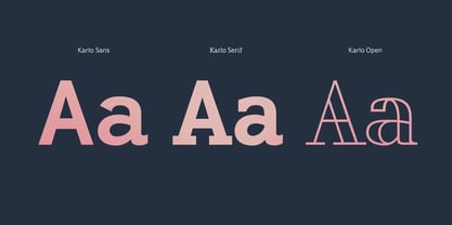
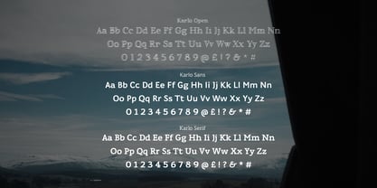
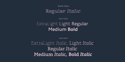
Karlo Serif Family
10 policesPar style :
$20.90
Paquet de 10 styles :
$209.00
Karlo Sans Family
10 policesPar style :
$20.90
Paquet de 10 styles :
$209.00
Karlo Open Family
2 policesPar style :
$22.50
Paquet de 2 styles :
$45.00
A propos de la famille Karlo Police
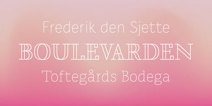
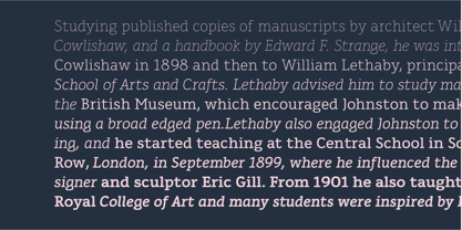
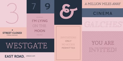
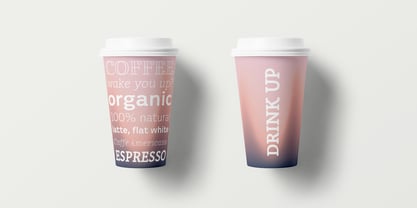
Karlo est une super famille composée de plusieurs branches, issues du même squelette léger. Les poids légers sont basés sur un stylo à largeur de trait régulière. Inspirée par les écrits du calligraphe Edward Johnston, la famille évolue dans deux directions dans les poids plus lourds. Johnston a démontré que le stylo à plume large peut produire différents styles d'écriture. Par la suite, une des graisses lourdes présente un faible contraste de trait humaniste (KarloSerifBold et KarloSansBold), et une autre présente un contraste de trait élevé de l'axe vertical avec des références aux caractères de travail du 19ème siècle (KarloOpen). Ce dernier s'inspire de la démonstration de Johnston sur le stylo à plume large, où il a suggéré de fixer deux crayons l'un à l'autre. Chaque crayon représentant un bord du stylo, il devient plus évident de comprendre comment le stylo fonctionne dans l'écriture. L'aspect informel et convivial des KarloSans et KarloSerif les rend utilisables aussi bien pour les textes courants que pour les formats d'affichage. KarloOpen, en revanche, est uniquement conçu pour l'affichage de quelques mots à la fois. Au Danemark, un homme qui s'appelle Karlo est généralement un vieux monsieur à la coiffure soignée qui fait un effort sur son apparence. C'est un homme à tout faire qui peut faire un peu de tout et de rien quand c'est nécessaire. C'est un homme heureux qui vit au jour le jour. Pour moi, la famille de polices de caractères possède certaines des mêmes qualités.
Jetez un coup d'œil à Pyke qui est une excellente paire pour Karlo.
Concepteurs : Sofie Beier
Éditeur : The Northern Block
Fonderie : The Northern Block
Maître d'ouvrage : The Northern Block
MyFonts débout : 4 janvier 2018
Karlo
À propos The Northern Block
Fondée en 2006 par Jonathan Hill, The Northern Block est une fonderie de caractères collaborative internationalement reconnue pour la production de polices modernistes pour les marques, les créatifs et les fabricants. L'équipe internationale hautement qualifiée et enthousiaste de The Northern Block conçoit et développe des caractères de détail et personnalisés primés, et fait avancer la conception d'écritures non latines, y compris l'arabe, le cyrillique, le grec et l'hébreu.La page de la fonderie Premium peut être consultée ici.
En savoir plus
Lire moins