Sélectionnez ce type de licence lorsque vous développez une application pour iOS, Android ou Windows Phone et que vous intégrez le fichier de fonte dans le code de votre application mobile.
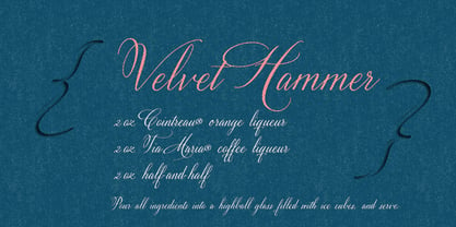
Velvet Hammer
par Great Lakes Lettering
Styles individuels à partir de $40.00


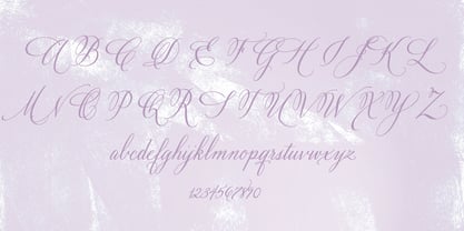
Velvet Hammer Font la famille était
conçu par
Dathan Boardman,
Jen Maton et
publié par
Great Lakes Lettering. Velvet Hammer contient
1
styles.
En savoir plus sur cette famille
À propos de la famille Velvet Hammer Police
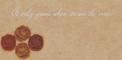
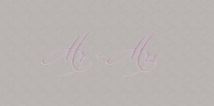
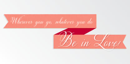
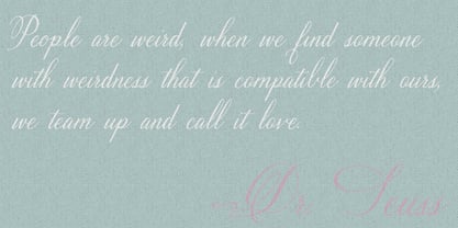
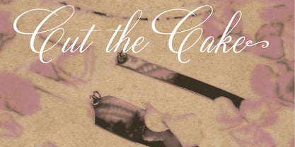
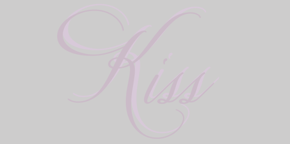
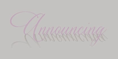
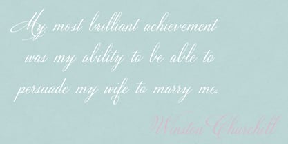
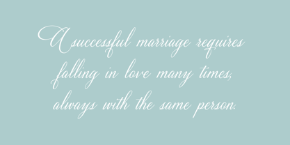
The Velvet Hammer est une véritable calligraphie à la main police qui offre à l'observateur un sentiment d'élégance forte. Ce police peut être utilisé pour des cartes, des affiches, des panneaux, des invitations de mariage, des catalogues, des couvertures de livres et bien d'autres choses encore ! Le style simple et unique du Velvet Hammer peut se suffire à lui-même ou s'intégrer confortablement à n'importe quel affichage ou texte police!
Concepteurs : Dathan Boardman, Jen Maton
Éditeur : Great Lakes Lettering
Fonderie : Great Lakes Lettering
Maître d'ouvrage : Great Lakes Lettering
MyFonts débout : 26 novembre 2014
Marteau de velours
À propos Great Lakes Lettering
Dathan Boardman et Molly Jacques Erickson ont fondé Great Lakes Lettering à partir d'une appréciation mutuelle de la calligraphie artistique. "En 2012, j'ai travaillé sur beaucoup de calligraphies polices et je suis tombé sur le travail de Molly. J'ai tout de suite été frappé par son aspect viscéral et par le fait qu'il ne ressemblait à aucun autre type de calligraphie que j'avais pu rencontrer", explique Dathan. "Je l'ai contactée pour lui demander si elle était intéressée par la transformation de son lettrage en polices." La première police de caractères du duo, Frosted, est sortie plus tard dans l'année. Les polices de caractères les plus vendues de Dathan et Molly comprennent Asterism, un style calligraphique police avec une ligne de base mobile et beaucoup de personnalité brillante, et Kailey, une police de caractères lettrée à la main inspirée du style de Molly, composé de coups de pinceau audacieux, de fioritures fluides et de caractères distinctifs. Alissa Mazzenga a rejoint l'équipe en 2014 avec le lancement de sa création Feast, une police de caractères dont la magie semble résider dans le mouvement éthéré de vagues d'encre fluides, formant de douces lignes arquées et un design qui se suffit à lui-même. Les membres du groupe polices sont surtout connus pour leur travail dans des contextes variés, à la fois formels et informels. Ils ont travaillé avec des marques telles que Nike et Martha Stewart et ont encore de beaux jours devant eux. "De nombreuses collaborations passionnantes nous attendent. Comme notre site polices devient plus raffiné et plus formel, nous atteignons un nouveau niveau d'élégance qui nous incite à continuer et à perfectionner notre méthode de travail.
En savoir plus
Lire moins