Sélectionnez ce type de licence lorsque vous développez une application pour iOS, Android ou Windows Phone et que vous intégrez le fichier de fonte dans le code de votre application mobile.
Filson Soft
par Mostardesign
Styles individuels à partir de $25.00
Famille complète de 16 polices: $199.00


Filson Soft Font la famille était
conçu par
Olivier Gourvat et
publié par
Mostardesign. Filson Soft contient
16
styles et des offres familiales.
En savoir plus sur cette famille
- AaGlyphs
-
Meilleure offreOffres familiales
- Styles individuels
- Spécifications techniques
- Licences
A propos de Filson Soft Police Family
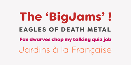
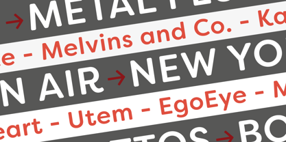
Le Filson Soft est la version arrondie du populaire Filson Soft.
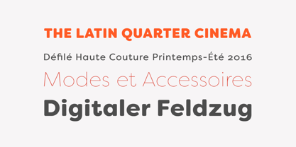
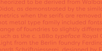
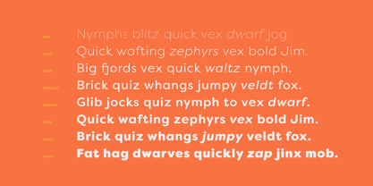
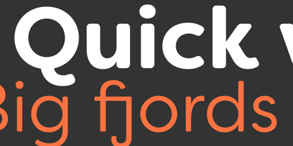
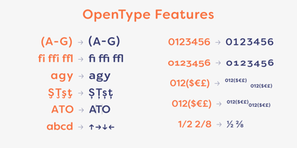
. A première vue, la caractéristique principale de Filson Soft sont les lettres distinctives 'K', 'Q' et surtout 'R' qui rendent la famille police très élégante. Avec ses terminaisons arrondies, cette famille police est également parfaite pour des titres originaux et donnera à vos futures créations un aspect sympathique. Mais avec toutes ces caractéristiques originales, le Filson Soft est très lisible et très polyvalent. Sa grande hauteur de x, se comporte même très bien dans les petites tailles. Le Filson Soft est disponible en 8 graisses - Thin, Light, Book, Regular, Medium, Bold, Black, Heavy - avec une gamme professionnelle de fonctions Opentype telles que les chiffres lining et oldstyle, les alternances stylistiques, les formes sensibles à la casse, les formes localisées, les jeux stylistiques, les flèches et les f-ligatures. Pour un meilleur contrôle typographique, Filson Soft inclut également une classe OpenType de crénage avec des milliers de paires de crénage.
Concepteurs : Olivier Gourvat
Éditeur : Mostardesign
Fonderie : Mostardesign
Maître d'ouvrage : Mostardesign
MyFonts débout : 20 avril 2016
Filson Soft
À propos Mostardesign
C'est en 2004 que le graphiste Olivier Gourvat a commencé à expérimenter la création de caractères pour son studio de graphisme, Mostardesign Studio. Avec la création de son premier site police, Visoko, en 2009, Olivier s'est principalement concentré sur la création de caractères. "J'utilise mon expérience professionnelle et mes connaissances du processus de conception graphique pour créer des polices uniques et professionnels afin d'aider les designers et les concepteurs de sites web à créer une communication efficace pour leurs projets", explique-t-il. C'est en gardant à l'esprit son passé de graphiste qu'il crée des familles de caractères polyvalentes comme Sofia Pro, l'une de ses meilleures ventes polices à ce jour. "Je considère que la polyvalence d'un police est le premier pas vers le succès d'une bonne communication globale", explique Olivier. "Une grande famille avec beaucoup de graisses différentes transmettra un message fort à son public tout en étant facile à utiliser sur différents supports, qu'ils soient imprimés ou numériques.
En savoir plus
Lire moins