Sélectionnez ce type de licence lorsque vous développez une application pour iOS, Android ou Windows Phone et que vous intégrez le fichier de fonte dans le code de votre application mobile.
Near Myth
par Comicraft
Styles individuels à partir de $19.00
Famille complète de 2 polices: $29.00

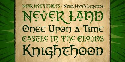
Near Myth Font la famille était
conçu par
John Roshell et
publié par
Comicraft. Near Myth contient
2
styles et des offres familiales.
En savoir plus sur cette famille
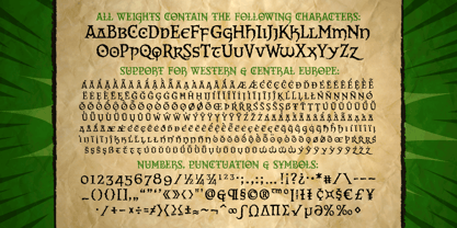
- AaGlyphs
-
Meilleure offreOffres familiales
- Styles individuels
- Spécifications techniques
- Licences
Par style :
$14.50
Paquet de 2 styles :
$29.00
A propos de Near Myth Police Family
Les Dieux nordiques d'Asgard, les Titans de l'Olympe et les Sages de la Terre du Milieu ont parlé ! Leurs déclarations ont été gravées dans la roche à travers les montagnes de Midgard et leur légende sera désormais connue de tous... Car JG - notre très cher M. Fontastic - a signé une licence pour que comicbookfonts.com puisse commercialiser les typographies des dieux.
Non vraiment, il a passé un accord avec Loki. Il a trempé son stylo dans son propre sang et tout.
Concepteurs : John Roshell
Éditeur : Comicraft
Fonderie : Comicraft
Fonderie d'origine : unknown
Maître d'ouvrage : Comicraft
MyFonts débout : 26 octobre 2005
Proche du mythe
À propos Comicraft
Les plus grands auteurs de bandes dessinées au monde Polices! Après avoir lettré consciencieusement des milliers de bandes dessinées, les Fearless Polices de Comicraft sauvent la mise dans les jeux vidéo, les émissions télévisées, les titres de films et partout où l'on a besoin d'une polices amusante et vivante. En 1992, le duo dynamique de Richard Starkings et John Roshelll, et leur flotte intrépide de Police Finaglers, ont commencé à fournir un design unique et un lettrage fin aux industries de la bande dessinée, de la télévision et des jeux vidéo, et sont devenus connus pour être les pionniers de l'utilisation de l'ordinateur dans l'art du lettrage de la bande dessinée. Pris au piège dans un monde qu'ils n'ont jamais créé, les Fearless Polices de Comicraft viendront à la rescousse en un clin d'œil ! La page de la fonderie Premium peut être consultée ici.
En savoir plus
Lire moins