Sélectionnez ce type de licence lorsque vous développez une application pour iOS, Android ou Windows Phone et que vous intégrez le fichier de fonte dans le code de votre application mobile.
Avram Sans™
par Tour De Force
Styles individuels à partir de $0.00
Famille complète de 5 polices: $85.00


Avram Sans Font la famille était
conçu par
Dusan Jelesijevic et
publié par
Tour De Force. Avram Sans contient
5
styles et des offres familiales.
En savoir plus sur cette famille
- AaGlyphs
-
Meilleure offreOffres familiales
- Styles individuels
- Spécifications techniques
- Licences
Par style :
$17.00
Paquet de 5 styles :
$85.00
A propos de la famille Avram Sans Police
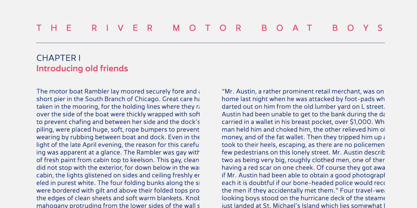
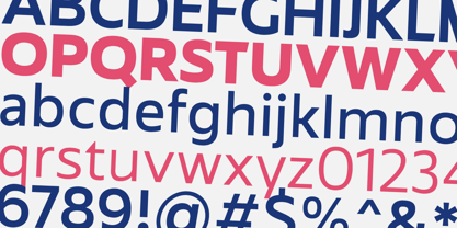
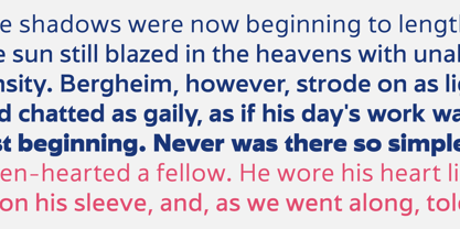
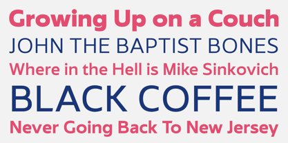
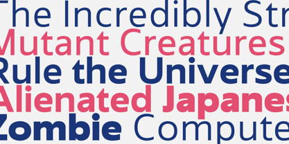
Avram Sans est une famille de caractères sans empattement modernes, lisibles et universels, conçus pour obtenir les meilleures performances dans un large éventail de situations. De par sa conception, il flirte avec les caractères géométriques et humanistes traditionnels, mais contient également des caractéristiques contemporaines qui, réunies, donnent une famille de caractères sans empattement simple, élégante et unique, déclinée en 5 graisses. Avram Sans se comporte bien dans les très petites tailles. Outre les chiffres de la ligne tabulaire, il contient des lettres SmallCap pour les caractères latins de base. Au total, l'Avram Sans comprend 425 glyphs, couvrant entièrement les langues écrites latines.
Concepteurs : Dusan Jelesijevic
Éditeur : Tour De Force
Fonderie : Tour De Force
Maître d'ouvrage : Tour De Force
MyFonts débout : 7 janvier 2016
Avram Sans™
est une marque déposée de Tour De Force Police Foundry.

À propos Tour De Force
police Fondée par Slobodan Jelesijević et Dusan Jelesijević en mai 2009, Tour de Force Police Foundry est une fonderie indépendante, unique en son genre en Serbie, qui a produit des caractères originaux de haute qualité utilisés dans le monde entier. Depuis notre laboratoire de glyphes situé dans la petite ville de Gornji Milanovac, en Serbie centrale, nous avons ancré notre savoir-faire et notre réputation dans la fourniture des normes européennes classiques d'un service personnalisé exceptionnel à nos clients du monde entier. Il s'agit d'un service qui croit en l'importance de prendre soin des petites choses - et de perfectionner les petits détails qui peuvent faire toute la différence.
En savoir plus
Lire moins