Sélectionnez ce type de licence lorsque vous développez une application pour iOS, Android ou Windows Phone et que vous intégrez le fichier de fonte dans le code de votre application mobile.
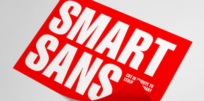
Smart Sans™
par Monotype
Styles individuels à partir de $29.99
Famille complète de 3 polices: $205.99


Smart Sans Font la famille était
conçu par
Rod McDonald et
publié par
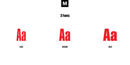
Monotype. Smart Sans contient
3
styles et des offres familiales.
En savoir plus sur cette famille
- AaGlyphs
-
Meilleure offreOffres familiales
- Styles individuels
- Spécifications techniques
- Licences
Par style :
$68.33
Paquet de 3 styles :
$204.99
Smart Sans Complete Family Pack
3 policesPar style :
$68.66
Paquet de 3 styles :
$205.99
Smart Sans Complete Family Pack
3 policesPar style :
$62.66
Paquet de 3 styles :
$187.99
À propos de Smart Sans Police Family
Smart Sans est un hommage personnel à Leslie (Sam) Smart, le premier directeur de la typographie à être engagé par une grande maison de composition au Canada. Smart était un pionnier du design du vingtième siècle qui a élevé les normes de la typographie canadienne. Avec trois de ses pairs, il a créé le premier Type Directors Club à Toronto.
Après la mort de Sam Smart en 1998, le créateur de caractères Rod McDonald a décidé qu'il fallait faire quelque chose pour commémorer la vie et les réalisations de Sam Smart. J'avais d'abord pensé à créer une bourse d'études au nom de Sam, mais la conception d'une police de caractères a rapidement remplacé cette idée", explique Rod McDonald. "Une fois que j'ai décidé de créer une police de caractères, il est devenu évident que ce serait une police sans empattement, pour la seule raison que j'aimais le nom Smart Sans.
Deux polices de caractères ont inspiré le travail de M. McDonald. "Comme des milliers de designers, j'aime beaucoup la série Helvetica Compressed de Matthew Carter. Et quand j'étais plus jeune, j'aimais aussi les caractères de Fred Lambert.
McDonald a dessiné trois graisses pour la famille Smart Sans, toutes idéales pour créer des titres qui attirent l'attention et des textes d'affichage percutants. Le "g" à deux étages contribue à la personnalité vivante du design, et le "r" court permet de maintenir un espacement serré et régulier.
Smart Sans est l'hommage parfait à un grand typographe, car il relève la barre de ce que l'on peut attendre des caractères sans empattement condensés. Sam Smart en serait ravi".
Concepteurs : Rod McDonald
Éditeur : Monotype
Fonderie : Monotype
Maître d'ouvrage : Monotype
MyFonts débout : 13 octobre 2005
Smart Sans™
est une marque déposée de Monotype Imaging Inc. et peut être enregistrée dans certaines juridictions.
À propos Monotype
La bibliothèque de Monotype est l'une des collections de caractères les plus vastes et les plus complètes au monde. Elle comprend des dessins originaux d'importance historique et une nouvelle gamme de caractères contemporains et à la mode : polices. La bibliothèque de Monotype comprend des milliers de classiques intemporels, des reprises artisanales et des dessins originaux provenant des créateurs de caractères et des fonderies les plus innovants de l'histoire. Cette bibliothèque distinctive et primée de polices offre aux marques et aux concepteurs une sélection large et fiable de caractères pour une typographie expressive à l'impression et à l'écran. La page Premium Foundry peut être consultée ici.
En savoir plus
Lire moins