Sélectionnez ce type de licence lorsque vous développez une application pour iOS, Android ou Windows Phone et que vous intégrez le fichier de fonte dans le code de votre application mobile.
Maga
par DSType


- AaGlyphs
-
Meilleure offreOffres familiales
- Styles individuels
- Spécifications techniques
- Licences
Par style :
$24.00
Paquet de 10 styles :
$240.00
À propos de la famille Maga Police
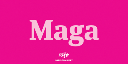
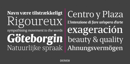
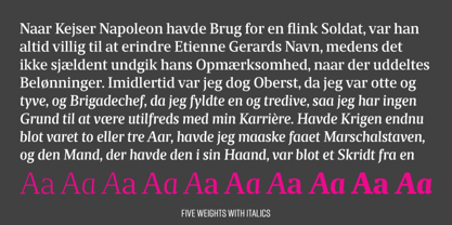
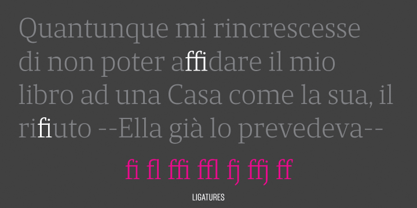
Maga partage le squelette de l'un de nos premiers caractères (Quaestor, de 2004), mais nous ne voulions pas nous contenter d'étendre un design existant. Nous avons donc fait un pas en avant, non seulement en améliorant les caractéristiques et les graisses, mais aussi en rendant l'italique plus utilisable que son prédécesseur. L'équilibre entre les guillemets et l'espace entre les lettres en fait un caractère très peu encombrant, très lisible, mais suffisamment élégant pour la conception de magazines contemporains.
Concepteurs : Dino dos Santos
Éditeur : DSType
Fonderie : DSType
Maître d'ouvrage : DSType
MyFonts débout : 16 janvier 2012
À propos DSType
“I began designing typefaces in the early ’90s because there weren’t many typefaces available to us in those days,” Dino dos Santos, founder of DSType, said in his Creative Characters interview. “I started designing fonts that matched the new typographic experience. To me, graphic design was never about taking a picture and then just choosing one of the available typefaces” Based in Porto, Portugal, Dino got his start designing typefaces for magazines and large corporations. Frustrated that the only fonts available for use were system fonts and dry transfer sheets, he began selling his typefaces on MyFonts. Since then, the self-taught designer has created a library full of striking experiments, charming display type, and most notably, an amazing collection of well-wrought, extensive text families. His collection also boasts a handful of bestsellers such as Velino Text, Prelo Slab and Prumo Slab. “There is not much of a type design history in Portugal,” he noted in his interview. He is, however, interested in what has been done in his country by older generations of type designers and calligraphers. “I want to understand what happened, how things worked back then, and expose the world to some lesser-known work. History is often seen as something that passed away, and that’s it. But for me history is one of the most relevant aspects of type design. I believe we are made of history, but also that we should take a step forward by connecting it to the present and the future and we can do that through technology.”The Premium foundry page can be viewed Here.
En savoir plus
Lire moins