Seleccione este tipo de licencia cuando esté desarrollando una aplicación app para iOS, Android o Windows Phone, y vaya a incrustar el archivo en el código de su aplicación móvil. va a incrustar el archivo fuente en el código de su aplicación móvil.
Daisy Lau
por Dharma Type
Estilos individuales desde $19.99


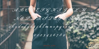
Daisy Lau Fuente La familia era
diseñada por
Ryoichi Tsunekawa y
publicado por
Dharma Type. Daisy Lau contiene
1
estilos.
Más información sobre esta familia
Sobre la familia Daisy Lau Fuente
Basado en algunas escrituras del siglo XIX. La textura de tinta da un aspecto realista a la escritura. La sensación de escritura suave crea un ambiente antiguo y nostálgico. Rising Star en marzo de 2007. Hay otras dos escrituras diseñadas con el mismo concepto. -Daisy Lau -Lily Wang -Pansy Bo
Diseñadores: Ryoichi Tsunekawa
Editorial: Dharma Type
Fundición: Dharma Type
Propietario del diseño: Dharma Type
MyFonts debut: 10 de enero de 2007
Daisy Lau

Acerca de Dharma Type
Hasta ahora, Dharma Type ha publicado un centenar de tipos latinos, incluido Bebas Neue (fuente abierta y gratuita fuente), y muchos de sus fuentes han aparecido en diversas publicaciones y se han utilizado en múltiples medios, como títulos de películas (por ejemplo, La la land), logotipos de marcas y carteles.
Seguir leyendo
Leer menos