Seleccione este tipo de licencia cuando esté desarrollando una aplicación app para iOS, Android o Windows Phone, y vaya a incrustar el archivo en el código de su aplicación móvil. va a incrustar el archivo fuente en el código de su aplicación móvil.
Bokar
por Pelavin Fonts
Estilos individuales desde $25.00

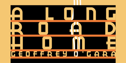
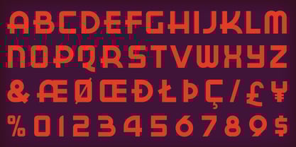
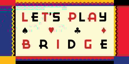
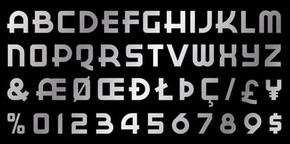
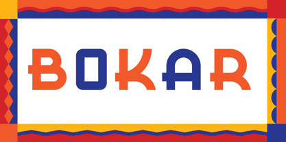
Bokar Fuente La familia era
diseñada por
Daniel Pelavin y
publicado por
Pelavin Fonts. Bokar contiene
1
estilos.
Más información sobre esta familia
Sobre la familia Bokar Fuente
Me inspiran las imágenes que la tecnología ha dejado obsoletas. Admiro especialmente los envases de las marcas de café Eight O'Clock, Red Circle y Bokar de A&P, cuya excéntrica pero elegante tipografía nos remite a una época anterior menos complicada. El Bokar de fuente es mi guiño de agradecimiento a esas mezclas robustas y con cuerpo que se salvaron del azote soso e insípido de las marcas corporativas.
Diseñadores: Daniel Pelavin
Editorial: Pelavin Fonts
Fundición: Pelavin Fonts
Propietario del diseño: Pelavin Fonts
MyFonts debut: 10 de febrero de 2010
Bokar
Acerca de Pelavin Fonts
Daniel Pelavin lleva cinco décadas transformando y fundiendo las imágenes y la efeméride cultural de nuestro tiempo en mensajes convincentes y convincentes para la edición, la publicidad y el diseño de comunicación. Ascendió en los legendarios estudios de arte de Detroit, en la época dorada de principios de los setenta. Pelavin fue aprendiz y trabajó con artistas de toda la gama de profesionales de las artes gráficas, incluidos ilustradores decorativos, de moda, de productos y técnicos, así como rotulistas, tipógrafos y diseñadores. Su fascinación por las formas de las letras desde una edad temprana le ha llevado a crear fuentes, influenciado por muchos periodos históricos diferentes.
Seguir leyendo
Leer menos