Seleccione este tipo de licencia cuando esté desarrollando una aplicación app para iOS, Android o Windows Phone, y vaya a incrustar el archivo en el código de su aplicación móvil. va a incrustar el archivo fuente en el código de su aplicación móvil.
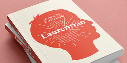
Laurentian™
por Monotype
Estilos individuales desde $29.00
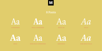
Familia completa de 8 fuentes : $179.99


Laurentian Fuente La familia era
diseñada por
Rod McDonald y
publicado por
Monotype. Laurentian contiene
8
estilos y opciones de paquetes familiares.
Más información sobre esta familia
- Aa Glifos
-
¡Mejor PrecioPaquetes de familia
- Estilos individuales
- Especificaciones técnicas
- Licencias
Por estilo:
$22.49
Paquete de 8 estilos:
$179.99
Laurentian Volume
5 fuentesPor estilo:
$25.19
Paquete de 5 estilos:
$125.99
Laurentian Volume
5 fuentesPor estilo:
$25.19
Paquete de 5 estilos:
$125.99
Laurentian Volume
5 fuentesPor estilo:
$25.19
Paquete de 5 estilos:
$125.99
Laurentian Condensed Volume
3 fuentesPor estilo:
$20.99
Paquete de 3 estilos:
$62.99
Sobre la familia Laurentian Fuente
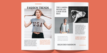
Maclean's es una revista semanal de noticias canadiense con una amplia misión editorial. Un número típico cubre desde la violencia en el otro lado del globo hasta la calabaza más grande cultivada en un condado local.
En 2001, Maclean's invitó a Rod McDonald a formar parte del equipo de diseño para renovar" la publicación, de 96 años de antigüedad. La revista quería ofrecer a sus lectores una voz tipográfica profesional, limpia y fácil de leer. Sobre todo, el tipo de letra tenía que ser capaz de hablar de los cientos de temas inconexos que se trataban en cada número sin dejar de ser creíble y poco artificioso.
¿Tal vez una tarea difícil? A esto hay que añadir que se trataba del primer tipo de texto encargado por una revista canadiense. McDonald, a quien algunos han calificado de "tipógrafo laureado" no oficial de Canadá, aceptó el reto.
McDonald utilizó dos modelos históricos como base para el diseño de Laurentian: el trabajo del diseñador tipográfico francés Claude Garamond y el del impresor y fundador tipográfico inglés William Caslon. De Garamond, Laurentian adquirió su eje humanista, sus gracias nítidas y sus terminales que imitan los trazos de la pluma. Las letras de Caslon son menos humanistas, con un contraste más marcado en el peso del trazo y serifas que parecen construidas en lugar de dibujadas. Estos rasgos también dejaron su impronta en Laurentian.
Con estos dos diseños como base, McDonald dibujó Laurentian pensando en las columnas de texto estrechas y los tamaños de letra pequeños de las revistas. Dotó a sus letras de fuertes trazos verticales y serifas robustas, una altura x robusta y una anchura de caracteres ligeramente comprimida
Una tarea difícil, pero el genio de McDonald es evidente en la legibilidad del rostro, su tranquila vivacidad y la apertura de las letras. El resultado es un tipo de letra que no sólo satisface el exigente encargo de diseño de Maclean, sino que también presta un servicio excepcional en una amplia variedad de aplicaciones.
Laurentian está disponible en tres pesos: normal, semiondulado y negrita, con cursivas complementarias para normal y semiondulado, y un conjunto de mayúsculas para títulos".
Diseñadores: Rod McDonald
Editorial: Monotype
Fundición: Monotype
Propietario del diseño: Monotype
MyFonts debut: 13 de octubre de 2005
Laurentian™
es una marca comercial de Monotype Imaging Inc. y puede estar registrada en determinadas jurisdicciones.
Acerca de Monotype
La Biblioteca Monotype es una de las mayores y más completas colecciones de tipos de letra del mundo, con diseños originales de importancia histórica y una nueva gama de diseños contemporáneos y de moda fuentes. La Biblioteca Monotype incluye miles de clásicos atemporales, revivals artesanales y diseños originales de muchos de los diseñadores tipográficos y fundiciones más innovadores de la historia. Esta biblioteca distintiva y galardonada de primera calidad fuentes ofrece a marcas y diseñadores una selección amplia y fiable de tipos de letra para una tipografía expresiva en impresión y en pantalla. La página de la Fundición Premium puede consultarse aquí.
Seguir leyendo
Leer menos