Seleccione este tipo de licencia cuando esté desarrollando una aplicación app para iOS, Android o Windows Phone, y vaya a incrustar el archivo en el código de su aplicación móvil. va a incrustar el archivo fuente en el código de su aplicación móvil.
1741 Financiere
por GLC
Estilos individuales desde $20.00
Familia completa de 2 fuentes : $45.00

1741 Financiere Fuente La familia era
diseñada por
publicado por
GLC. 1741 Financiere contiene
2
estilos y opciones de paquetes familiares.
Más información sobre esta familia
- Aa Glifos
-
¡Mejor PrecioPaquetes de familia
- Estilos individuales
- Especificaciones técnicas
- Licencias
Por estilo:
$22.50
Paquete de 2 estilos:
$45.00
Sobre la familia 1741 Financiere Fuente
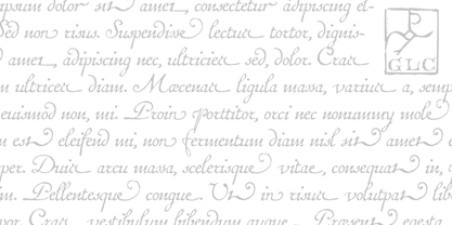
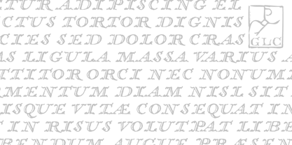
Esta familia se inspira en la fuente de Fournier llamada "Financière". Se trata de una fuente manual, tallada en 1741 por Pierre Simon Fournier (le jeune) y publicada en su Manuel Typographique... en París (1764-1766). Ofrecemos "Financière" de 1741 como un rico complemento a nuestra GLC Fournier de 1786. La fuente está enriquecida con numerosas ligaduras y especificaciones OTF para hacerla atractiva y ofrecer muchas y variadas posibilidades tipográficas en un texto.
Diseñadores:
Editorial: GLC
Fundición: GLC
Propietario del diseño: GLC
MyFonts debut: 16 de octubre de 2009
1741 Financiere

Acerca de GLC
Gilles Le Corre nació en 1950 en Nantes, Francia. Pintor desde finales de los años 70, también es grabador y calígrafo. Conoce el arte medieval y los libros antiguos desde que tiene uso de razón. Más recientemente ha hecho del ordenador una herramienta para escribir como la pluma y la tinta. Con él, pretende hacer posible la impresión de libros con el mismo aspecto que los antiguos. Desde 2007 intenta reproducir con gran exactitud una amplia gama de tipos de letra históricos europeos, sobre todo medievales y de las primeras épocas de la imprenta -su periodo favorito-, desde 1456 con Gutenberg, hasta 1913 con una fuente inspirada en una máquina de escribir antigua de verdad.
Seguir leyendo
Leer menos