Seleccione este tipo de licencia cuando esté desarrollando una aplicación app para iOS, Android o Windows Phone, y vaya a incrustar el archivo en el código de su aplicación móvil. va a incrustar el archivo fuente en el código de su aplicación móvil.
Threefortysixbarrel™
por Typodermic
Estilos individuales desde $13.95
Familia completa de 3 fuentes : $16.95

Threefortysixbarrel Fuente La familia era
diseñada por
Ray Larabie y
publicado por
Typodermic. Threefortysixbarrel contiene
3
estilos y opciones de paquetes familiares.
Más información sobre esta familia
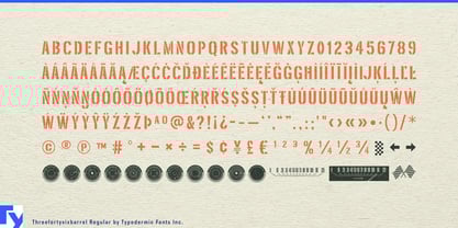
- Aa Glifos
-
¡Mejor PrecioPaquetes de familia
- Estilos individuales
- Especificaciones técnicas
- Licencias
Por estilo:
$5.65
Paquete de 3 estilos:
$16.95
Sobre la familia Threefortysixbarrel Fuente
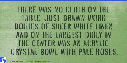
Revolucione sus motores y prepárese para añadir músculo a su tipografía con Threefortysixbarrel, el tipo de letra definitivo para los que viven la vida en el carril rápido. Este tipo de letra de alto octanaje se desprendió de de descuento , el filtro de aire de un Plymouth Barracuda de 1970.
Con Threefortysixbarrel, podrá proclamar su mensaje con confianza y autoridad. Este alfabeto sin tonterías es apenas legal en la calle, al igual que los muscle cars en los que se inspira. Y con tres estilos diferentes para elegir, puede personalizar su tipografía para que coincida perfectamente con su mensaje.
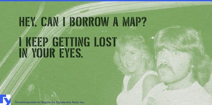
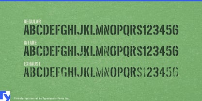
En primer lugar, tenemos Threefortysixbarrel. Esta es la versión seria y limpia de fuente, con una poderosa personalidad que llama la atención. Es perfecta para cuando necesitas hacer una declaración que no pueda ser ignorada.
Si busca un estilo más vintage, Threefortysixbarrel Intake es la mejor opción. Este estilo presenta un efecto de tipografía oxidada realista que hará que tu tipografía parezca de la época dorada de los muscle cars. Es perfecto para añadir un toque de nostalgia a tus diseños.
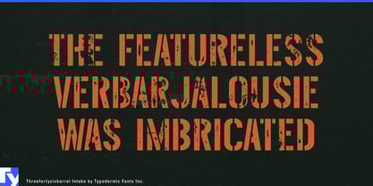
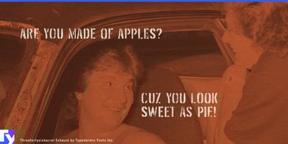
Y, por último, tenemos el escape Threefortysixbarrel. Este estilo es áspero y descolorido, como un muscle car que ha sido llevado al límite. Es la elección perfecta cuando quieres que tu tipografía tenga un aire desaliñado y desgastado.
Pero eso no es todo: los estilos de textura de Threefortysixbarrel también incluyen pares personalizados que se sustituirán automáticamente en las aplicaciones que puedan manejar ligaduras OpenType. Esto significa que las texturas de caracteres repetidos se romperán, dando como resultado un efecto aún más realista y desaliñado.
¿A qué esperas? Coge la empuñadura de pistola, pisa a fondo el acelerador y despega con Threefortysixbarrel. Este tipo de letra es la elección definitiva para cualquiera que quiera añadir algo de fuerza a sus diseños.
Es compatible con la mayoría de los sistemas de escritura europeos basados en el latín, incluidas las siguientes lenguas. Afaan Oromo, afar, afrikaans, albanés, alsaciano, aromano, aimara, bashkir (latín), vasco, bielorruso (latín), bemba, bikol, bosnio, bretón, caboverdiano, criollo, catalán, cebuano, chamorro, chavacano, chichewa, tártaro de Crimea (latín), croata, checo, danés, dawan, dholuo, neerlandés, inglés, estonio, feroés, fiyiano, filipino, finés, francés, frisón, friulano, gagauz (latín), gallego, ganda, genovés, alemán, groenlandés, criollo guadalupeño, criollo haitiano, hawaiano, hiligaynon, húngaro, islandés, ilocano, indonesio, irlandés, italiano, jamaicano, kaqchikel, karakalpak (latín), casubio, kikongo, kinyarwanda, kirundi, kurdo (latín), letón, lituano, lombardo, bajo sajón, luxemburgués, maasai, makhuwa, malayo, maltés, maorí, moldavo, montenegrino, ndebele, napolitano, noruego, novial, occitano, osetio (latín), papiamento, piamontés, polaco, portugués, quechua, rarotongano, rumano, romanche, sami, sango, saramaccan, sardo, gaélico escocés, serbio (latín), shona, siciliano, silesio, eslovaco, esloveno, somalí, sorabo, sotho, español, swahili, swazi, sueco, tagalo, tahitiano, tetum, tongano, tshiluba, tsonga, tswana, tumbuka, turco, turcomano (latín), tuvaluano, uzbeko (latín), veneciano, vepsiano, võro, valón, waray-waray, wayuu, galés, wolof, xhosa, yapés, zapoteco zulú y zuni.
Diseñadores: Ray Larabie
Editorial: Typodermic
Fundición: Typodermic
Fundición original: unknown
Propietario del diseño: Typodermic
MyFonts debut: 28 de mayo de 2004
Tresporseisbarril™
es una marca comercial de Typodermic.
Acerca de Typodermic
Bienvenido a Typodermic Fuentes, una animada fundición tipográfica con sede en Nagoya (Japón), fundada por el diseñador tipográfico canadiense Raymond Larabie en 2001. Nuestra biblioteca está repleta de más de 500 tipos de letra diferentes para impulsar la creatividad en el diseño gráfico, la publicidad, la web y el desarrollo de app . Como pioneros de la tipografía digital, adoptamos pronto las licencias de fuentes y app , ampliando constantemente los límites del diseño. Con corazón canadiense y precisión japonesa, somos sus socios globales en tipografía extraordinaria. Descubra Typodermic Fuentes, donde la creatividad se une al carácter.
Seguir leyendo
Leer menos