Seleccione este tipo de licencia cuando esté desarrollando una aplicación app para iOS, Android o Windows Phone, y vaya a incrustar el archivo en el código de su aplicación móvil. va a incrustar el archivo fuente en el código de su aplicación móvil.
Hawkes
por Kimmy Design
Estilos individuales desde $10.00
Familia completa de 14 fuentes : $75.00

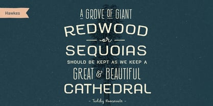


Hawkes Fuente La familia era
diseñada por
Kimmy Kirkwood y
publicado por
Kimmy Design. Hawkes contiene
14
estilos y opciones de paquetes familiares.
Más información sobre esta familia
- Aa Glifos
-
¡Mejor PrecioPaquetes de familia
- Estilos individuales
- Especificaciones técnicas
- Licencias
Hawkes Sans
9 fuentesPor estilo:
$5.55
Paquete de 9 estilos:
$50.00
Hawkes Variable Width
3 fuentesPor estilo:
$8.33
Paquete de 3 estilos:
$25.00
Hawkes Script
2 fuentesPor estilo:
$7.50
Paquete de 2 estilos:
$15.00
Sobre la familia Hawkes Fuente
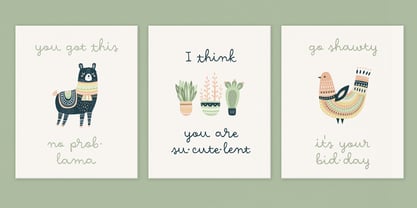
Hawkes is an extensive handmade typeface family that comes with a bundle of weights, widths and styles, all designed to work cohesively. Here is a breakdown of the Hawkes family. Hawkes Sans: The primary subfamily is a sans-serif typeface that includes nine fonts: three weights (light, medium and bold) and three widths (narrow, regular and wide). Within this set are an array of stylistic features; including small capitals, character style alternatives, discretionary ligatures and contextual alternatives. See details below for more information on OpenType Features. Hawkes Variable Width Sans: The secondary subfamily is the same base sans-serif fonts but combined in variating widths. Essentially, it takes all three widths of each weight and randomly mixes them together. This creates a funky and creative alternative to the more traditional sans-serif set. The variations are for the uppercase, lowercase, small capitals, ligatures and numbers. Hawkes Script: The last subfamily is the script typeface. It’s a quirky script with variations of its own, including ligatures, swashes and contextual alternatives (again, see below for further details.) The script font works great as a complimentary style to the sans-serif, or on it’s own. FEATURES Alright, let’s get into all the extra goodies this typeface has to offer. Small Capitals: Small caps are short capital letters designed to blend with lowercase text. These aren’t just capital letters just scaled down but designed to fit with the weight of both the lowercase and capitals. With Hawkes, small caps can either sit on the baseline (in line with the base of the capital and lowercase) or to be lifted to match the height of the capital letters by applying the discretionary ligature setting in the OpenType panel. These small capitals have a dot underlining them that sit along the baseline. The feature offers a unique display affect that is great for logos, titles and other headline needs. Discretionary Ligatures: A discretionary ligature is more decorative and unique combination than a standard ligature and can be applied at the users discretion (as the name indicates.) The specific styling for these ligatures varies for different fonts. With Hawkes, they are used as an all capital styling feature, or to lift the small capitals to align with the height of the capitals. In the former setting, both lowercase and uppercase letters are first changed to all capitals, then a specialized set of letter combinations are transitioned so small characters are positioned within a main capital letter. These combinations only happen with main characters that include an applicable stem, such as C F K L R T Y. Some of these combinations include two or three characters. When Small Caps is turned ‘on’, this feature will lift the small caps to the height of the capital letter. For more information, please check out the user guide! Stylistic Alternatives: Stylistic alternates are a secondary form of a character, often used to enhance the look or style of a font. For Hawkes, these alternatives provide a slightly more handmade feel. A - the capital and small capital A will lose its pointed apex and become rounded. Think of it more as an upside-down U than an up-side-down V ;-) Oo, G, Ss, Cc- these characters’ topmost terminal becomes a loop. The O is applied automatically, the G S and C need to be turn on individually. Titling Alternatives: This feature does sort of the opposite of what it intends. Instead of being used for titling purposes, this feature makes the text look better in paragraph text settings. Kk Rr h n m - curved terminals on the are straightened e - the counter stroke also gets straightened from a more looping motion y - the shape of y is changed from a rounded character to a sharper apex (think more like a ‘v’ than ‘u’) Contextual Alternatives: Contextual alternates are glyphs designed to work within context of other adjacent glyphs. With Hawkes Sans, there are three slightly different variations per character. The feature rotates the application of each variation. This helps with organic authenticity, so if you have two e’s next to each other, they won’t look identical (reflecting the natural variations in handwriting and lettering.) With Hawkes Variable width fonts, I have created a contextual pattern that randomizes the widths of each character. So, when the feature is turned ‘on’ in the OpenType panel, the widths would alternate in a pattern such as: Narrow, Wide, Regular, Narrow, Regular Wide, Narrow, etc. It happens automatically so the user doesn’t have to think or worry about getting a random seed. With Hawkes Script, contextual alternates allow strokes to connect properly from one character to the next while maintaining a believable, natural flow. Connecting strokes are present for two letters next to each other but are replaced by a shorter stroke when located at the end of a word or sentence. Some characters have in-strokes when located at the start of a word. When a character is preceded by a capital letter that doesn’t connect, it too needs an in-stroke or altered spacing. This feature is complicated and messy, but luckily you don’t really have to think about it! I’ve done all the coding so all you have to do is turn ‘on’ the feature in the OpenType panel and you are off to the races! I’m just letting you know what’s happening behind the scenes. Swashes: These are just for Hawkes Script and provide tail swashes to the start and ends of letters. There are three different options. You can pick the basic option by turning ‘on’ the swash feature in the OpenType panel, or you can pick using the Glyph panel. Stylistic Sets: This feature work in new versions of Illustrator CC and InDesign CC. You can pick specific styling sets instead of turning on an entire feature. For example, let’s say you want to have a loopy S, but not a loopy C or O, you can just turn on the S in the Style Set. It also helps create the little drop box that pops up when you hover over a character, showing you the alternates associated with that character. This makes it easy to pick and choose specific styles you want in a word or headline. ---------- And there it is folks! That’s all the basic info on Hawkes, I know it’s been a lot and I appreciate you hanging on. If you are like me and need more of a visual reference to accessing all these goodies, I’ve made a user guide to help navigate Hawkes and everything it has to offer. Altogether this extensive family boasts 14 total fonts in a wide array of styles, weights and widths, making it a great addition to any handmade type collection. Enjoy!
Diseñadores: Kimmy Kirkwood
Editorial: Kimmy Design
Fundición: Kimmy Design
Propietario del diseño: Kimmy Design
MyFonts debut: 19 de febrero de 2020
Hawkes
Acerca de Kimmy Design
"Kimmy Design tiene su sede en Santa Mónica, California, pero es tan móvil como yo", dice Kimmy Kirkwood. "Me encanta encontrar nueva inspiración y trabajo desde Seattle, Palm Springs, Santa Mónica, ¡o donde me lleve la próxima aventura!". Kimmy fundó su empresa en 2010; el mismo año que se graduó en la universidad. Su primera tipografía, Madeleine, basada en un logotipo que creó para un hotel de Positano (Italia), formaba parte de uno de sus proyectos de fin de carrera. Lo utilizó como una oportunidad para aprender los entresijos del diseño tipográfico y desarrollar las habilidades de programación necesarias para crear un verdadero fuente. Desde entonces, sus diseños más exitosos han sido Lunchbox y Lunchbox Slab: extravagantes tipos de letra dibujados a mano que ofrecen una increíble variedad de opciones personalizables y un aspecto auténticamente artesanal. "Mi objetivo con ellos", dice, "era hacerlos lo bastante únicos como para que el producto final de cualquier diseñador pareciera hecho a mano". "Me encantan los tipos de letra orgánicos. Crear algo que parezca hecho a mano de forma natural y dejar que los clientes lo hagan suyo. En cada familia dibujada a mano que hago incluyo múltiples pesos, estilos y variaciones". Kimmy utiliza alternancias contextuales en sus tipos de letra y suele crear entre 3 y 5 variaciones de cada letra, lo que da a su fuentes una verdadera sensación de dibujo a mano. "También suelo incluir alternativas estilísticas, que van desde la creación de variaciones sencillas en letras concretas hasta una alternativa de estilo única para cada carácter. Las versalitas son una forma estupenda de dar más opciones a los diseñadores, manteniendo al mismo tiempo la anchura y el tamaño de fuente . Todas mis familias de fuente son multilingües, y muchas incluyen alfabetos cirílicos y griegos completos. Siempre que es posible, incluyo algún tipo de barra, ya sea en mayúsculas de fantasía, al principio y al final de los caracteres, o barras estilísticas". Todas estas opciones personalizables dan a las familias de la joven diseñadora un aire íntimo y personal. "Dos personas distintas podrían utilizar mi fuente y crear algo totalmente único la una de la otra. Eso es lo que hace que sean tan divertidos de usar".
Seguir leyendo
Leer menos