Seleccione este tipo de licencia cuando esté desarrollando una aplicación app para iOS, Android o Windows Phone, y vaya a incrustar el archivo en el código de su aplicación móvil. va a incrustar el archivo fuente en el código de su aplicación móvil.
Frederik
por The Northern Block
Estilos individuales desde $26.95
Familia completa de 20 fuentes : $198.95

Frederik Fuente La familia era
diseñada por
Ksenia Belobrova y
publicado por
The Northern Block. Frederik contiene
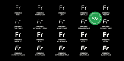
20
estilos y opciones de paquetes familiares.
Más información sobre esta familia
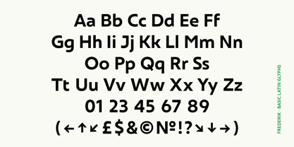
- Aa Glifos
-
¡Mejor PrecioPaquetes de familia
- Estilos individuales
- Especificaciones técnicas
- Licencias
Sobre la familia Frederik Fuente
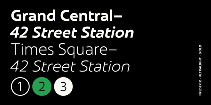
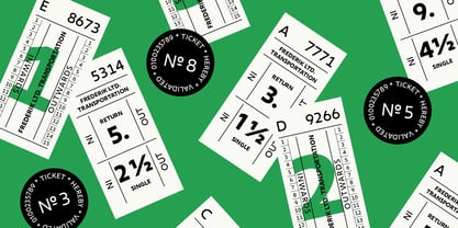
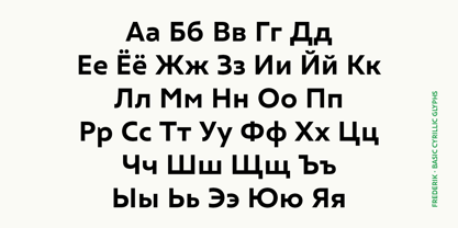
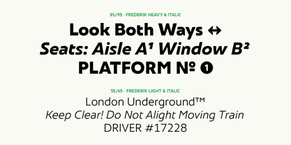
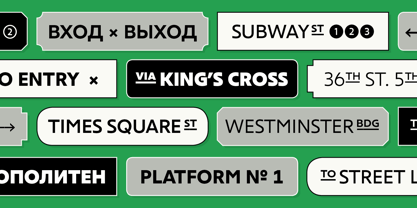
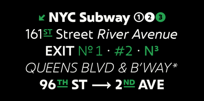
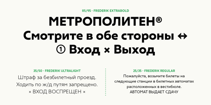
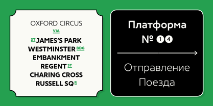
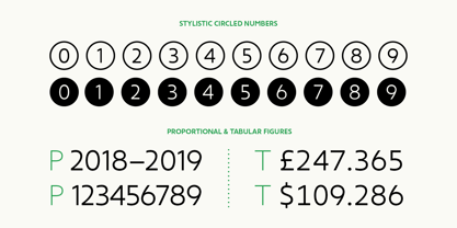
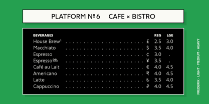
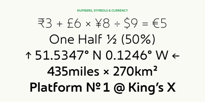
Frederik es una sans humanista tradicional con un toque moderno. Su aspecto es fresco y neutro, pero igualmente orgánico y agradable. Frederik presenta 10 estilos que van del fino al negro, además de cursivas a juego. Los pesos Normal y Medio funcionan excepcionalmente bien para textos pequeños, mientras que los estilos Ligero y Pesado son los más adecuados para la presentación, lo que convierte a Frederik en una familia tipográfica muy versátil, adecuada para una amplia gama de usos. Las características Opentype incluyen inferiores, superiores, fracciones, signo de número, números en círculo, ordinales estilísticos, ligaduras, numerosas flechas, incluida la longitud extendida, y compatibilidad con todos los idiomas latinos y cirílicos.
Diseñadores: Ksenia Belobrova
Editorial: The Northern Block
Fundición: The Northern Block
Propietario del diseño: The Northern Block
MyFonts debut: 25 de abril de 2019
Frederik
Acerca de The Northern Block
Fundada en 2006 por Jonathan Hill, The Northern Block es una fundición tipográfica colaborativa reconocida internacionalmente por producir fuentes modernista para marcas, creativos y creadores. El equipo global de The Northern Block, altamente cualificado y entusiasta, diseña y desarrolla galardonados tipos de letra minoristas y personalizados, y está impulsando el diseño de escrituras no latinas, como el árabe, el cirílico, el griego y el hebreo.
Seguir leyendo
Leer menos