Seleccione este tipo de licencia cuando esté desarrollando una aplicación app para iOS, Android o Windows Phone, y vaya a incrustar el archivo en el código de su aplicación móvil. va a incrustar el archivo fuente en el código de su aplicación móvil.
Ultramarina
por Huy!Fonts
Estilos individuales desde $24.95


Ultramarina Fuente La familia era
diseñada por
Juanjo Lopez y
publicado por
Huy!Fonts. Ultramarina contiene
1
estilos.
Más información sobre esta familia
Sobre la familia Ultramarina Fuente
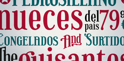
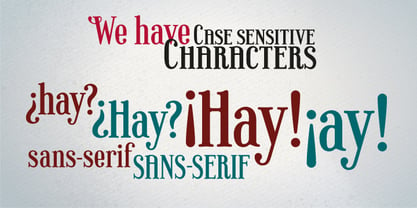
A medio camino entre las letras de madera de display del siglo XIX y las sans-serif grotescas americanas de principios del XX, encontramos Ultramarina, una fuente de display para uso en titulares de gran cuerpo, que muestran su poder de atracción por la comida de calidad, la legumbre del país y los caballeros con bigote y delantal.
Diseñadores: Juanjo Lopez
Editorial: Huy!Fonts
Fundición: Huy!Fonts
Propietario del diseño: Huy!Fonts
MyFonts debut: Sep 22, 2011
Ultramarina
Acerca de Huy!Fonts
Huy! Fuentes es una fundición tipográfica digital con sede en Madrid creada por Juanjo López, dedicada al diseño y distribución de tipografías originales y a medida.Los diseños originales son exploraciones personales muy influenciadas por el impacto de las letras en nuestra cultura visual, desde el trabajo de los troqueladores renacentistas hasta los rótulos vyniles de la tienda de ultramarinos local. En el diseño a medida de fuentes, el conocimiento de la historia de las letras desde un punto de vista técnico, estético y cultural nos permite encontrar la solución que mejor se adapte al briefing del cliente.
Seguir leyendo
Leer menos