Seleccione este tipo de licencia cuando esté desarrollando una aplicación app para iOS, Android o Windows Phone, y vaya a incrustar el archivo en el código de su aplicación móvil. va a incrustar el archivo fuente en el código de su aplicación móvil.
Storyline
por Comicraft
Estilos individuales desde $19.00
Familia completa de 3 fuentes : $39.00

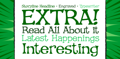
Storyline Fuente La familia era
diseñada por
John Roshell y
publicado por
Comicraft. Storyline contiene
3
estilos y opciones de paquetes familiares.
Más información sobre esta familia
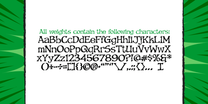
- Aa Glifos
-
¡Mejor PrecioPaquetes de familia
- Estilos individuales
- Especificaciones técnicas
- Licencias
Por estilo:
$13.00
Paquete de 3 estilos:
$39.00
Sobre la familia Storyline Fuente
Empieza despacio, atrayéndote suavemente... te presenta a una serie de personajes extrañamente interesantes y convincentes. Al principio, la trama parece predecible y, de repente, la narración da un giro totalmente inesperado. El protagonista se ve inmerso en una serie de giros devastadores y alarmantes. El antagonista triunfa, el mal vence al bien y la histeria colectiva se apodera de las calles de la ciudad. Nuestro héroe se ve separado de su verdadero amor, y parece que ella se ha enamorado del villano de la obra. ¿Prevalecerá el bien? ¿Perecerá el Mal? ¿¡Conquistará el amor todo!? Aún no lo sé... hasta ahí he llegado. No te preocupes, tiene un Gran Final.
Diseñadores: John Roshell
Editorial: Comicraft
Fundición: Comicraft
Fundición original: unknown
Propietario del diseño: Comicraft
MyFonts debut: 30 de agosto de 2006
Storyline
Acerca de Comicraft
¡El mejor cómic del mundo Fuentes! Tras haber rotulado obedientemente miles de cómics, los intrépidos de Comicraft Fuentes salvan el día en videojuegos, programas de televisión, títulos de películas y dondequiera que se necesite un fuentes divertido y animado. En 1992, el dúo dinámico formado por Richard Starkings y John Roshelll, y su intrépida flota de rotuladores Fuente Finaglers, empezaron a ofrecer un diseño único y una fina rotulación a las industrias del cómic, la televisión y los videojuegos, y se han hecho famosos por ser pioneros en el uso del ordenador en el arte de la rotulación de cómics. Atrapados en un mundo que nunca crearon, los intrépidos de Comicraft Fuentes acudirán al rescate en el último momento. La página de la fundición Premium puede consultarse aquí.
Seguir leyendo
Leer menos