Seleccione este tipo de licencia cuando esté desarrollando una aplicación app para iOS, Android o Windows Phone, y vaya a incrustar el archivo en el código de su aplicación móvil. va a incrustar el archivo fuente en el código de su aplicación móvil.
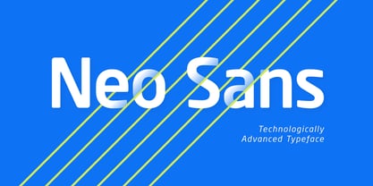
Neo Sans®
por Monotype
Estilos individuales desde $34.99
Familia completa de 12 fuentes : $461.99

Neo Sans Fuente La familia era
diseñada por
Sebastian Lester y
publicado por
Monotype. Neo Sans contiene
12
estilos y opciones de paquetes familiares.
Más información sobre esta familia
- Aa Glifos
-
¡Mejor PrecioPaquetes de familia
- Estilos individuales
- Especificaciones técnicas
- Licencias
Sobre la familia Neo Sans Fuente
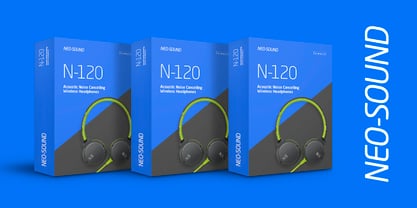
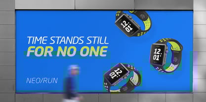
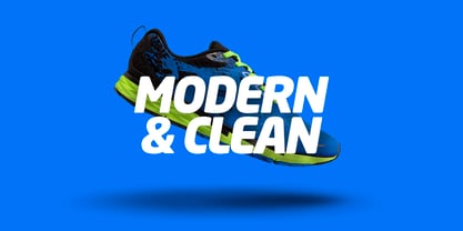
El diseñador Sebastian Lester describe su colección de tipos Neo Sans como "legible sin ser neutra, matizada sin ser recargada y expresiva sin distraer". Con formas redondeadas y cuadradas, la familia Neo Sans está disponible en seis pesos, de ligero a ultra, y en cursiva. Su personalidad vanguardista la convierte en una excelente elección para proyectos de marca, así como para el diseño editorial o de publicaciones. Combine la colección Neo Sans con un diseño con gracias para obtener un contraste tipográfico interesante; para una continuidad más directa, considere el diseño hermano del tipo de letra, la familia Neo Tech también de Lester, disponible en seis pesos con cursiva a juego.
Diseñadores: Sebastian Lester
Editorial: Monotype
Fundición: Monotype
Propietario del diseño: Monotype
MyFonts debut: 13 de octubre de 2005
Neo Sans®
es una marca comercial de Monotype Imaging Inc. registrada en la Oficina de Patentes y Marcas de EE.UU. y puede estar registrada en otras jurisdicciones.
Acerca de Monotype
La Biblioteca Monotype es una de las mayores y más completas colecciones de tipos de letra del mundo, con diseños originales de importancia histórica y una nueva gama de diseños contemporáneos y de moda fuentes. La Biblioteca Monotype incluye miles de clásicos atemporales, revivals artesanales y diseños originales de muchos de los diseñadores tipográficos y fundiciones más innovadores de la historia. Esta biblioteca distintiva y galardonada de primera calidad fuentes ofrece a marcas y diseñadores una selección amplia y fiable de tipos de letra para una tipografía expresiva en impresión y en pantalla. La página de la Fundición Premium puede consultarse aquí.
Seguir leyendo
Leer menos