Seleccione este tipo de licencia cuando esté desarrollando una aplicación app para iOS, Android o Windows Phone, y vaya a incrustar el archivo en el código de su aplicación móvil. va a incrustar el archivo fuente en el código de su aplicación móvil.
Bunken Tech Sans
por Buntype
Estilos individuales desde $0.00
Familia completa de 24 fuentes : $298.00

Bunken Tech Sans Fuente La familia era
diseñada por
Petra Niedernolte,
Ralf Sander y
publicado por
Buntype. Bunken Tech Sans contiene
24
estilos y opciones de paquetes familiares.
Más información sobre esta familia
- Aa Glifos
-
¡Mejor PrecioPaquetes de familia
- Estilos individuales
- Especificaciones técnicas
- Licencias
Bunken Tech Sans Std Complete Pack
12 fuentesPor estilo:
$16.50
Paquete de 12 estilos:
$198.00
Bunken Tech Sans Pro Complete Pack
12 fuentesPor estilo:
$24.83
Paquete de 12 estilos:
$298.00
Bunken Tech Sans Std Survival Pack
4 fuentesPor estilo:
$21.00
Paquete de 4 estilos:
$84.00
Bunken Tech Sans Pro Survival Pack
4 fuentesPor estilo:
$32.00
Paquete de 4 estilos:
$128.00
Sobre la familia Bunken Tech Sans Fuente
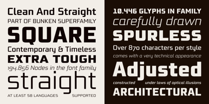
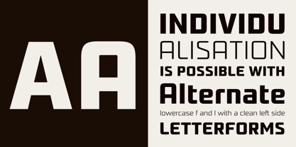
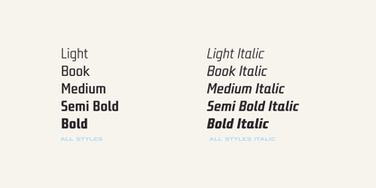
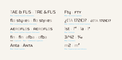
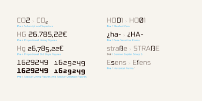
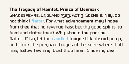
La superfamilia Bunken Tech Sans: Una reminiscencia de la construida fuentes de la era moderna diseñada con formas considerablemente más limpias. Bunken Tech Sans sigue la mejor tradición de las estructuras de líneas rectas y algo angulosas de sus predecesoras, al tiempo que ofrece un diseño mucho más abierto y suave. Así, las formas de las letras se reducen a los elementos más esenciales: Los espolones de a, b, n y otras minúsculas aparecen tan poco como detalles decorativos o de estilo, los bordes interiores ligeramente redondeados son más agradables a la vista que ciertos modelos históricos y conforman un estilo armónico y fluido. Utilice En particular, Bunken Tech Sans destaca como titular fácil y distintivo fuente con su diseño técnico de líneas rectas. Los contadores abiertos y la gran altura x la hacen igualmente adecuada para su uso en textos más breves. También se complementa perfectamente con Bunken Sans o Bunken Slab en textos más largos (disponible próximamente). Características Disponible en 10 estilos con anchos que van de Light a ExtraBold con cursiva asociada. Todos los estilos son muy amplios: Compatibilidad con al menos 58 idiomas, versalitas, 9 conjuntos numéricos (por ejemplo, Lining, Oldstyle, Tabular y Small Cap Figures), ligaduras, caracteres alternativos, numerosas funciones Opentype y muchas otras pequeñas características que hacen más agradable el trabajo diario con fuente , además de satisfacer deseos tipográficos. Cada estilo contiene más de 870 caracteres. Cada estilo está disponible en una edición profesional (Pro) y estándar (Std) con una gama reducida de funciones. (soporte de idiomas, funciones OpenType y número de glifos). Encontrará más información en las páginas correspondientes. Bunken Tech Sans forma parte de la superfamilia Bunken Tech y está disponible en Condensed, Normal y Wide. También de interés: La variante con gracias Bunken Tech Slab Características en detalle: 12 Pesos: -Ligero -Libro -Medio -Negrita -Negrita -ExtraBold y las cursivas correspondientes 3 anchos: -Condensado -Normal -Ancho Caracteres alternativos: A, E, F, L, S, e, f, t, s, y, etc. Mayúsculas pequeñas 5 juegos de cifras: -Figuras de forro -Figuras de estilo antiguo -Tabuladores -Tabfigures de estilo antiguo -Figuras de tapas pequeñas Ordinales automáticos Fracciones automáticas Soporte ampliado de idiomas y mucho más...
Diseñadores: Petra Niedernolte, Ralf Sander
Editorial: Buntype
Fundición: Buntype
Propietario del diseño: Buntype
MyFonts debut: 16 de octubre de 2014
Bunken Tech Sans