Seleccione este tipo de licencia cuando esté desarrollando una aplicación app para iOS, Android o Windows Phone, y vaya a incrustar el archivo en el código de su aplicación móvil. va a incrustar el archivo fuente en el código de su aplicación móvil.
Aanaar
por Letterjuice
Estilos individuales desde $66.00
Familia completa de 7 fuentes : $398.00

Aanaar Fuente La familia era
diseñada por
Pilar Cano y
publicado por
Letterjuice. Aanaar contiene
7
estilos y opciones de paquetes familiares.
Más información sobre esta familia
- Aa Glifos
-
¡Mejor PrecioPaquetes de familia
- Estilos individuales
- Especificaciones técnicas
- Licencias
Por estilo:
$56.85
Paquete de 7 estilos:
$398.00
Aanaar Core Pack
3 fuentesPor estilo:
$58.66
Paquete de 3 estilos:
$176.00
Aanar Light Bundle
2 fuentesPor estilo:
$60.00
Paquete de 2 estilos:
$120.00
Aanaar Regular Bundle
2 fuentesPor estilo:
$60.00
Paquete de 2 estilos:
$120.00
Sobre la familia Aanaar Fuente
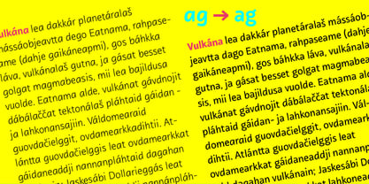
Este tipo de letra procede de un proyecto autoiniciado llamado Sápmi, cuyo objetivo es contribuir a mantener vivas un grupo de lenguas minoritarias mediante la resolución de problemas en el entorno educativo. Esta edición rediseñada toma el nombre de Aanaar y se une a nuestra biblioteca con un conjunto de caracteres más amplio y dos nuevos pesos que completan el tipo de letra proporcionando una gran paleta tipográfica, además de añadir a y g estilísticas de dos pisos para lectores más avanzados, así como para permitir que el tipo de letra se utilice en otros entornos. El tipo de letra se diseñó originalmente para libros de texto infantiles. Al analizar el diseño tipográfico infantil, identificamos algunos problemas importantes y los resolvimos dentro de los límites que teníamos. La principal preocupación en un tipo de letra para niños es el reconocimiento de las letras, ya que aún no han desarrollado plenamente su capacidad de lectura. Por ejemplo, letras como la "a" y la "g" comparten una estructura muy similar en este tipo de letra, donde la única parte distintiva es el descendente de la "g". Se sabe que la parte inferior de la letra es el rasgo menos importante a la hora de leer, por lo que decidimos distinguirlas claramente poniendo una "a" con un espolón en la parte superior derecha. Esto también ayudó a distinguir la "a" de la "o". Los tipos de letra infantiles suelen tener una sola "a", por lo que la "a" suele estar demasiado cerca de la "o". Además, desplazamos la articulación de la "a" hacia arriba y estrechamos muy ligeramente la "a" para asegurarnos de que no se confundan. En general, la altura x es bastante alta y el tipo de letra tiene un poco de movimiento, lo que le da un buen ritmo que ayuda a avanzar agradablemente en la lectura. Aanaar consta de 5 pesos (Light, Regular, Medium, Bold y Black) más dos cursivas (Light Italic y Italic).
Diseñadores: Pilar Cano
Editorial: Letterjuice
Fundición: Letterjuice
Propietario del diseño: Letterjuice
MyFonts debut: 20 de junio de 2014
Aanaar
Acerca de Letterjuice
Somos una pequeña fundición y estudio de diseño tipográfico con experiencia en muchos campos diferentes relacionados con el diseño tipográfico, la tipografía, la comunicación visual y la enseñanza. Estamos especializados en letras en un sentido amplio, desde el diseño tipográfico al lettering, desde el latín al árabe, pasando por otras escrituras como el griego, el cirílico, el hebreo y el tailandés. Nuestra biblioteca tipográfica es una manifestación de nuestra curiosidad personal y nuestro terreno de experimentación. Disfrutamos teniendo espacio para explorar nuestra creatividad dentro de los límites de la funcionalidad, ¡esperamos que le guste lo que vea!
Seguir leyendo
Leer menos