Seleccione este tipo de licencia cuando esté desarrollando una aplicación app para iOS, Android o Windows Phone, y vaya a incrustar el archivo en el código de su aplicación móvil. va a incrustar el archivo fuente en el código de su aplicación móvil.
Andes Condensed
por Latinotype
Estilos individuales desde $29.00
Familia completa de 20 fuentes : $256.00

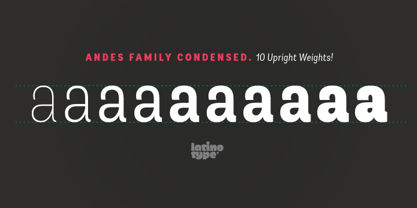
Andes Condensed Fuente La familia era
diseñada por
Daniel Hernández y
publicado por
Latinotype. Andes Condensed contiene
20
estilos y opciones de paquetes familiares.
Más información sobre esta familia
- Aa Glifos
-
¡Mejor PrecioPaquetes de familia
- Estilos individuales
- Especificaciones técnicas
- Licencias
Sobre la familia Andes Condensed Fuente
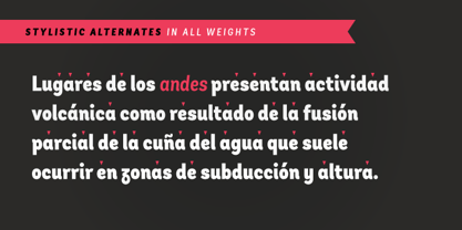
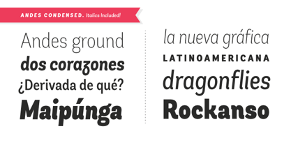
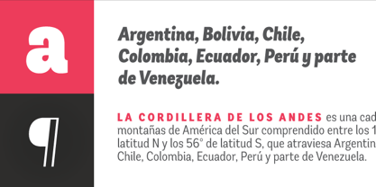
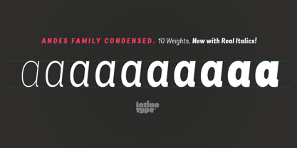
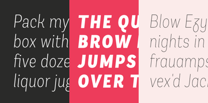
Andes, diseñado por Daniel Hernández, es un tipo de letra para pantalla de características neohumanistas. Sus diferentes terminales, entre otros elementos, le dan un aspecto de tipografía mixta. Andes es un tipo de letra con 10 pesos verticales, 10 cursivas y una versión condensada, que van desde la ultraligera hasta la negra, cada una con la misma altura x. Este tipo de letra contiene glifos cursivos adicionales (a, y, z, g) que ayudan a enfatizar el texto o las palabras. Andes se basa en el diseño de Merced y ambos comparten varias características.
Diseñadores: Daniel Hernández
Editorial: Latinotype
Fundición: Latinotype
Propietario del diseño: Latinotype
MyFonts debut: 2 de agosto de 2012
Andes Condensado
Acerca de Latinotype
Con sede en Concepción y Santiago de Chile, los fundadores de Latinotype afirman: "Nuestro objetivo es diseñar nuevos tipos de letra remezclando diversas influencias relacionadas con nuestra identidad sudamericana con productos de alta calidad para la industria del diseño contemporáneo." Y el dúo ha estado haciendo precisamente eso desde la creación de su fundición en 2007. Luciano Vergara y Daniel Hernández, una de las fundiciones con más éxito de los últimos años en MyFonts , han reunido una colección de tipos de letra en rápido crecimiento en una amplia gama de géneros. El nombre del grupo, "Latinotype", está especializado en tipos de letra de gran colorido, y subraya el fuerte vínculo que sienten con su identidad cultural. La página de la fundición Premium puede consultarse aquí.
Seguir leyendo
Leer menos