Seleccione este tipo de licencia cuando esté desarrollando una aplicación app para iOS, Android o Windows Phone, y vaya a incrustar el archivo en el código de su aplicación móvil. va a incrustar el archivo fuente en el código de su aplicación móvil.
Same Same But Different
por Hanoded
Estilos individuales desde $15.00
Familia completa de 4 fuentes : $50.00

Same Same But Different Fuente La familia era
diseñada por
David Kerkhoff y
publicado por
Hanoded. Same Same But Different contiene
4
estilos y opciones de paquetes familiares.
Más información sobre esta familia
- Aa Glifos
-
¡Mejor PrecioPaquetes de familia
- Estilos individuales
- Especificaciones técnicas
- Licencias
Por estilo:
$12.50
Paquete de 4 estilos:
$50.00
Sobre la familia Same Same But Different Fuente
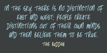
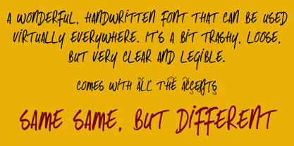
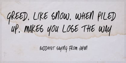
Same Same, But Different es una letra suelta y manuscrita fuente con una excelente legibilidad. Recuerda a los post-it o a los garabatos de cuaderno y puede utilizarse prácticamente en cualquier sitio. Same Same But Different incluye un amplio soporte de idiomas.
Diseñadores: David Kerkhoff
Editorial: Hanoded
Fundición: Hanoded
Propietario del diseño: Hanoded
MyFonts debut: Feb 22, 2011
Igual pero diferente
Acerca de Hanoded
Hanoded es una fundición tipográfica con sede en los Países Bajos dirigida por David Kerkhoff. Tras terminar sus estudios de periodismo, David viajó mucho y acabó en Israel, donde permaneció varios años. David tuvo muchos trabajos: cuidador de zoo, orfebre, artista y cocinero (por nombrar algunos), pero se decidió por trabajar como guía turístico y fotógrafo. David se especializa en tipografía impresa a mano y utiliza pinceles, plumas, tinta y pintura para crear su -a veces aterrador- fuentes. Vive en una pequeña aldea cerca del Rin con su mujer, tres hijos, un puñado de gallinas muy mimadas y dos cobayas llamadas Cookie y Chippie.
Seguir leyendo
Leer menos