Seleccione este tipo de licencia cuando esté desarrollando una aplicación app para iOS, Android o Windows Phone, y vaya a incrustar el archivo en el código de su aplicación móvil. va a incrustar el archivo fuente en el código de su aplicación móvil.
Civita
por Hoftype
Estilos individuales desde $0.00
Familia completa de 12 fuentes : $198.00


Civita Fuente La familia era
diseñada por
Dieter Hofrichter y
publicado por
Hoftype. Civita contiene
12
estilos y opciones de paquetes familiares.
Más información sobre esta familia
- Aa Glifos
-
¡Mejor PrecioPaquetes de familia
- Estilos individuales
- Especificaciones técnicas
- Licencias
Sobre la familia Civita Fuente
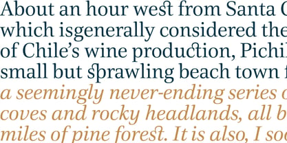
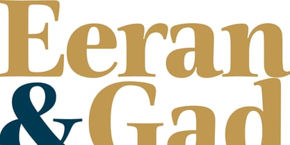
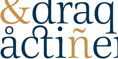
Civita es un nuevo "Tipo Moderno" con un alto contraste de trazo, rasgos formales distintivos y una fuerte personalidad. Tiene un ductus fluido pero, no obstante, una estructura sólida. Civita está bien equipada con muchas características OpenType que la hacen especialmente adecuada para tipografías ambiciosas. La familia Civita consta de 12 estilos, se presenta en formato OpenType con compatibilidad ampliada para más de 40 idiomas. Todos los pesos contienen versalitas, cifras proporcionales de línea, cifras tabulares de línea, cifras proporcionales de estilo antiguo, cifras de línea de estilo antiguo, símbolos monetarios a juego y numerales fraccionarios y científicos.
Diseñadores: Dieter Hofrichter
Editorial: Hoftype
Fundición: Hoftype
Propietario del diseño: Hoftype
MyFonts debut: Sep 28, 2012
Civita
Acerca de Hoftype
German designer Dieter Hofrichter started his foundry in 2010. Since then, he has remained focused on developing text fonts that integrate the rich history and tradition of typography with contemporary styles. Based in Munich, his first typeface on MyFonts was Impara, a sans serif with lively stroke ductus and distinct humanistic characteristics that is a representation of linear coolness and classic elegance. Since his debut, he has continued to produce beautiful, high quality serif faces. Capita, one of the foundry’s best sellers, is a self-dominated face with a fresh style that avoids the harshness of many slab serifs. Dieter has also seen success with one of his most recent designs, Mangan, a text face that combines classical rationality with contemporary design. “One of our intentions is to utilize the knowledge of the history of type to create contemporary types,” Dieter says. “Style consciousness and many years of experience in type design are our qualifications for producing functional and usable types of high quality.”
Seguir leyendo
Leer menos