Seleccione este tipo de licencia cuando esté desarrollando una aplicación app para iOS, Android o Windows Phone, y vaya a incrustar el archivo en el código de su aplicación móvil. va a incrustar el archivo fuente en el código de su aplicación móvil.
Acto
por DSType
Estilos individuales desde $40.00
Familia completa de 22 fuentes : $480.00

Acto Fuente La familia era
diseñada por
Dino dos Santos y
publicado por
DSType. Acto contiene
22
estilos y opciones de paquetes familiares.
Más información sobre esta familia
- Aa Glifos
-
¡Mejor PrecioPaquetes de familia
- Estilos individuales
- Especificaciones técnicas
- Licencias
Sobre la familia Acto Fuente
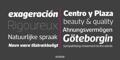
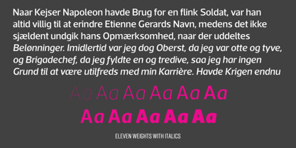
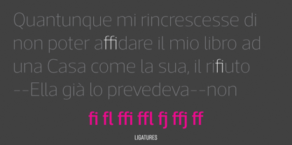
Acto es un sistema tipográfico diseñado como contrapartida sin gracias del anterior Acta. Ambas familias tipográficas fueron diseñadas en 2010 para el rediseño del periódico chileno La Tercera, pero a diferencia de algunas de nuestras anteriores fuentes (por ejemplo, Leitura) Acto no coincide exactamente con Acta en términos de estructura, por lo que pueden vivir por su cuenta. Acto es nuestra primera sans en la que las mayúsculas tienen la misma altura que los ascendentes, así que decidimos evitar problemas comunes como la confusión entre la I y la l, dibujando una l curva. Mantuvimos ese espíritu eliminando los espolones de la b, la g y la q, lo que dio como resultado un tipo de letra más cálido que Prelo, por ejemplo. Al final, se trata de una familia sans muy potente, con once pesos y sus correspondientes cursivas, para diseño editorial y corporativo.
Diseñadores: Dino dos Santos
Editorial: DSType
Fundición: DSType
Propietario del diseño: DSType
MyFonts debut: 16 de enero de 2012
Acto
Acerca de DSType
“I began designing typefaces in the early ’90s because there weren’t many typefaces available to us in those days,” Dino dos Santos, founder of DSType, said in his Creative Characters interview. “I started designing fonts that matched the new typographic experience. To me, graphic design was never about taking a picture and then just choosing one of the available typefaces” Based in Porto, Portugal, Dino got his start designing typefaces for magazines and large corporations. Frustrated that the only fonts available for use were system fonts and dry transfer sheets, he began selling his typefaces on MyFonts. Since then, the self-taught designer has created a library full of striking experiments, charming display type, and most notably, an amazing collection of well-wrought, extensive text families. His collection also boasts a handful of bestsellers such as Velino Text, Prelo Slab and Prumo Slab. “There is not much of a type design history in Portugal,” he noted in his interview. He is, however, interested in what has been done in his country by older generations of type designers and calligraphers. “I want to understand what happened, how things worked back then, and expose the world to some lesser-known work. History is often seen as something that passed away, and that’s it. But for me history is one of the most relevant aspects of type design. I believe we are made of history, but also that we should take a step forward by connecting it to the present and the future and we can do that through technology.”The Premium foundry page can be viewed Here.
Seguir leyendo
Leer menos