Wählen Sie diesen Lizenztyp, wenn Sie eine app für iOS, Android oder Windows Phone entwickeln und Sie die Datei Font in den Code Ihrer mobilen Anwendung einbetten.
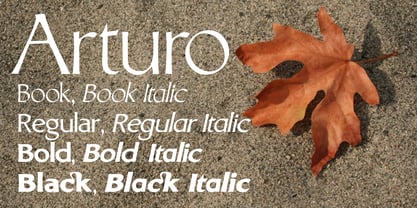
Arturo
von Hackberry Font Foundry
Einzelschnitte ab $24.95
Vollständige Familie mit 8 Fonts : $99.95

Arturo Font Familie wurde entworfen von
David Bergsland und
herausgegeben von
Hackberry Font Foundry. Arturo enthält
8
Stile und Optionen für Familienpakete.
Mehr über diese Familie
- Aa Glyphen
-
Bestes AngebotFamilienpakete
- Einzelschnitte
- Technische Daten
- Lizenzierung
Per Font:
$12.49
Paket mit 8 Fonts:
$99.95
Arturo Set
4 FontsPer Font:
$12.48
Paket mit 4 Fonts:
$49.95
Arturo Book Set
4 FontsPer Font:
$12.48
Paket mit 4 Fonts:
$49.95
Über die Schriftfamilie Arturo
Arturo ist eine brandneue Font Familie, die auf der ursprünglichen Inspiration eines alten Alphabets in einem der
Dover Clip Art-Bücher. Es hat sich jedoch weit von diesen rohen Wurzeln entfernt. Jede Figur ist neu gezeichnet worden. Ich hatte zum Beispiel eine Light-Version, die ich nie zum Laufen gebracht habe. Arturo basiert auf diesem hellen Stil und heißt Arturo Book. Der Name stammt von einem guten Freund von mir in El Paso. Er war das Versuchskaninchen, dem ich die Anfänge dieses Stils vor so vielen Jahren untergeschoben habe. Ich habe für ihn mehrere Werbematerialien mit den Rohzeichnungen angefertigt. Ich fand, dass er es zumindest verdient hat, dass die Familie nach ihm benannt wird. Dies ist eine normale Font Familie für mich, da sie Großbuchstaben, Kleinbuchstaben und Kapitälchen mit den entsprechenden Ziffern für jeden Fall hat. Diese Font verfügt über alle OpenType-Funktionen des Satzes für 2009. Es gibt mehrere Ligaturen für Ihren Spaß und Ihr Vergnügen: bb gg ff fi fl ffi ffl ffy fj ft tt ty Wh Th und mehr. Wie alle meine Fonts, gibt es: Großbuchstaben, Kleinbuchstaben, Kapitälchen, proportionale Linienziffern, proportionale Mediävalziffern und Kapitälchenziffern, sowie Zähler, Nenner, Ober- und Unterlängen und einen kompletten Satz von Ordnungszahlen von 1 bis unendlich. Viel Spaß!
Designer: David Bergsland
Herausgeber: Hackberry Font Foundry
Foundry: Hackberry Font Foundry
Eigentümer des Designs: Hackberry Font Foundry
MyFonts Debüt: Dezember 9, 2008
Arturo

Über Hackberry Font Foundry
Verkaufen Die Hackberry Font Foundry wurde 1998 gegründet, um die Fonts von David Bergsland für die Verwendung in seinen Schulungsbüchern für digitales Publishing zu entwickeln. Das Ziel von Davids Fonts ist es, ihnen einen handgezeichneten Charakter zu verleihen. Im Zeitalter zunehmender technologischer "Glätte" lockert er absichtlich die Struktur auf und fügt der Glyphen mit Brüchen "Luft" hinzu. Alle Fonts sind als OpenType Pro Fonts mit speziellen Produktionsmerkmalen gestaltet. Fast alle Fonts haben Ziffern im alten Stil und Kapitälchen, dazu Kapitälchen, Ligaturen und spezielle Dingbats. Sie kommen in der Buchproduktion besonders gut zur Geltung. Die Produktionsfamilien haben kontrastierende serifenlose und serifenbetonte Familien, die beide die gleichen vertikalen Font Metriken verwenden - für Einlaufköpfe und ähnliches. Zurzeit schreibt und gestaltet er hauptsächlich Bücher.
Mehr lesen
Weniger lesen