Wählen Sie diesen Lizenztyp, wenn Sie eine app für iOS, Android oder Windows Phone entwickeln und Sie die Datei Font in den Code Ihrer mobilen Anwendung einbetten.
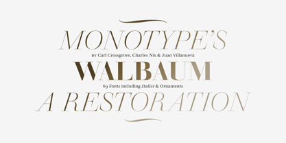
Walbaum
von Monotype
Einzelschnitte ab $49.00
Vollständige Familie mit 69 Fonts : $209.99

Walbaum Font Familie wurde entworfen von
Carl Crossgrove,
Charles Nix,
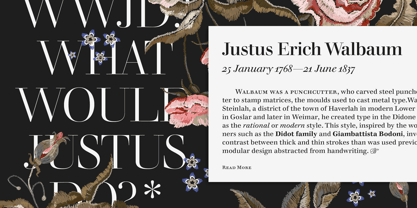
Justus Erich Walbaum,
Juan Villanueva,
Lynne Yun und
herausgegeben von
Monotype. Walbaum enthält
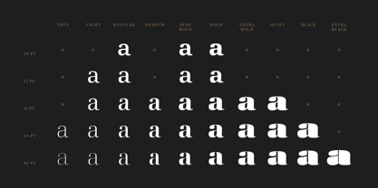
69
Stile und Optionen für Familienpakete.
Mehr über diese Familie
- Aa Glyphen
-
Bestes AngebotFamilienpakete
- Einzelschnitte
- Technische Daten
- Lizenzierung
Über die Schriftfamilie Walbaum
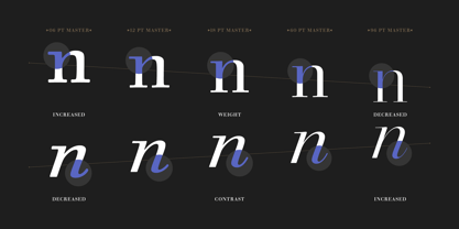
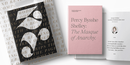
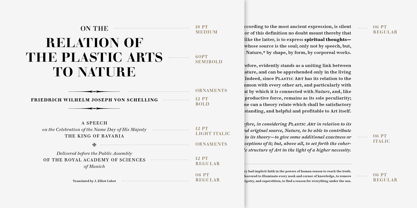
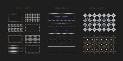
Walbaum wurde erstmals in den frühen 1800er Jahren entworfen und erlangte nie das Publikum oder die Anerkennung, die es verdiente - trotz seiner einfachen Eleganz und seiner anspruchsvollen Ausstrahlung. Für diese umfangreiche Schriftfamilie wurde sie vollständig restauriert. Sie umfasst 32 Schnitte, einschließlich Ornamente und zwei Zierschnitte. Walbaum bietet die Art von Wärme, die vergleichbare Schriften wie Bodoni oder Didot vermissen lassen, und wirkt mühelos zugänglich und lesbar. Das Monotype-Team Carl Crossgrove, Charles Nix und Juan Villanueva hat sich an die ursprünglichen Intentionen des Designers Justus Erich Walbaum gehalten und auch Arbeiten des Sohnes des Designers in einige der extremeren Display-Schnitte integriert. Die Textgewichte eignen sich gut für die Anforderungen digitaler Umgebungen, während die Zier- und Displaygewichte dramatischere, skulpturale Formen bieten. Ungewöhnlich ist, dass die Familie auch eine große Auswahl an Ornamenten umfasst. Von großen Werbetafeln bis hin zu Mikroschriften für E-Reader - Walbaum deckt alles ab. Die Familie ist im OpenType OTF-Format Font erhältlich und umfasst über 600 Glyphen mit typografischen OpenType-Merkmalen wie Kapitälchen, Mediäval- und Linienziffern, proportionale und tabellarische Ziffern, Brüchen und Ligaturen.
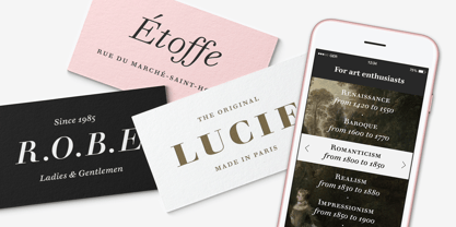
Vorgestellt in: Beste Fonts für Logos, Beste Fonts für Visitenkarten
Designer: Carl Crossgrove, Charles Nix, Justus Erich Walbaum, Juan Villanueva, Lynne Yun
Herausgeber: Monotype
Foundry: Monotype
Eigentümer des Designs: Monotype
MyFonts Debüt: null
Walbaum
Über Monotype
Die Monotype Library ist eine der weltweit größten und umfangreichsten Schriftensammlungen, die sowohl historisch bedeutsame Originaldesigns als auch ein frisches Angebot an zeitgenössischen und modischen Fonts enthält. Die Monotype Library umfasst Tausende von zeitlosen Klassikern, handgefertigten Wiederbelebungen und Originaldesigns von vielen der innovativsten Schriften Designer und Foundrys der Geschichte. Diese unverwechselbare, preisgekrönte Bibliothek von Premium Fonts bietet Marken und Designer eine breite und zuverlässige Auswahl an Schriften für ausdrucksstarke Typografie im Druck und auf dem Bildschirm. Die Seite Premium Foundry kann hier eingesehen werden.
Mehr lesen
Weniger lesen