Wählen Sie diesen Lizenztyp, wenn Sie eine app für iOS, Android oder Windows Phone entwickeln und Sie die Datei Font in den Code Ihrer mobilen Anwendung einbetten.
Neue Plak™
von Monotype
Einzelschnitte ab $57.99
Vollständige Familie mit 60 Fonts : $989.99

Neue Plak Font Familie wurde entworfen von
Paul Renner,
Linda Hintz,
Toshi Omagari und
herausgegeben von
Monotype. Neue Plak enthält
60
Stile und Optionen für Familienpakete.
Mehr über diese Familie
- Aa Glyphen
-
Bestes AngebotFamilienpakete
- Einzelschnitte
- Technische Daten
- Lizenzierung
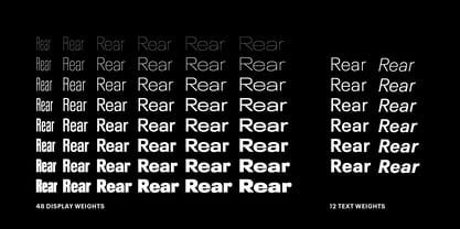
Neue Plak Display Pack
48 FontsPer Font:
$18.33
Paket mit 48 Fonts:
$879.99
Neue Plak Text Pack
12 FontsPer Font:
$40.83
Paket mit 12 Fonts:
$489.99
Über die Schriftfamilie Neue Plak
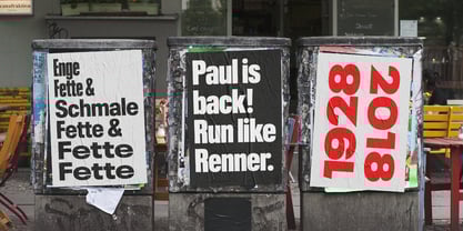
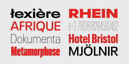
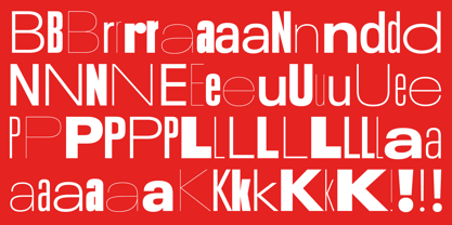
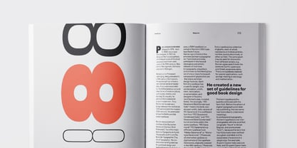
Die ursprünglich 1928 entworfene Plak ist so etwas wie ein verlorenes Juwel in der Welt der Schriften. Obwohl sie vom Futura-Schöpfer Paul Renner gezeichnet wurde, erlangte sie nie die gleiche Popularität und erlebte jahrzehntelang keine dringend benötigte digitale Wiederbelebung. Linda Hintz und Toshi Omagari von Monotype Designer haben die drei vorhandenen Schnitte genommen und sie nach umfangreichen Recherchen über die ursprüngliche Holzschrift in die große Familie der Neuen Plak erweitert. Die Schrift ist in 60 Schnitten erhältlich, die Renners Intentionen treu bleiben und die gleiche Mischung aus "schrulligen" Details und "deutscher Steifheit" bieten - wie Hintz es beschreibt. Das Design ist eine ungewöhnliche Mischung aus einem trotzigen Äußeren, das durch verspieltere Details im Kleinbuchstaben r und den großen Punkten des Kleinbuchstaben i konterkariert wird. Weitere charakteristische Details sind offene oder durchgestrichene Zählungen und eine Reihe von Haarfarben, die Renners ursprüngliches Design auf seine nackten Knochen reduzieren. Die Display-Gewichte der Neuen Plak schreien geradezu danach, in redaktionellen Texten, auf Verpackungen oder in Logos verwendet zu werden, während die Textgewichte sowohl im Druck als auch in digitalen Umgebungen gut funktionieren.
Neue Plak Text Variables sind Font Dateien, die eine Achse aufweisen und eine voreingestellte Instanz von Thin bis Black haben
Designer: Paul Renner, Linda Hintz, Toshi Omagari
Herausgeber: Monotype
Foundry: Monotype
Eigentümer des Designs: Monotype
MyFonts Debüt: null
Neue Plak™
ist eine Marke von Monotype Imaging Inc. und Mai ist in bestimmten Ländern registriert.
Über Monotype
Die Monotype Library ist eine der weltweit größten und umfangreichsten Schriftensammlungen, die sowohl historisch bedeutsame Originaldesigns als auch ein frisches Angebot an zeitgenössischen und modischen Fonts enthält. Die Monotype Library umfasst Tausende von zeitlosen Klassikern, handgefertigten Wiederbelebungen und Originaldesigns von vielen der innovativsten Schriften Designer und Foundrys der Geschichte. Diese unverwechselbare, preisgekrönte Bibliothek von Premium Fonts bietet Marken und Designer eine breite und zuverlässige Auswahl an Schriften für ausdrucksstarke Typografie im Druck und auf dem Bildschirm. Die Seite Premium Foundry kann hier eingesehen werden.
Mehr lesen
Weniger lesen