Wählen Sie diesen Lizenztyp, wenn Sie eine app für iOS, Android oder Windows Phone entwickeln und Sie die Datei Font in den Code Ihrer mobilen Anwendung einbetten.
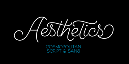
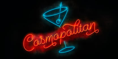
Cosmopolitan™
von Fenotype
Einzelschnitte ab $25.00
35% Rabatt
Vollständige Familie mit 15 Fonts : $79.00


Cosmopolitan Font Familie wurde entworfen von
Emil Karl Bertell und
herausgegeben von
Fenotype. Cosmopolitan enthält
15
Stile und Optionen für Familienpakete.
Mehr über diese Familie
- Aa Glyphen
-
Bestes AngebotFamilienpakete
- Einzelschnitte
- Technische Daten
- Lizenzierung
Cosmopolitan Script Complete
6 FontsPer Font:
$11.50
$7.48
Paket mit 6 Fonts:
$69.00
$44.85
Cosmopolitan Sans Complete
6 FontsPer Font:
$8.16
$5.31
Paket mit 6 Fonts:
$49.00
$31.85
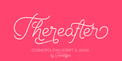
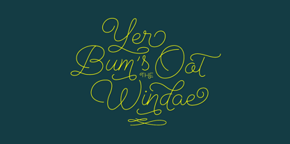
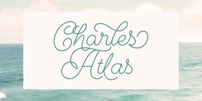
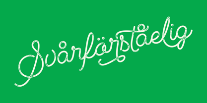
Über die Schriftfamilie Cosmopolitan
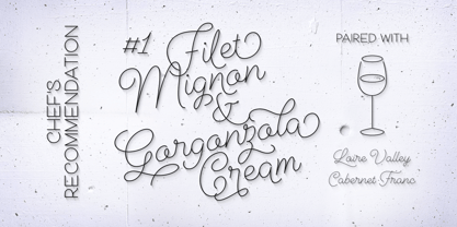
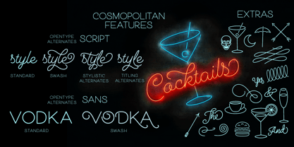
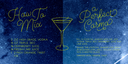
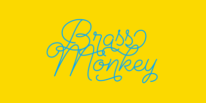
Cosmopolitan ist eine Monoline-Schriftfamilie Font mit Schrift- und Sans-Versionen, die beide gut zusammen oder einzeln funktionieren. Sie ist in fünf Strichstärken und "gedruckten" Versionen erhältlich. Für zusätzliche Swashes, Swirls und Piktogramme gibt es die Cosmopolitan Extras. Cosmopolitan Script ist vollgepackt mit OpenType-Alternativen: Aktivieren Sie Swash, Stylistic oder Titling Alternates in jedem OpenType-Programm, das etwas von OpenType versteht, oder finden Sie noch mehr Alternativen in der Glyphenpalette. Cosmopolitan Sans hat verschiedene Swash-Alternativen für Groß- und Kleinbuchstaben. Die Cosmopolitan-Familie bietet ein elegantes Aussehen für jedes Projekt, vom Druck bis zum Digitaldruck. Kaufen Sie die ganze Familie zum besten Preis! Cosmopolitan Family wurde von zwei anderen großartigen Monoline-Familien Font inspiriert: Selfie und Beloved.
Designer: Emil Karl Bertell
Herausgeber: Fenotype
Foundry: Fenotype
Eigentümer des Designs: Fenotype
MyFonts Debüt: September 6, 2016
Cosmopolitan™.
ist eine Marke von Fenotype Schriften.
Über Fenotype
Emil Bertell has done it all. Having published his first font files at 16, he was considered to be an international free-font hero while still in his teens. He went on to attend design college, drop out, and become a well-known graphic designer and illustrator. Now one of the most successful type designers from the Nordic countries on MyFonts, the Finland-based designer said in his Creative Characters interview that he’s “had an obsession with visual culture from the beginning.” Before turning his attention to type design full-time, Emil had a very successful career as an award-winning illustrator. “Illustration became my main livelihood,” he said. “I drew painstaking pencil illustrations for magazines, advertising, stamps, etc. I often designed my own fonts for festivals and hand-drew the lettering posters; I also did a few pencil illustrations based on lettershapes, and that got out of hand, so I had to do a lot more of them.” In 2012 he finally made the switch and committed all of his time to type design. Emil first saw success with his Billboard typeface. “It became my first Rising Star on MyFonts and made me realize that I could actually make a living by designing fonts,” he said. “I realized that there’s actually a market out there that I could become a part of.” Throughout the rest of that year he began to see even more success. It began in January, when his font, Mishka, was featured in our Most Popular Fonts of 2011 list. He went on to find a way to bookend the year and was listed among the Most Popular Fonts of 2012 with his Mercury Script design. Since then, his foundry’s success has continued on with best sellers like Voyage and The Carpenter. Fans of the foundry have a lot to look forward to in the near future. Emil will continue to produce beautiful scripts (some coming soon to MyFonts!) and has plans to expand his business.
Mehr lesen
Weniger lesen