Wählen Sie diesen Lizenztyp, wenn Sie eine app für iOS, Android oder Windows Phone entwickeln und Sie die Datei Font in den Code Ihrer mobilen Anwendung einbetten.
Bourton
von Kimmy Design
Einzelschnitte ab $5.00
Vollständige Familie mit 34 Fonts : $99.00

Bourton Font Familie wurde entworfen von
Kimmy Kirkwood und
herausgegeben von
Kimmy Design. Bourton enthält
34
Stile und Optionen für Familienpakete.
Mehr über diese Familie
- Aa Glyphen
-
Bestes AngebotFamilienpakete
- Einzelschnitte
- Technische Daten
- Lizenzierung
Bourton Basic Pack
25 FontsPer Font:
$3.00
Paket mit 25 Fonts:
$75.00
Über die Schriftfamilie Bourton
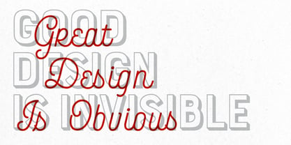
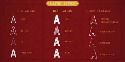
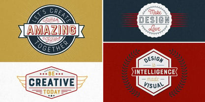
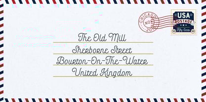
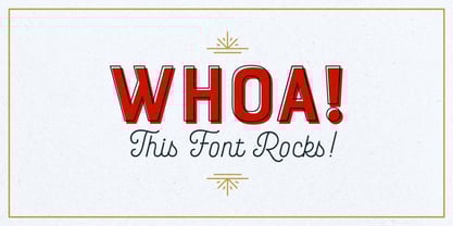
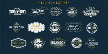
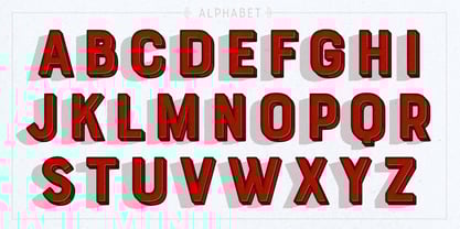
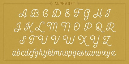
Bourton ist die serifenlose Cousine von Burford. Sie hat nicht nur ein neues Aussehen, sondern bietet auch mehr Optionen für die Schichtung, stilistische Alternativen, grafische Extras und sogar eine eigene Schrift Font! Für einen handgezeichneten Look, sehen Sie sich Bourton Handan. Okay... hier ist also alles, was Sie mit Bourton bekommen! Bourton Schichtung Fonts - 6 Basisebenen Fonts (Basis, Inline, Marquee, Streifen A, Streifen B, Streifen C) - 6 Obere Ebene Fonts (Basis, Tropfen, Punkte, Linie hell, Umriss hell, Umriss mittel, Umriss fett) - 6 Extrude Fonts (Extrude, Umriss, Schatten A, Schatten B, Schatten C, Schatten) - 5 Tropfenschatten Fonts + 5 Solostile (Tropfenschatten, Tropfen-Extrudieren, Tropfen-Linie, Tropfen-Streifen A, Tropfen-Streifen B) - 2 Linien Fonts für sekundären Text (Linie mittel, Linie fett) Bourton-Schrift - Hell - Kühn Bourton Extras Ornamente, Banner, Rahmen, Ränder, Flaggen und Zeilenumbruch (OTF, EPS, AI mit Nutzer Guide für OTS) Schnörkel (OTF, EPS, AI mit Nutzer Leitfaden für OTS). Viel Spaß beim Erstellen!
Designer: Kimmy Kirkwood
Herausgeber: Kimmy Design
Foundry: Kimmy Design
Original Foundry: unknown
Eigentümer des Designs: Kimmy Design
MyFonts Debüt: November 18, 2016
Bourton
Über Kimmy Design
“Kimmy Design is based out of Santa Monica, CA, but it’s as mobile as I am,” Kimmy Kirkwood says. “I love finding new inspiration and I work from Seattle, Palm Springs, Santa Monica, or wherever the next adventure takes me!” Kimmy founded her company in 2010; the same year that she graduated from college. Her first typeface, Madeleine, which is based on a logotype that she had created for a hotel in Positano, Italy, was actually a part of one of her final collegiate projects. She used it as an opportunity to teach herself about the intricacies of type design and develop the programming skills needed to create a true working font. Since then, her most successful designs have included Lunchbox and Lunchbox Slab: quirky hand-drawn typefaces that give an incredible array of customizable options and an authentically hand-crafted look. “My goal with these,” she says, “was to make them unique enough that the end product from any designer would look as if it was all made by hand.” “I love organic typefaces. Creating something that looks naturally handcrafted and letting the customers make it their own. In every hand drawn family I make I include multiple weights, styles and variations.” Kimmy uses contextual alternates in her typefaces and typically creates 3-5 variations of each letter, giving her fonts a truly hand-lettered feel. “I also usually include stylistic alternatives, which range from creating simple variations on specific letters to a unique style alternative for every character. Small Caps are a great way to give more options to designers while keeping the width and size of the font consistent. All of my font families are multilingual, and many include full Cyrillic and Greek alphabets. Whenever possible, I always include some sort of swash - either in fancy capitals, at the beginning and end of characters, or stylistic swashes.” All of these customizable options give the young designer’s families an intimate, personal feel. “Two different people could use my font and create something totally unique from one another. That’s what makes them so fun to use!”
Mehr lesen
Weniger lesen