Wählen Sie diesen Lizenztyp, wenn Sie eine app für iOS, Android oder Windows Phone entwickeln und Sie die Datei Font in den Code Ihrer mobilen Anwendung einbetten.
Sean Phillips
von Comicraft
Einzelschnitte ab $39.00
Vollständige Familie mit 3 Fonts : $69.00

Sean Phillips Font Familie war
entworfen von
veröffentlicht von
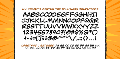
Comicraft. Sean Phillips enthält
3
Stile und Optionen für Familienpakete.
Mehr über diese Familie
- Aa Glyphen
-
Bestes AngebotFamilienpakete
- Einzelschnitte
- Technische Daten
- Lizenzierung
Per Font:
$23.00
Paket mit 3 Fonts:
$69.00
Über die Schriftfamilie Sean Phillips
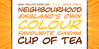
Der Engländer Sean Phillips wollte einen Schriftzug Font , der zu seiner unverwechselbaren Arbeit mit Joe Casey an WILDCATS passt - und wir haben ihn ihm gegeben! Das Schwierigste war natürlich, Seans nordischen Akzent herauszuarbeiten und dafür zu sorgen, dass jedes Mal, wenn Wörter wie "color", "favorite" und "neighborhood" auftauchten, der Buchstabe "u" korrekt eingesetzt wurde. Sean's Font wurde nun unter Monaten einem Betatest unterzogen und ist nun bereit für die Veröffentlichung für die Öffentlichkeit. Ja, Sean Phillips, Ihr beliebter britischer Meister der Comic-Kunst, kommt bald in eine Nachbarschaft in Ihrer Nähe - jetzt in voller Farbe!
Designer:
Herausgeber: Comicraft
Foundry: Comicraft
Eigentümer des Designs: Comicraft
MyFonts Debüt: Oktober 26, 2005
Sean Phillips
Über Comicraft
Die weltbesten Comicbücher Fonts! Nachdem sie pflichtbewusst Tausende von Comics gezeichnet haben, retten die Fearless Fonts von Comicraft den Tag in Videospielen, Fernsehsendungen, Filmtiteln und überall dort, wo Spaß und Lebendigkeit gefragt sind Fonts . 1992 begannen das dynamische Duo Richard Starkings und John Roshelll und ihre furchtlose Flotte von Font Finaglers damit, der Comic-, Fernseh- und Videospielindustrie einzigartiges Design und feinste Beschriftungen zu liefern, und wurden als Pioniere beim Einsatz des Computers in der Kunst der Comicbeschriftung bekannt. Gefangen in einer Welt, die sie nie erschaffen haben, kommen die Fearless Fonts von Comicraft zur Rettung in letzter Sekunde!Die Premium Foundry Seite kann hier angesehen werden.
Mehr lesen
Weniger lesen