Wählen Sie diesen Lizenztyp, wenn Sie eine app für iOS, Android oder Windows Phone entwickeln und Sie die Datei Font in den Code Ihrer mobilen Anwendung einbetten.
Cutthroat Lower
von Comicraft
Einzelschnitte ab $49.00
Vollständige Familie mit 4 Fonts : $139.00

Cutthroat Lower Font Familie wurde entworfen von
John Roshell und
herausgegeben von
Comicraft. Cutthroat Lower enthält
4
Stile und Optionen für Familienpakete.
Mehr über diese Familie
- Aa Glyphen
-
Bestes AngebotFamilienpakete
- Einzelschnitte
- Technische Daten
- Lizenzierung
Per Font:
$34.75
Paket mit 4 Fonts:
$139.00
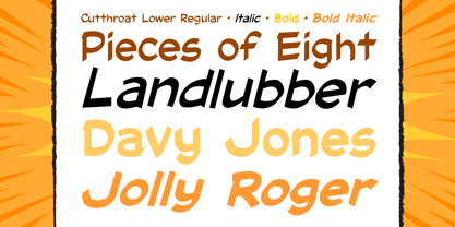
Über die Schriftfamilie Cutthroat Lower
Shiver me Timbers und Splice me Mainbrace! In der Schmugglerbucht gehen seltsame Dinge vor sich... Eine Ansammlung von Dieben, Räubern, Piraten und hinterhältigen Schurken, wie man sie seit Tagen von Rotbart nicht mehr gesehen hat! Jemand wird an der Rah schwingen oder über die Planke gehen, wenn die Karte mit dem Standort der Fonts , die für Grim Todd McFarlane's SPAWN: THE DARK AGES erstellt wurde, nicht bald auftaucht!
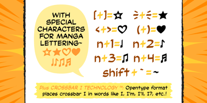
Mit voller europäischer Sprachunterstützung, Manga-Zeichen und Crossbar I Technology™ ist Cutthroat die perfekte Font , um eine Stimme mit Autorität und Biss zu verkörpern. Siehe die Familie Ähnliche zu Cutthroat Lower:
Designer: John Roshell
Herausgeber: Comicraft
Foundry: Comicraft
Eigentümer des Designs: Comicraft
MyFonts Debüt: August 1, 2008
Cutthroat Lower
Über Comicraft
Die weltbesten Comicbücher Fonts! Nachdem sie pflichtbewusst Tausende von Comics gezeichnet haben, retten die Fearless Fonts von Comicraft den Tag in Videospielen, Fernsehsendungen, Filmtiteln und überall dort, wo Spaß und Lebendigkeit gefragt sind Fonts . 1992 begannen das dynamische Duo Richard Starkings und John Roshelll und ihre furchtlose Flotte von Font Finaglers damit, der Comic-, Fernseh- und Videospielindustrie einzigartiges Design und feinste Beschriftungen zu liefern, und wurden als Pioniere beim Einsatz des Computers in der Kunst der Comicbeschriftung bekannt. Gefangen in einer Welt, die sie nie erschaffen haben, kommen die Fearless Fonts von Comicraft zur Rettung in letzter Sekunde!Die Premium Foundry Seite kann hier angesehen werden.
Mehr lesen
Weniger lesen