Wählen Sie diesen Lizenztyp, wenn Sie eine app für iOS, Android oder Windows Phone entwickeln und Sie die Datei Font in den Code Ihrer mobilen Anwendung einbetten.
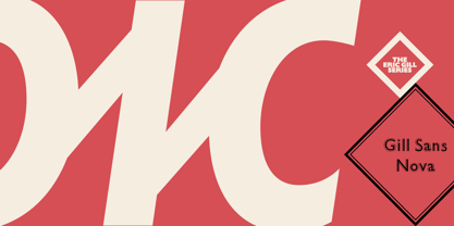
Gill Sans® Nova
von Monotype
Einzelschnitte ab $61.99
Vollständige Familie mit 43 Fonts : $506.99


Gill Sans Nova Font Familie wurde entworfen von
Eric Gill,
George Ryan und
herausgegeben von
Monotype. Gill Sans Nova enthält
43
Stile und Optionen für Familienpakete.
Mehr über diese Familie
- Aa Glyphen
-
Bestes AngebotFamilienpakete
- Einzelschnitte
- Technische Daten
- Lizenzierung
Gill Sans Nova Selection
14 FontsPer Font:
$18.07
Paket mit 14 Fonts:
$252.99
Über die Schriftfamilie Gill Sans Nova
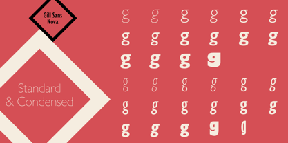
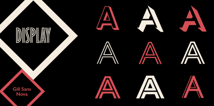
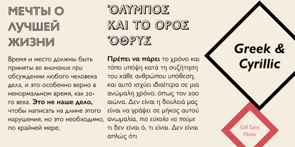
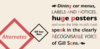
Die Schrift Gill Sans® Nova des Monotype Studio-Designers George Ryan erweitert die beliebte Gill Sans-Familie von 18 auf 43 Fonts und bietet eine koordinierte Auswahl an Antiqua- und Condensed-Designs. Mehrere neue Display-Schriften Fonts sind verfügbar, darunter eine Reihe von sechs Inline-Schriften, schattierte Outline-Schriften Fonts , die nie digitalisiert wurden, und Gill Sans Nova Deco, die zuvor aus der Monotype-Bibliothek zurückgezogen wurde. Es wird eine Vielzahl von OpenType®-Funktionen unterstützt, die es ermöglichen, experimentelle Zeichen aus verschiedenen Phasen der langen Geschichte von Gill Sans einzubinden, darunter spitze Diagonalen bei 'A', 'V' und 'W' sowie Alternativen für 'b', 'd', 'p' und 'q'. Als Alternative zu den tabellarischen Entwürfen sind auch Proportionsziffern erhältlich. Die Schriftfamilie Gill Sans Nova verfügt über einen umfangreichen Zeichensatz, der lateinische, griechische und kyrillische Sprachen unterstützt. Die Anzeigeschriften unterstützen nur Latein. "Gill Sans hat nach ihrer ersten Veröffentlichung 1928 schnell den Nerv der Menschen getroffen und wurde schnell populär", erklärt Ryan. "Sie wurde für jede Publikationstechnologie angepasst, vom mechanischen Schriftsatz bis hin zur digitalen Bildbearbeitung, wobei sie von Monotype in jeder Iteration die beste Behandlung erfuhr. Dies gilt insbesondere für die neue Serie hinzugefügt am , die dennoch die Vertrautheit von Gill Sans bewahrt. Mein Ziel war es, die Klarheit in digitalen Umgebungen zu gewährleisten, fehlende Strichstärken hinzuzufügen und der Familie mit neuen Display Fonts sowie von Gill inspirierten alternativen Zeichen mehr Persönlichkeit zu verleihen." Die Schriftfamilie Gill Sans Nova ist Teil der neuen Eric Gill Serie, die auf dem Erbe von Monotype aufbaut und das Werk von Eric Gill mit mehr Strichstärken, mehr Zeichen und mehr Sprachen erweitert und neu belebt, um eine breite Palette von Designanforderungen zu erfüllen. Die Serie erweckt auch neue Elemente zum Leben, die von einigen unveröffentlichten Arbeiten Gills inspiriert sind, die kürzlich in Monotypes Archiv mit Original-Schriftzeichnungen, Designerkorrespondenz und Dokumenten aus dem letzten Jahrhundert entdeckt wurden.
Designer: Eric Gill, George Ryan
Herausgeber: Monotype
Foundry: Monotype
Eigentümer des Designs: Monotype
MyFonts Debüt: null
Gill Sans® Nova
ist eine beim United States Patent and Trademark Office eingetragene Marke von The Monotype Corporation und Mai ist in bestimmten anderen Ländern eingetragen.
Über Monotype
Die Monotype Library ist eine der weltweit größten und umfangreichsten Schriftensammlungen, die sowohl historisch bedeutsame Originaldesigns als auch ein frisches Angebot an zeitgenössischen und modischen Fonts enthält. Die Monotype Library umfasst Tausende von zeitlosen Klassikern, handgefertigten Wiederbelebungen und Originaldesigns von vielen der innovativsten Schriften Designer und Foundrys der Geschichte. Diese unverwechselbare, preisgekrönte Bibliothek von Premium Fonts bietet Marken und Designer eine breite und zuverlässige Auswahl an Schriften für ausdrucksstarke Typografie im Druck und auf dem Bildschirm. Die Seite Premium Foundry kann hier eingesehen werden.
Mehr lesen
Weniger lesen