Canturiana font family


Designed by  Daniel Hernández in 2022
Luciano Vergara in 2022
César Araya in 2022

According to the Dictionary of the Spanish Royal Academy, «canturía» is the exercise of singing, and a way of singing musical compositions.


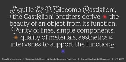
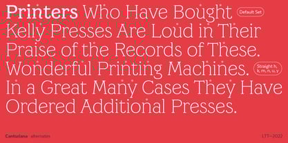
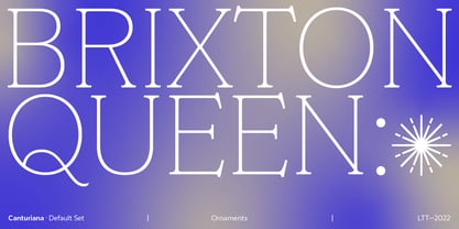
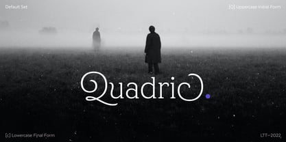
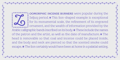
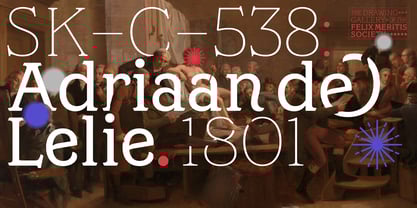
Canturiana Type (derived from «canturía») has a romantic and musical air, as well as a clear sensuality thanks to its sinuous construction. The curves seduce us, conquer us, hypnotize us and the letters acquire a resounding lightness, and a very earthly presence that is complemented by a certain aerial, spiritual expressiveness.


Canturiana Type is inspired by Canterbury, a font designed in the 1920s by the legendary American type designer and engineer Morris Fuller Benton and published by the American Type Founders (ATF). Canturiana Type collects all this heritage and transforms it into a digital typeface perfectly functional and adapted to the visual communication of the 21st century. Its elegant art deco essence provides it with a unique and heterodox imprint that works in very different media, giving them distinction and depth.


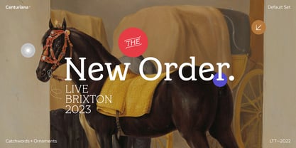
The creative process of Canturiana Type has gone through various mutations to a point where each episode of its creation has left its mark, a multiple imprint that makes it unique, singular in its essence and plural in its possibilities. For this reason, Canturiana Type expresses itself with several voices without any variation in its essence. A conceptual ambiguity that makes it truly versatile. Canturiana Type is a typographic choir, a complex entity that has infinite nuances and tones. Classic

and cool. Disruptive and romantic. Literary and musical.


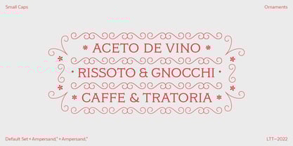
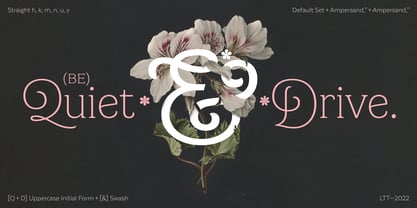
Canturiana Type is composed of 5 weights, and has a large number of swashes, alternate characters, ligatures and various visual elements to make compositions as titles or for use in short texts. Canturiana Type has more than a thousand glyphs and offers a wide range of languages that use the Latin alphabet.

Canturiana Bold

Desktop fonts are designed to be installed on a computer for use with applications. Licensed per user.
Annual web fonts are licensed for a set number of page views.
Application licensing allows fonts to be embedded in your software applications. The license may be based on the number of titles or the number of installations.
Electronic Document Fonts can be embedded in an eBook, eMagazine or eNewspaper. Fonts are licensed annually per issue.
Server fonts can be installed on a server and e.g. used by automated processes to create items. A license is per server core CPU per year.
A Digital Ads license allows you to embed web fonts in digital ads, such as ads created in HTML5. These license is based on the number of ad impressions.
Canturiana


Select technical format and
language support of the font.
world-map map

Std / OT CFF

supports at least

21 languages.


Technical details
OpenType outline flavour:
CFF - PostScript-Outlines
Technical font names:
File name: Canturiana-Bold.otf
Windows menu name: Canturiana Bold
PostScript name: , Canturiana-Bold
PostScript full name: , Canturiana Bold
Catalog number:
167695758
Characters:
1085
US$ 78
Add to cart

Features

Languages

Case-Sensitive Forms

Tag: case

Function: Shifts various punctuation marks up to a position that works better with all-capital sequences or sets of lining figures; also changes oldstyle figures to lining figures. By default, glyphs in a text face are designed to work with lowercase characters. Some characters should be shifted vertically to fit the higher visual center of all-capital or lining text. Also, lining figures are the same height (or close to it) as capitals, and fit much better with all-capital text. The user selects a block of text and applies this feature. The dashes, bracketing characters, guillemet quotes and the like shift up to match the capitals, and oldstyle figures change to lining figures.

Fractions

Tag: frac

Function: Replaces figures separated by a slash with 'common' (diagonal) fractions. The user enters 3/4 in a recipe and gets the threequarters fraction.

Standard Ligatures

Tag: liga

Function: Replaces a sequence of glyphs with a single glyph which is preferred for typographic purposes. This feature covers the ligatures which the designer/manufacturer judges should be used in normal conditions. The glyph for ffl replaces the sequence of glyphs f f l.

Localized Forms

Tag: locl

Function: Many scripts used to write multiple languages over wide geographical areas have developed localized variant forms of specific letters, which are used by individual literary communities. For example, a number of letters in the Bulgarian and Serbian alphabets have forms distinct from their Russian counterparts and from each other. In some cases the localized form differs only subtly from the script 'norm', in others the forms are radically distinct. This feature enables localized forms of glyphs to be substituted for default forms. The user applies this feature to text to enable localized Bulgarian forms of Cyrillic letters; alternatively, the feature might enable localized Russian forms in a Bulgarian manufactured font in which the Bulgarian forms are the default characters.

Ordinals

Tag: ordn

Function: Replaces default alphabetic glyphs with the corresponding ordinal forms for use after figures. One exception to the follows-a-figure rule is the numero character (U+2116), which is actually a ligature substitution, but is best accessed through this feature. The user applies this feature to turn 2.o into 2.o (abbreviation for secundo).

Superscript

Tag: sups

Function: Replaces lining or oldstyle figures with superior figures (primarily for footnote indication), and replaces lowercase letters with superior letters (primarily for abbreviated French titles). The application can use this feature to automatically access the superior figures (more legible than scaled figures) for footnotes, or the user can apply it to Mssr to get the classic form.

Contextual Alternates

Tag: calt

Function: In specified situations, replaces default glyphs with alternate forms which provide better joining behavior. Used in script typefaces which are designed to have some or all of their glyphs join. In Caflisch Script, o is replaced by o.alt2 when followed by an ascending letterform.

Swash

Tag: swsh

Function: This feature replaces default character glyphs with corresponding swash glyphs. Note that there may be more than one swash alternate for a given character. The user inputs the ampersand character when setting text with Poetica with this feature active, and is presented with a choice of the 63 ampersand forms in that face.

Small Capitals From Capitals

Tag: c2sc

Function: Small Capitals From Capitals

Small Capitals

Tag: smcp

Function: This feature turns lowercase characters into small capitals. This corresponds to the common SC font layout. It is generally used for display lines set in Large & small caps, such as titles. Forms related to small capitals, such as oldstyle figures, may be included. The user enters text as mixed capitals and lowercase, and gets Large & small cap text.

Sylistic Set 1

Tag: ss01

Function: In addition to, or instead of, stylistic alternatives of individual glyphs (see 'salt' feature), some fonts may contain sets of stylistic variant glyphs corresponding to portions of the character set, e.g. multiple variants for lowercase letters in a Latin font. Glyphs in stylistic sets may be designed to harmonise visually, interract in particular ways, or otherwise work together. Examples of fonts including stylistic sets are Zapfino Linotype and Adobe's Poetica. Individual features numbered sequentially with the tag name convention 'ss01' 'ss02' 'ss03' . 'ss20' provide a mechanism for glyphs in these sets to be associated via GSUB lookup indexes to default forms and to each other, and for users to select from available stylistic sets.

Sylistic Set 2

Tag: ss02

Function: In addition to, or instead of, stylistic alternatives of individual glyphs (see 'salt' feature), some fonts may contain sets of stylistic variant glyphs corresponding to portions of the character set, e.g. multiple variants for lowercase letters in a Latin font. Glyphs in stylistic sets may be designed to harmonise visually, interract in particular ways, or otherwise work together. Examples of fonts including stylistic sets are Zapfino Linotype and Adobe's Poetica. Individual features numbered sequentially with the tag name convention 'ss01' 'ss02' 'ss03' . 'ss20' provide a mechanism for glyphs in these sets to be associated via GSUB lookup indexes to default forms and to each other, and for users to select from available stylistic sets.

Sylistic Set 3

Tag: ss03

Function: In addition to, or instead of, stylistic alternatives of individual glyphs (see 'salt' feature), some fonts may contain sets of stylistic variant glyphs corresponding to portions of the character set, e.g. multiple variants for lowercase letters in a Latin font. Glyphs in stylistic sets may be designed to harmonise visually, interract in particular ways, or otherwise work together. Examples of fonts including stylistic sets are Zapfino Linotype and Adobe's Poetica. Individual features numbered sequentially with the tag name convention 'ss01' 'ss02' 'ss03' . 'ss20' provide a mechanism for glyphs in these sets to be associated via GSUB lookup indexes to default forms and to each other, and for users to select from available stylistic sets.

Sylistic Set 4

Tag: ss04

Function: In addition to, or instead of, stylistic alternatives of individual glyphs (see 'salt' feature), some fonts may contain sets of stylistic variant glyphs corresponding to portions of the character set, e.g. multiple variants for lowercase letters in a Latin font. Glyphs in stylistic sets may be designed to harmonise visually, interract in particular ways, or otherwise work together. Examples of fonts including stylistic sets are Zapfino Linotype and Adobe's Poetica. Individual features numbered sequentially with the tag name convention 'ss01' 'ss02' 'ss03' . 'ss20' provide a mechanism for glyphs in these sets to be associated via GSUB lookup indexes to default forms and to each other, and for users to select from available stylistic sets.

Sylistic Set 5

Tag: ss05

Function: In addition to, or instead of, stylistic alternatives of individual glyphs (see 'salt' feature), some fonts may contain sets of stylistic variant glyphs corresponding to portions of the character set, e.g. multiple variants for lowercase letters in a Latin font. Glyphs in stylistic sets may be designed to harmonise visually, interract in particular ways, or otherwise work together. Examples of fonts including stylistic sets are Zapfino Linotype and Adobe's Poetica. Individual features numbered sequentially with the tag name convention 'ss01' 'ss02' 'ss03' . 'ss20' provide a mechanism for glyphs in these sets to be associated via GSUB lookup indexes to default forms and to each other, and for users to select from available stylistic sets.

Sylistic Set 6

Tag: ss06

Function: In addition to, or instead of, stylistic alternatives of individual glyphs (see 'salt' feature), some fonts may contain sets of stylistic variant glyphs corresponding to portions of the character set, e.g. multiple variants for lowercase letters in a Latin font. Glyphs in stylistic sets may be designed to harmonise visually, interract in particular ways, or otherwise work together. Examples of fonts including stylistic sets are Zapfino Linotype and Adobe's Poetica. Individual features numbered sequentially with the tag name convention 'ss01' 'ss02' 'ss03' . 'ss20' provide a mechanism for glyphs in these sets to be associated via GSUB lookup indexes to default forms and to each other, and for users to select from available stylistic sets.

Initial Forms

Tag: init

Function: Replaces glyphs at the beginnings of words with alternate forms designed for this use. This is common in Latin connecting scripts, and required in various non-Latins like Arabic. In the typeface Ex Ponto, the default t in the word 'type' is replaced with the t.begin form.

Terminal Forms

Tag: fina

Function: Replaces glyphs at the ends of words with alternate forms designed for this use. This is common in Latin connecting scripts, and required in various non-Latins like Arabic. In the typeface Poetica, the default e in the word 'type' is replaced with the e.end form.

Glyph Composition/Decomposition

Tag: ccmp

Function: To minimize the number of glyph alternates, it is sometimes desired to decompose a character into two glyphs. Additionally, it may be preferable to compose two characters into a single glyph for better glyph processing. This feature permits such composition/decompostion. The feature should be processed as the first feature processed, and should be processed only when it is called. In Syriac, the character 0x0732 is a combining mark that has a dot above AND a dot below the base character. To avoid multiple glyph variants to fit all base glyphs, the character is decomposed into two glyphs...a dot above and a dot below. These two glyphs can then be correctly placed using GPOS. In Arabic it might be preferred to combine the shadda with fatha (0x0651, 0x064E) into a ligature before processing shapes. This allows the font vendor to do special handling of the mark combination when doing further processing without requiring larger contextual rules.

Capital Spacing

Tag: cpsp

Function: Globally adjusts inter-glyph spacing for all-capital text. Most typefaces contain capitals and lowercase characters, and the capitals are positioned to work with the lowercase. When capitals are used for words, they need more space between them for legibility and esthetics. This feature would not apply to monospaced designs. Of course the user may want to override this behavior in order to do more pronounced letterspacing for esthetic reasons. The user sets a title in all caps, and the Capital Spacing feature opens the spacing.

Kerning

Tag: kern

Function: Adjusts amount of space between glyphs, generally to provide optically consistent spacing between glyphs. Although a well-designed typeface has consistent inter-glyph spacing overall, some glyph combinations require adjustment for improved legibility. Besides standard adjustment in the horizontal direction, this feature can supply size-dependent kerning data via device tables, "cross-stream" kerning in the Y text direction, and adjustment of glyph placement independent of the advance adjustment. Note that this feature may apply to runs of more than two glyphs, and would not be used in monospaced fonts. Also note that this feature does not apply to text set vertically. The o is shifted closer to the T in the combination "To."

Mark Positioning

Tag: mark

Function: Positions mark glyphs with respect to base glyphs. In the Arabic script, positioning the Hamza above the Yeh.

Mark to Mark Positioning

Tag: mkmk

Function: Positions marks with respect to other marks. Required in various non-Latin scripts like Arabic. In Arabic, the ligaturised mark Ha with Hamza above it; can also be obtained by positioning these marks relative to one another.

These fonts support the Basic Latin character set. Each font is Unicode™ encoded, and available in d

Tag: Basic Latin

Function: These fonts support the Basic Latin character set. Each font is Unicode™ encoded, and available in different formats. Please review the product information for each font to ensure it will meet your requirements.