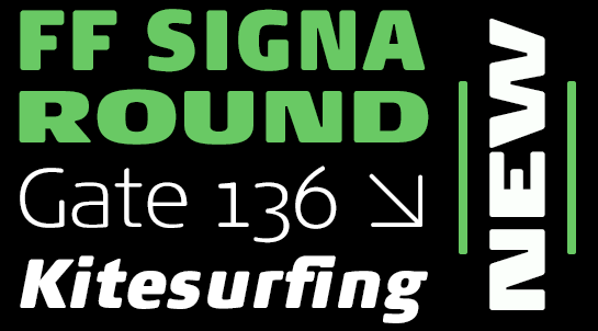
FF Signa
Before Danish graphic artist and typeface designer Ole Søndergaard studied graphic design and started a multi-award-winning career, he completed an apprenticeship as a sign painter. The craftsmanship gained in this process is the basis of several very successful font designs.
One of his biggest projects is the FF Signa™ superfamily. The typical Danish font was originally designed for signaling, but has developed into an extended family that delivers perfect results – not only in print but also on-screen. The readable, open letters are more oriented to architectural typography than to book printing and are difficult to categorize. The letter forms, derived from the Antiqua, and the moderate contrast in the line strength are typical features of a humanistic sans. However, the in some cases strongly reduced forms and minimal details bring a very modern, interesting, and contemporary tone to the font. A large x-height supports legibility, even in the small sizes. After its creation at the beginning of the new millennium, FF Signa quickly grew into a large family. The well-developed sans got numerous siblings: FF Signa™ Correspondence, an office-optimized version; FF Signa™ Serif; the FF Signa™ Slab; and the stencil versions of the sans, serif and slab. The clan thus became a modern, universal genius. The newest member of the family is the sans-derived, softer and more friendly FF Signa™ Round. Both together and individually, the very well-developed family members offer you an enormous range of tonalities and variations. This makes FF Signa your ideal partner for large-scale projects such as journals, books and magazines, as well as corporate identity and company equipment – in print or on-screen.
One of his biggest projects is the FF Signa™ superfamily. The typical Danish font was originally designed for signaling, but has developed into an extended family that delivers perfect results – not only in print but also on-screen. The readable, open letters are more oriented to architectural typography than to book printing and are difficult to categorize. The letter forms, derived from the Antiqua, and the moderate contrast in the line strength are typical features of a humanistic sans. However, the in some cases strongly reduced forms and minimal details bring a very modern, interesting, and contemporary tone to the font. A large x-height supports legibility, even in the small sizes. After its creation at the beginning of the new millennium, FF Signa quickly grew into a large family. The well-developed sans got numerous siblings: FF Signa™ Correspondence, an office-optimized version; FF Signa™ Serif; the FF Signa™ Slab; and the stencil versions of the sans, serif and slab. The clan thus became a modern, universal genius. The newest member of the family is the sans-derived, softer and more friendly FF Signa™ Round. Both together and individually, the very well-developed family members offer you an enormous range of tonalities and variations. This makes FF Signa your ideal partner for large-scale projects such as journals, books and magazines, as well as corporate identity and company equipment – in print or on-screen.
