FF Yoga
FF Yoga and FF Yoga Sans: an extended family, rich in detail, not just for text setting
With its generous layout and open counters, the FF Yoga super family from Xavier Dupré is the ideal choice for application as a body copy font. It perfectly combines the features of a strong Antiqua and a neutral Sans and can be used, for instance, for the design of books, magazines and newspapers, but it is equally useful in packaging design and in advertising, whether used conventionally on paper or digitally on the Web.
Dupré chose an unusual approach for the design of the FF Yoga extended family. Whereas usually only one font family is created, from which further developments for the super family are then derived, Dupré developed FF Yoga® and FF Yoga® Sans in parallel. Dupré explains that this is how he is able to reject design ideas which do not work in one family or another, but at the same time is able to pursue an individual approach and to relate the two families to each other in the basic approach.
Dupré skillfully derives the basic form for FF Yoga from the Renaissance Antiqua and adds a touch of Fraktur. Together with the distinctive, only slightly rounded, rectangular serifs, it is especially the large, truncated drops which determine the character of this font. Large sizes bring out yet more details, which give the font the individuality needed for headlines: for example, the sharply streamlined form of the “j”, the asymmetric inner shape of the lowercase “e” and serifs, such as in “v”, “y”, “A” and “K”, whose connection to the trunk is filled in on one side.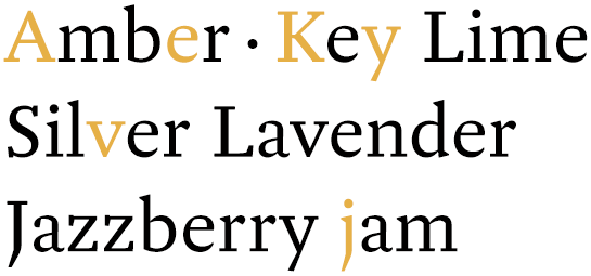 All weights come with a distinctly slanted, genuine italic. Here, a marked contrast in weight and extended terminals lend the font the character of a feather pen font and give the italic styles a lively, dynamic flair. Thanks to the marked contrast of the italic with the upright styles, individual words are easy to distinguish from the rest of the text and you can use the styles to produce variations for emphasis in your text.
 The forms of the FF Yoga Sans, like those of the FF Yoga, hark back to the Renaissance Antiqua. In comparison to the other member of the family, however, Dupré has designed the Sans to be more muted and restrained. There is hardly any appreciable contrast in the stroke widths and the absence of spurs in the “b”, “d”, “p” and “q” gives the font a reduced, almost constructed vibrancy, emphasized even further by the very round “o”.
Nonetheless Dupré has also included some lively, interesting details in the Sans. The ends of the lowercase “c” are designed differently, the terminals on some letters are slightly beveled and the distinctive “j” turns up again in the Sans.
Like the font as a whole, the genuine italic in the FF Yoga Sans has a rather restrained appearance. Dupré gives the letters more contrast in the stroke width and in several places allows the careful influences of a script to shine through. In addition, the lowercase “a” changes to the closed form and the “f” is given a descender.
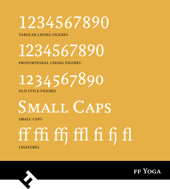
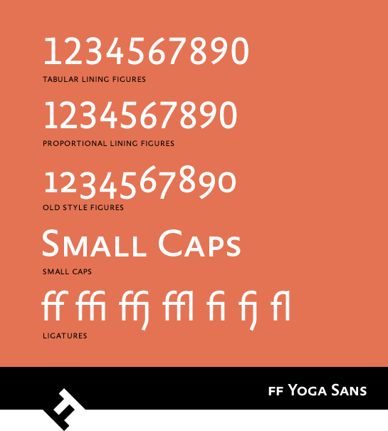
 FF Yoga and FF Yoga Sans are available respectively in five stroke widths, from Hairline to Bold, which complement each other perfectly. They also include various figure sets with mediaeval and uppercase numerals, small caps and numerous ligatures.
 Whether alone or in combination, thanks to their technically perfect design and their strong character, the members of the FF Yoga super family are sure to cut a fine figure in many different applications. Use the very legible Antiqua FF Yoga in long texts or let the numerous individual details take effect in headings and captions. The FF Yoga Sans can support its sans serif sister in captions or marginal texts, but it can also be used alone, for instance to produce an elegant effect on product packaging. The FF Yoga extended family will never let you down in large projects, whether on the printed page or in digital applications.
Dupré skillfully derives the basic form for FF Yoga from the Renaissance Antiqua and adds a touch of Fraktur. Together with the distinctive, only slightly rounded, rectangular serifs, it is especially the large, truncated drops which determine the character of this font. Large sizes bring out yet more details, which give the font the individuality needed for headlines: for example, the sharply streamlined form of the “j”, the asymmetric inner shape of the lowercase “e” and serifs, such as in “v”, “y”, “A” and “K”, whose connection to the trunk is filled in on one side.
 All weights come with a distinctly slanted, genuine italic. Here, a marked contrast in weight and extended terminals lend the font the character of a feather pen font and give the italic styles a lively, dynamic flair. Thanks to the marked contrast of the italic with the upright styles, individual words are easy to distinguish from the rest of the text and you can use the styles to produce variations for emphasis in your text.
 The forms of the FF Yoga Sans, like those of the FF Yoga, hark back to the Renaissance Antiqua. In comparison to the other member of the family, however, Dupré has designed the Sans to be more muted and restrained. There is hardly any appreciable contrast in the stroke widths and the absence of spurs in the “b”, “d”, “p” and “q” gives the font a reduced, almost constructed vibrancy, emphasized even further by the very round “o”.
Nonetheless Dupré has also included some lively, interesting details in the Sans. The ends of the lowercase “c” are designed differently, the terminals on some letters are slightly beveled and the distinctive “j” turns up again in the Sans.
Like the font as a whole, the genuine italic in the FF Yoga Sans has a rather restrained appearance. Dupré gives the letters more contrast in the stroke width and in several places allows the careful influences of a script to shine through. In addition, the lowercase “a” changes to the closed form and the “f” is given a descender.
 FF Yoga and FF Yoga Sans are available respectively in five stroke widths, from Hairline to Bold, which complement each other perfectly. They also include various figure sets with mediaeval and uppercase numerals, small caps and numerous ligatures.

 Whether alone or in combination, thanks to their technically perfect design and their strong character, the members of the FF Yoga super family are sure to cut a fine figure in many different applications. Use the very legible Antiqua FF Yoga in long texts or let the numerous individual details take effect in headings and captions. The FF Yoga Sans can support its sans serif sister in captions or marginal texts, but it can also be used alone, for instance to produce an elegant effect on product packaging. The FF Yoga extended family will never let you down in large projects, whether on the printed page or in digital applications.