FF Franziska

FF Franziska: a noteworthy text font, not simply for small sizes
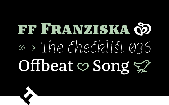
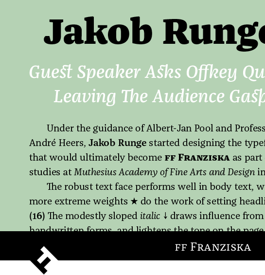
Numerous distinctive details contribute to making the well-constructed Antiqua FF Franziska™ from Jakob Runge perfectly readable in small sizes and give the font in large sizes an individual character, which plays out well in headlines and logos.Runge drew the first sketches of the font, which was to become the FF Franziska, under the guidance of Albert-Jan Pool and Professor André Heers, as his student research project at the Muthesius University in Kiel. He combines elements of the Renaissance Antiqua with classical influences and here and there he adds a hint of slab serif. Many interesting font details emerge clearly, especially in the bold weights, whereas they are only carefully implied in the light styles.
 The truncated, drop-shaped terminals of the FF Franziska are a particularly distinctive design element in the formation of the characters. Runge explains that these terminals determine the flair of the font, not only in large font sizes, but also as subtle angular detail. In small sizes they are transformed into the complete drop in the eye of the observer, which gives the font a gentle vibrancy. A similar effect can be observed in the bold fonts with the prominent ink traps and the stems, which rejuvenate towards the connections. What is perceived in large sizes as an interesting, character-forming detail improves the readability of the small sizes and ensures a warm, soft flair. Further variety is provided by the asymmetric serifs and the striking, angular rounded points in the FF Franziska.
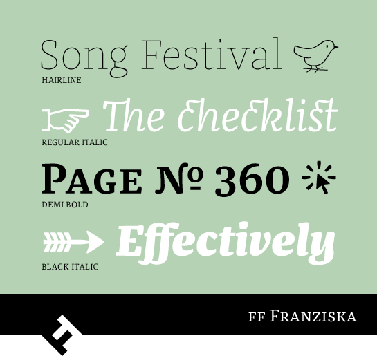
 The individual italic versions of FF Franziska are also very remarkable. Runge alters not only the shape of many of the letters, he also allows elements of a quill pen font to flow into the shapes. Thus, a few arches are clearly offset from the stem and the curves also bear the characteristic slightly angular style produced by a quill pen.
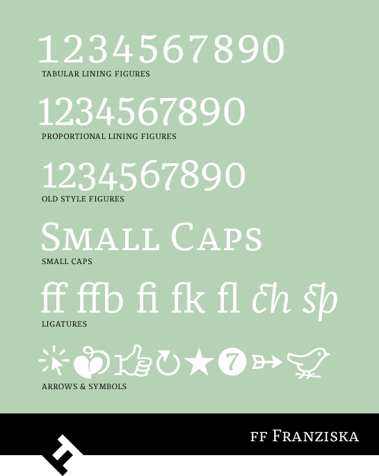
 FF Franziska is available in ten carefully graded weights from the very fine, reduced Hairline to the extremely bold Black, each of which has its matching italic. All the fonts include small capitals and various figure sets with upper-case and mediaeval figures. A variety of ligatures and some pretty ornaments and symbols round off the layout.
 Its many lively details give FF Franziska a character which lies between soft but angular and angular and yet soft. The very readable font can also be used without problems for very long texts, which can also be very well structured thanks to the many versions of the design. In large font sizes the distinctive details in the font become evident and give the FF Franziska a very individual character in headings and logos. FF Franziska is a true all-rounder which is also very effective on the screen.