FF Cocon
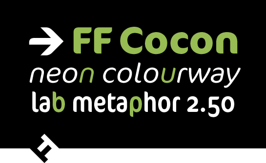
FF Cocon: a striking sans serif with a unique flair
The somewhat unusual, distinctive forms of FF Cocon® by Evert Bloemsma attract plenty of attention with their lively and friendly appearance. Use this font, well equipped with multiple widths, for advertising, packaging design, headlines or logos, for example.
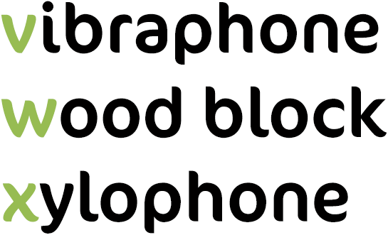
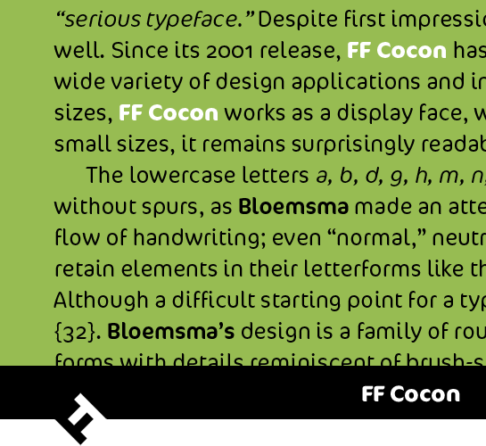
The Dutch type designer Evert Bloemsma brings together influences from very different styles in the sans serif FF Cocon. The avoidance of any spurs and a very reduced letter form lend the font a formal, almost structured character. However, the round shapes and, in particular, the asymmetrically curved, extended line ends – reminiscent of a brush font, in some cases – radiate warmth and vibrancy. There are also allusions to a brush font in some slightly curved stems, such as in “v”, “w”, or “x”.
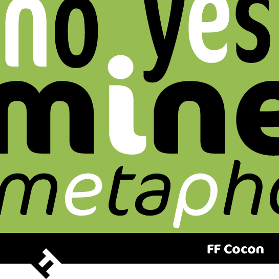
 This exciting blend of different styles in FF Cocon makes for a unique character. The countless interesting details are particularly noticeable in the larger font sizes.
 FF Cocon also works well in the smaller sizes, however: the font is very legible, not least because of the large x-height and the open forms.
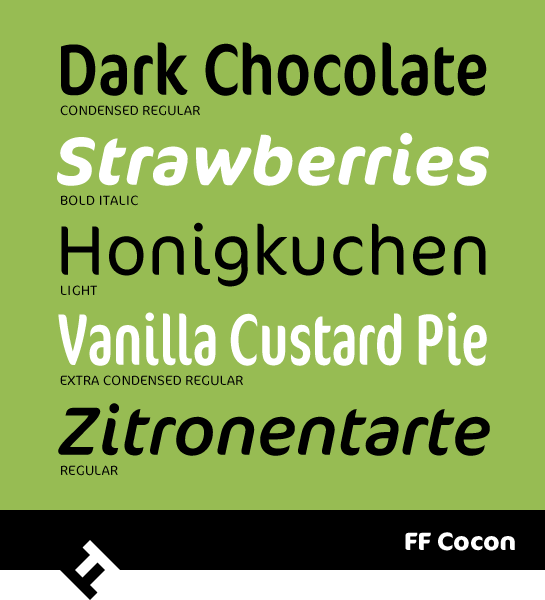
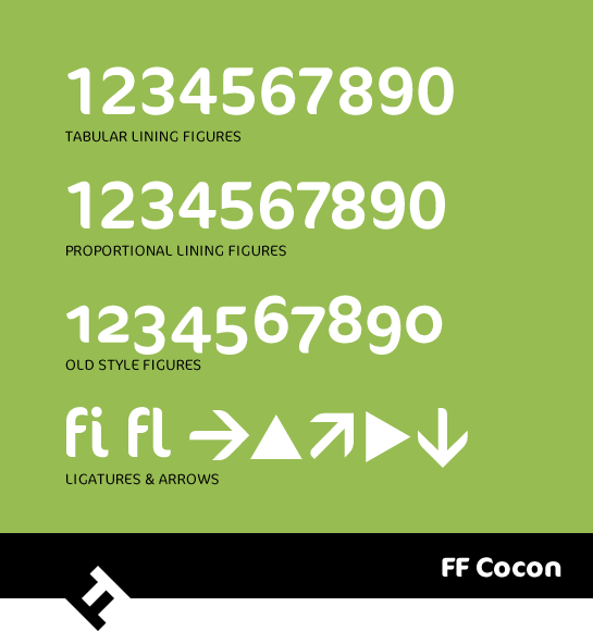
 Three weights in three widths, each with a matching italic, make FF Cocon ideal for very different tasks. Uppercase and old-style numbers, numerals for proportional and table setting, and symbols and arrows round out the selection of characters.
 While the lively and warm character of FF Cocon and its almost organic-like forms stands out, the font nonetheless has a very solid and serious appearance. Use the unobtrusive, but distinctive typeface to add a unique accent and flair to headlines, for example, or posters, logos or packaging design.

 This exciting blend of different styles in FF Cocon makes for a unique character. The countless interesting details are particularly noticeable in the larger font sizes.
 FF Cocon also works well in the smaller sizes, however: the font is very legible, not least because of the large x-height and the open forms.
 Three weights in three widths, each with a matching italic, make FF Cocon ideal for very different tasks. Uppercase and old-style numbers, numerals for proportional and table setting, and symbols and arrows round out the selection of characters.
 While the lively and warm character of FF Cocon and its almost organic-like forms stands out, the font nonetheless has a very solid and serious appearance. Use the unobtrusive, but distinctive typeface to add a unique accent and flair to headlines, for example, or posters, logos or packaging design.
