FF Milo
FF Milo: an unique, well-developed super family
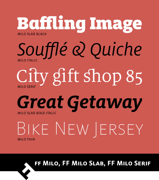
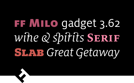
Mike Abbink designed FF Milo® as an all-around, bread-and-butter font. The easily legible font family was first published as a sans. In the years that followed, Abbink expanded it into a super family with FF Milo® Serif and FF Milo® Slab, thus covering all manner of design tasks, from text, to headlines, to logos and signalization systems. Each member of the family has enough character and individuality to stand on their own, but also combine perfectly.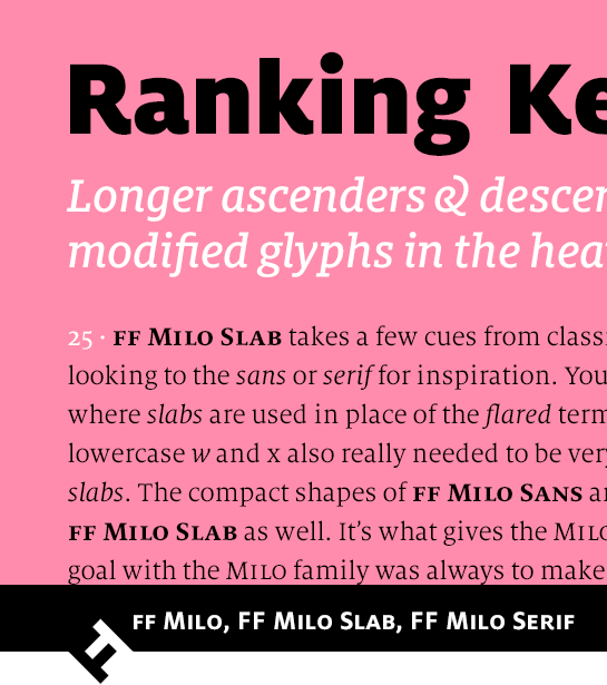
FF Milo
The shapes of the humanist sans FF Milo derive from the Renaissance Antiqua and have a large x-height with correspondingly short ascenders and descenders. A clear contrast in the stroke, as well as some extended line ends (in the “k” or “R”, for example) lend the font a lively and friendly flair. The options leave no wish unfulfilled, offering various number sets, small caps and standard ligatures as well as an alternative, single-story “g”.
All weights of FF Milo come with a true italic in which numerous, rounded line ends and several modified letter forms support the dynamic, flowing character of the slanted font version.
 FF Milo is available in nine finely graded weights, from Thin to Black, and is solid enough for use in magazines or newspapers.
FF Milo Serif
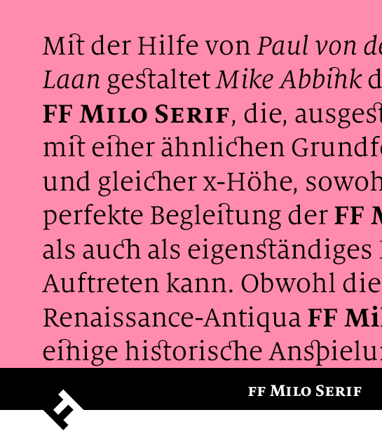
Mike Abbink designed FF Milo Serif with the help of Paul van der Laan. This version has a similar basic shape and the same x-height of the original, which enables it to accompany FF Milo perfectly or stand on its own. Although the French Renaissance Antiqua FF Milo Serif has some historical references, the font’s modern and contemporary character is a winner. In addition to small caps and various numeral sets, the well-equipped font has numerous, in some cases very ornamental ligatures available. FF Milo Serif is available in six weights, from Regular to Black, each with a matching italic.FF Milo Serif won the 2011 ISTD International Typographic Award and was selected along with the sans FF Milo as one of the best fonts of the first decade of the 21st century.
FF Milo Slab
FF Milo Slab also shares the basic design with the other members of the super family. With the support of Jesse Vega, Abbink adapted the font carefully so as to give the slab version the optimal appearance. They ascenders and descenders are designed so as to be slightly larger, the contrast adjusted and some letters – above all the italic – revised, and the new use of a right spur in the top line ends emphasizes the vertical character of the font. The compact overall flair of the font remains, however. In addition to small caps, the font has various number sets and standard ligatures, alternative shapes for the lower-case “a” and “g” as well as for the very ornamental “&” sign in the cursive.FF Milo Slab is available in nine finely graded weights, from Thin to Black, each with matching italic, and can be used as a modern and unique font in body texts as well as headlines.
