FF Ernestine

FF Ernestine: A monolinear slab serif with an individual, lively character
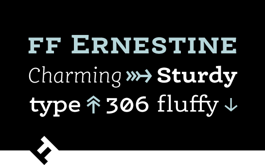
At first glance, the monolinear slab serif FF Ernestine® from Nina Stössinger looks like a typewriter font. A closer look, however, reveals unique, lively letters that, despite their playful character, are not at all cliché. You can easily use the friendly FF Ernestine, which is also perfectly legible in smaller font sizes, for longer texts or take advantage of the many details of the font in larger font sizes for unique headlines or logos. The first drafts of FF Ernestine came about as a study project in Zürich. Stössinger was searching for a design that combined various, opposing contrasts. Stössinger’s new font is warm, but also serious and charming; it is at once robust and a little playful.
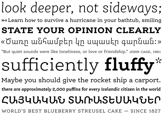
 She created the design with simple, somewhat downscaled letters that have powerful slab serifs, drop-shaped line ends, as well as a little swerve in the lines here and there. Letters like the lower-case “g” and “j” or the “K” are good examples of this.

Stössinger not only added italic styles, but also extended FF Ernestine to include the Armenian font system with the help of Lebanese designer Hrant Papazian. Although both the Latin and the Armenian characters retain their cultural identity with a separate design approach, the parallel development of italic and Armenian characters creates a shared typographic mood in the font. Stössinger’s italic adopts the slight incline of the Armenian characters, as well as their serif design. As a result, it is less the inclination of the italic that differentiates it from the upright sections, and more so the slightly lighter weight and the softer, more dynamic forms. FF Ernestine Italic is not only a distinct variation in the Latin writing system, but also the harmonious partner for the multilingual typesetting.
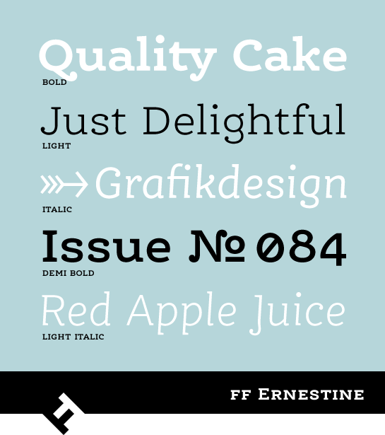
 The well-equipped FF Ernestine is available in three weights, each with a matching italic, and in a pro version, with the characters of the Armenian font system. Numerous ligatures, some alternative characters, various numeral sets and small caps in two sizes are also available – in the multi-lingual version, as well.
 The design of FF Ernestine is neutral enough that the font can be used in very different environments. The exceptional options, as well as the friendly, lively and individual character, bring a special flair to your designs, whether you use FF Ernestine for body text, headlines or logos. The American magazine for visual communications “Communication Arts” has also recognized the qualities of FF Ernestine with a design award.
