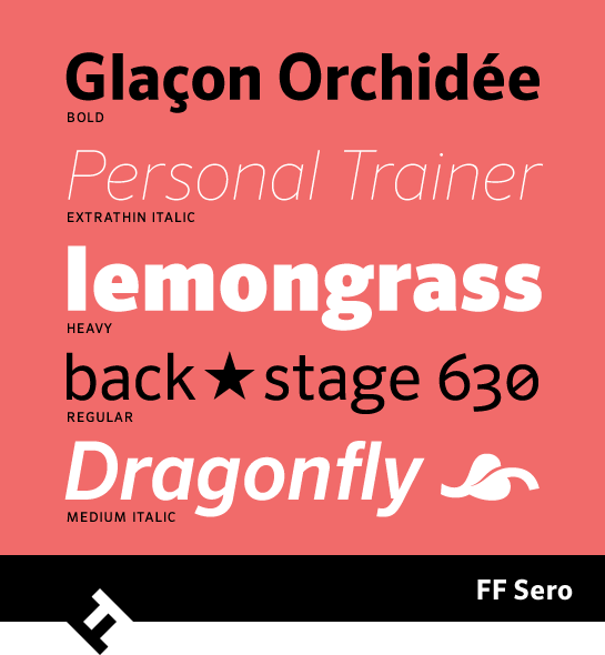
The distribution of the eight weights in FF Sero is not conventional: there are four thin styles below Regular, with Extra Thin, Thin, Extra Light and Light. The finely graded variants not only run counter to current trends for lean fonts, but also give you, the designer, the option to react precisely to the demands of texts and headlines. All weights have an italic, which changes the “a” to the closed format and the “g” to the single-story format. Apart from that, the lower-case “e” has a more rounded shape. Different character sets, ligatures and small caps round out the font’s options.
-

Awarded Typeface
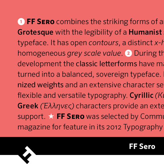
FF Sero appears clear, precise and restrained, but still has an individual character. The complete and well-thought-out expansion makes the typeface your ideal partner for projects in the corporate field, for example – including international projects, thanks to the great language support. “Communication Arts Magazine” also recognized these qualities and selected the font for the “2012 Typography Annual”.
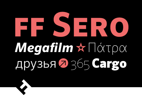
 The distribution of the eight weights in FF Sero is not conventional: there are four thin styles below Regular, with Extra Thin, Thin, Extra Light and Light. The finely graded variants not only run counter to current trends for lean fonts, but also give you, the designer, the option to react precisely to the demands of texts and headlines. All weights have an italic, which changes the “a” to the closed format and the “g” to the single-story format. Apart from that, the lower-case “e” has a more rounded shape. Different character sets, ligatures and small caps round out the font’s options.
 FF Sero appears clear, precise and restrained, but still has an individual character. The complete and well-thought-out expansion makes the typeface your ideal partner for projects in the corporate field, for example – including international projects, thanks to the great language support. “Communication Arts Magazine” also recognized these qualities and selected the font for the “2012 Typography Annual”.


