Select this license type when you are developing an app for iOS, Android, or Windows Phone, and you will be embedding the font file in your mobile application's code.
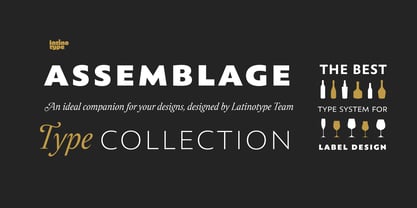
Assemblage
by Latinotype
Individual Styles from $29.00
Complete family of 9 fonts: $159.00


Assemblage Font Family was
designed by
Luciano Vergara,
Daniel Hernández,
Alfonso García,
Bruno Jara Ahumada and
published by
Latinotype. Assemblage contains
9
styles and family package options.
More about this family
- Aa Glyphs
-
Best ValueFamily Packages
- Individual Styles
- Tech Specs
- Licensing
Per style:
$17.66
Pack of 9 styles:
$159.00
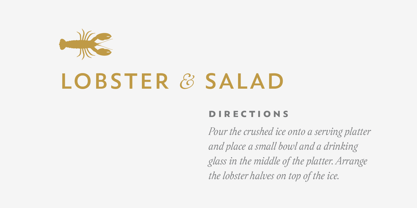
About Assemblage Font Family
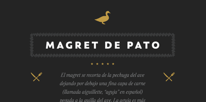
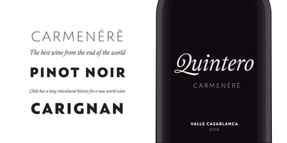
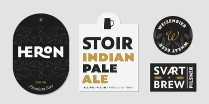
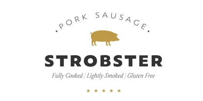
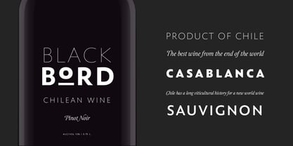
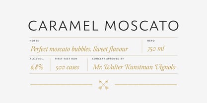
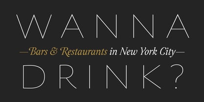
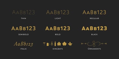
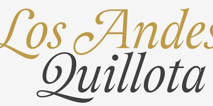
Assemblage Designed by Daniel Hernández, Alfonso García, Bruno Jara Ahumada and Luciano Vergara. Thanks to Pedro González for his contribution in the initial stage of the design process. Assemblage is a typeface-inspired by Roman square capitals-that comes in 6 different weights and ranging from Thin to Black. The background of the typeface makes it well-suited for branding, short text, titles and complex compositions, thanks to its italic version. Contrary to some conservative fonts, Assemblage includes an italic version with a look based on Elzeverian and Dutch Barroque typefaces, what gives the font an extra dash of elegance, resulting in a very enjoyable design. The family was specially created for labelling wine bottles and general packaging. Assemblage is a font collection consisting of a Sans Serif plus an Italic version of classic features. The family comes in 6 weights and includes ligatures, caps and small caps plus 3 sets of smaller small caps for different kinds of composition. The Italic version-with strong decorative features-comes with swashes. Assemblage also includes a set of dingbats, especially designed for packaging as well as for publishing or branding. The Sans contains 979 characters and the Italic version 620 characters. Assemblage supports 212 different languages and its OpenType features include ligatures, semi oldstyle figures, 3 sets of ornamental small caps (in the Sans version), swashes, ending forms and alternates in the Italic version.
Designers: Luciano Vergara, Daniel Hernández, Alfonso García, Bruno Jara Ahumada
Publisher: Latinotype
Foundry: Latinotype
Design Owner: Latinotype
MyFonts debut: Aug 17, 2016
Assemblage
About Latinotype
Based in Concepción and Santiago, Chile, Latinotype’s founders say, “Our goal is to design new typefaces remixing diverse influences related to our South American identity with high quality products for the contemporary design industry.” And the duo have been doing just that since their foundry’s creation in 2007. One of the most successful foundries on MyFonts in recent years, Luciano Vergara and Daniel Hernández, have put together a rapidly growing collection of typefaces in a wide array of genres. Specializing in colorful display and script faces, the group’s name “Latinotype” emphasizes the strong tie they feel to their cultural identity. The Premium foundry page can be viewed Here.
Read more
Read less
- Choosing a selection results in a full page refresh.