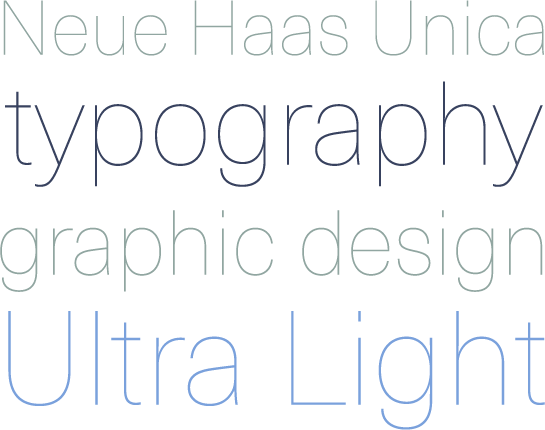
Neue Haas Unica
The Neue Haas Unica: a delicate revision of Helvetica.
With his re-edition of Metro, the Metro Nova, font designer Toshi Omagari has shown a deft hand for older typefaces and their revision. Now, with Haas Unica, Omagari has discovered a typeface from the 1980s and decided to digitalize and expand it. One result of his efforts is the style Neue Haas Unica Ultra Light, which is available immediately.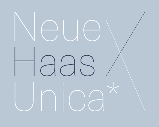 Technical breakthroughs in typesetting technology still have repercussions for fonts, which must be adapted to a new system. Of course, the opportunity to revise existing fonts not only came about during transition from photo typesetting to computer-based typesetting, but also during the previous change from hot metal to photo typesetting. A good example of this is the Haas Unica, published in 1980, which is a revision of Helvetica.
 At the end of the 1970s, Team 77, commissioned by the Haas’sche Schriftgiesserei, began to compare Max Miedinger’s Helvetica with other popular sans serif fonts and recommend careful adaptations based on the results of these comparisons. The result is Haas Unica; the name is composed from those of the two great predecessors, Helvetica and Univers.
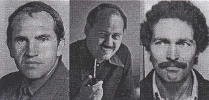
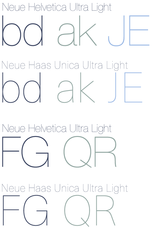
Team 77: André Gürtler, Christian Mengelt, Erich Gschwind In comparison to Helvetica, the spacing of Haas Unica was increased slightly and the letters have been carefully designed so as to be narrower. Letters with large curves like “b” or “d” in this way appear more attractive and lighter. Significant changes were made to the small “a”; the curve on the upper loop was shaped so as to be more round and the extended foot was pulled in somewhat. The “k” has a new shape; its limbs are no longer offset, but rather attach to the stem, and the tail of the capital “J” was shortened in order to suppress the large space created by that of Helvetica.
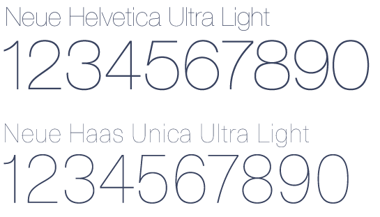
 As for the numbers, the upper curve of the “2” was made slightly smaller and the loops of “5” and “6” were consequently adapted. The curve in the diagonal in “7” was also reduced a little.
 At first glance, none of the changes appear revolutionary or significant. All in all, however, the many small adaptations have modified the font carefully. Haas Unica may seem quite similar to Helvetica at first glance. Its subtle borrowings from Univers lend the font more technical strength and provide for a touch more liveliness, dynamism and a friendlier appearance, all in all.
 Omagari recognized the potential of the older font and is not only working on a digital version, but also wants to expand the font significantly. Instead of the four weights of Haas Unica, Omagari’s Neue Haas Unica will have over nine tailored weights, from Ultra Thin to Extra Black.
The Ultra Light is now being published as the first style from the Neue Haas Unica. But don’t take our word for it; let the font itself convince you. Use the noble character of the narrow lines not only for headlines, but for longer texts.
