 Titanium Motors
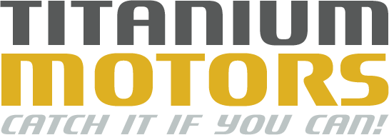
 hit the road as the result of a computer game project, and this race-simulating font was designed by Steve Matteson on the basis of an original concept by Jim Ford. The sans serif Titanium Motors is a majuscule font. The curves of the synthetic-seeming letters still retain horizontal and vertical sections, and it is thus apparent that they are based on the form of the superellipse. It is the clear contrast between the very thick verticals and thinner horizontals that generates the dynamism of this generously proportioned font.
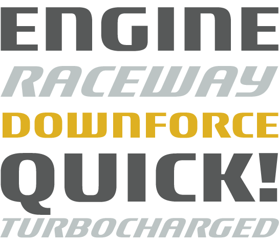
Somewhat unconventional are the letters ‘M’ and ‘N’ as their form is derived from that of the minuscule letters. And German typographers will be pleased to note that the ‘ß’ is rendered as a double-S.
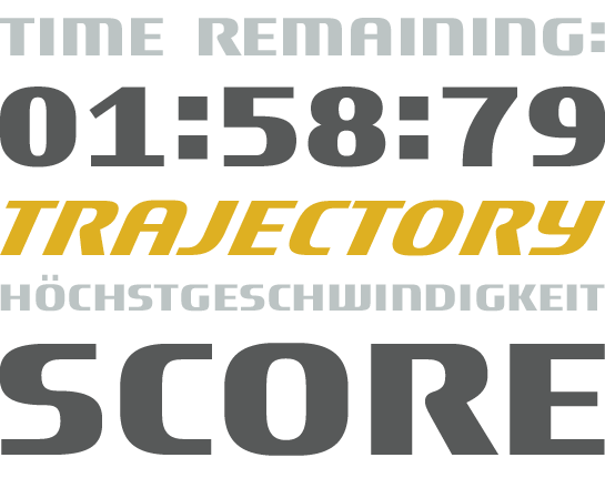

In addition to Titanium Motors Regular, there is a second weight with slanted letters called Titanium Motors Oblique. The characters are inclined at some 14° (considerably more than the 11° angle more usually employed), providing Titanium Motors Oblique with added energy.
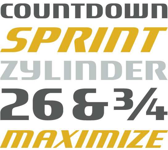
Titanium Motors represents speed, both on the ground and in the air. Its synthetic letters have a suitably technical panache, ensuring that the typeface has returned to its origins and has found a welcoming home in the world of computer games. Its bold and dynamic letters are perfect for use in title designs or short text passages that are intended to communicate a sense of speed.
 Titanium Motors hit the road as the result of a computer game project, and this race-simulating font was designed by Steve Matteson on the basis of an original concept by Jim Ford. The sans serif Titanium Motors is a majuscule font. The curves of the synthetic-seeming letters still retain horizontal and vertical sections, and it is thus apparent that they are based on the form of the superellipse. It is the clear contrast between the very thick verticals and thinner horizontals that generates the dynamism of this generously proportioned font.
 Somewhat unconventional are the letters ‘M’ and ‘N’ as their form is derived from that of the minuscule letters. And German typographers will be pleased to note that the ‘ß’ is rendered as a double-S.

 In addition to Titanium Motors Regular, there is a second weight with slanted letters called Titanium Motors Oblique. The characters are inclined at some 14° (considerably more than the 11° angle more usually employed), providing Titanium Motors Oblique with added energy.
 Titanium Motors represents speed, both on the ground and in the air. Its synthetic letters have a suitably technical panache, ensuring that the typeface has returned to its origins and has found a welcoming home in the world of computer games. Its bold and dynamic letters are perfect for use in title designs or short text passages that are intended to communicate a sense of speed.