Georgia Pro & Verdana Pro
Two classics come up trumps: Georgia Pro and Verdana Pro each with five weights and condensed variants
They were originally developed specifically as screen fonts and are available on all operating systems. Because of this, the two typefaces Georgia and Verdana are among the fonts most frequently used on websites. With the new, expanded Pro version both fonts can be used with greater versatility.

The siblings Georgia (derived from a Baroque Antiqua font) and the sans serif Verdana first saw the light of day in the 1990s. Matthew Carter had been commissioned by Microsoft to create fonts with good screen legibility. With this in view, Carter used the basic pixel grid as the starting point of his design process. He created the various letters using this framework and then subsequently adapted the curves to the outlines. The results show that this was the correct approach; the grid-like forms of Georgia and Verdana set new standards in computer typography. Their legibility is enhanced by their large x-height, clear outlines and generous character pitch.


Four different weights of both Georgia and Verdana were created – Regular and Bold in each case with the corresponding Italics. Carter explains: “Monitors at that time used a binary display system. Pixels could only be either on or off; there was no such thing as anti-aliasing. Bold thus had to be twice as thick as Regular – a significant difference to normal font families.”
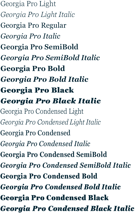
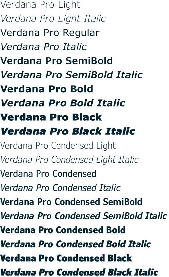
As in the case of the old Georgia and Verdana, all weights of Georgia Pro and Verdana Pro have their corresponding Italic variants.
More weights and more styles
And this is exactly where an improvement in the new Pro version is relevant. Working in collaboration with Matthew Carter, David Berlow of Font Bureau, Steve Matteson and Tom Rickner of Monotype have extended Georgia and Verdana by three further weights; both fonts now have a total of five weights with the addition of Light, Semibold and Black to the original Regular and Bold. Completely new are the Condensed typefaces that are available for all weights. It was the objective of Matteson, the creator of Georgia Pro, to open up new options for designers to use the additional weights and styles in headlines, subheadlines, for accentuation and quotes.As in the case of the old Georgia and Verdana, all weights of Georgia Pro and Verdana Pro have their corresponding Italic variants.
New characters and extended language support
The design team has not just made its mark in terms of the various weights, but has significantly extended the characters available. As OpenType-compatible features, Georgia Pro and Verdana Pro now also have genuine small caps and various numeral sets. There are uppercase and lowercase numerals that can be used in proportional and aligned settings. There are new additions to both fonts in the form of standard ligatures. But that’s not all. Not just the typographic aspects have been enhanced, but language support has been massively extended. Both fonts now cover the entire pan-European language area. As well as the characters for the Eastern European language area, they also offer Greek and Cyrillic characters.

New weights and styles, additional typographic applications and a substantial extension of language support mean that the options for use of the timeless classics Georgia and Verdana have been radically extended. With these two now completely developed font families, web and print product designers have a vastly enhanced resource from which to draw.