Potpourri
Potpourri: created with a drinking straw and opaque white on black laid paper
 See for yourself how Potpourri was created with a live demonstration by Gottfried Pott on the next page!
 Inspiration from an ‘A’ on the cover
The inspiration behind a font can come from an endless range of sources. For master calligraphist Gottfried Pott, it was the sight of a single letter on the cover of an edition of the Linotype magazine „Matrix 4.3”. The Versal ‘A’ which appeared on the cover came from an article in the magazine about the book Das Schreibmeisterbuch – A Letter Collection by Gottfried Pott. Gottfried Pott was impressed with the result he saw and resolved spontaneously, ‘A complete alphabet should be designed’.
 |
| Left: The “A” on the Matrix cover beside the “A” of the final Potpourri font |
An exceptional font project begins
Gottfried Pott wanted to recreate the special spontaneity and dynamism portrayed by the Versal ‘A’ on the magazine cover: in contrast to several other calligraphy fonts which convey a delicate, perfect effect, the calligraphist wanted to develop a lively, powerful script. Rather than being perceived as a simple ‘typeface’, he wanted the font to portray an intertwinement of various styles – which can be seen, for instance, in various letters with up and down strokes reminiscent of sans serif. This is also reflected in the name which Gottfried Pott chose for his new script:
Potpourri™, a creation of various font elements and styles.
An extraordinary writing tool achieves fantastic results
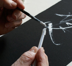
In practice, however, things proved difficult: Gottfried Pott couldn’t find a suitable writing tool to create the desired effect. In the end he decided to experiment with a drinking straw, the ends of which he cut to create rough fringes. He used this tool to write the letters with opaque white on black laid paper – and achieved exceptional effects. The frayed ends resulted in an uneven ink application with ever-changing effects, ink splashes and an inimitable ’Pottian’ spontaneity.
Perfect manual execution with extensive letter and language development
Gottfried Pott created an array of letters for this masterpiece. The font has been developed extensively and offers a range of alternative symbols, ligatures and broad European language support (Pro). In order to further enhance the hand-written effect of the script, the use of alternatives should not be limited.
Large letters reveal intricate font details
Although Potpourri is also legible in smaller font sizes, it is predestined for use in large font sizes: after all, only with sizes from 70 points can the beautiful details achieved through the use of the designer’s special tool be appreciated to the full. Potpourri is ideal for a range of application areas, such as invitations, poster design, for striking headlines in the editorial sector or for the creation of original initials.
Live demonstration: Linotype visits Gottfried Pott
In order to understand why Gottfried Pott took a drinking straw and how he expertly used it to create Potpourri, it has to be seen in person. That’s why Linotype travelled to his studio to pay the calligrapher a visit and see for ourselves exactly how his letters are created.
You can see the result on the next page!