Discover legacy content from linotype.com, preserved for your reference.
Harmonia Sans
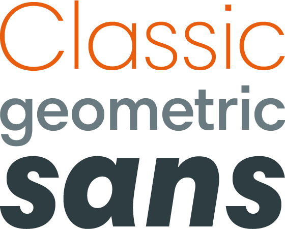
Harmonia Sans – geometry with a twist

Jim Wasco carefully analyzed his favorite geometric sans, classics like Wilhelm Pischner’s DIN Neuzeit® Grotesk, Paul Renner’s Futura®, and Herb Lubalin’s ITC Avant Garde Gothic®; and crafted a confident, legible monoline, contemporary sans serif that is neutral and legible, but with enough character and poise to sing on the page.
The result is Harmonia Sans™, a balanced and harmonious geometric sans with a twist – its proportions making for a friendlier, more dynamic typeface, that performs well in print and on screen. A great alternative to the numerous geometric sans serifs.
