About Boule Plus Font Family
CAPITALIZED, geometric, bold and round.
If the typographer sees a font like that, it's enough to make his toes curl. But sometimes it just has to be that way.
Geometrically constructed fonts do not necessarily have to be pointed and angular; It also works consistently around. And if I say it consistently, then in this case, that's done consistently.
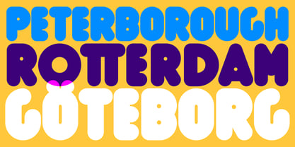
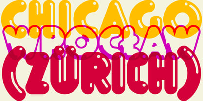
The basis for the BOULE is the circle. The letters are drawn with constant line width, the “corners“ and endings all have the same radius, the lines are all the same thickness.
The BOULE consists only of capitals. There is only one difference in the use of uppercase and lowercase letters: in the uppercase letters, the round letters are circular, while the lowercase letters are narrow.
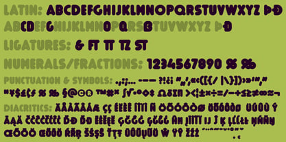
The character set of the Boule contains all letters and accents to support the Western, Northern, Central and Eastern European languages with Latin alphabet.
The BOULE is not only very fat, it also runs very tight; that is, the glyphs are very close to each other. To avoid "holes" due to unfortunate letter combinations, the BOULE contains ligatures for FT, ST, TT and TZ.
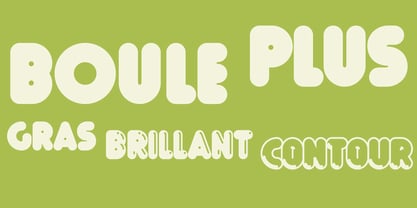
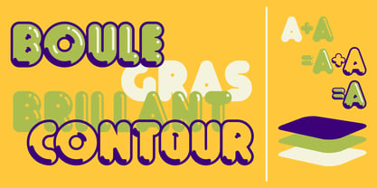
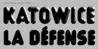
There are also other versions of the font: BOULE Brillant on the one hand. In this version, simple highlights simulate a light incidence from the top right. These light edges give the font a decorative effect that makes it easy to think of wet sausages or balloons in some shapes.
And finally the BOULE Contour. As the name implies, it is the outer contour of the letters, combined with a shadow at the bottom left.
The name BOULE (French for ball) says it already: this font is globated. Therefore, it is also very suitable for all three-dimensional alienation effects. With simple light and shadow you can achieve a very convincing 3D effect with little effort.
Boule Plus
About Ingo
Founded in 1994, ingoFonts provides the fonts designed and crafted by me, Ingo Zimmermann. I am a type design professional located in Augsburg, Germany, and working in corporate and editorial design. My very first fonts were stencils which I cut out of paperboard and used in graffiti. During my studies I began to publish my fonts under the label ingoFonts, and of all it started with a blackletter: ”Faber Fraktur.“ By now my designs include fonts of all styles, from classical to modern, script fonts, revivals of historic typefaces, Romans, sans serifs, decorative fonts, including fonts like ”Biró Script“, ”Absolut“ or ”Maier's Nr.8“, which seem to be growing quite popular since they've been published.
Read more
Read less