Discover legacy content from linotype.com, preserved for your reference.
Klint & ITC Chino
New sans serif types from Berlin – Announcing the release of Klint and ITC Chino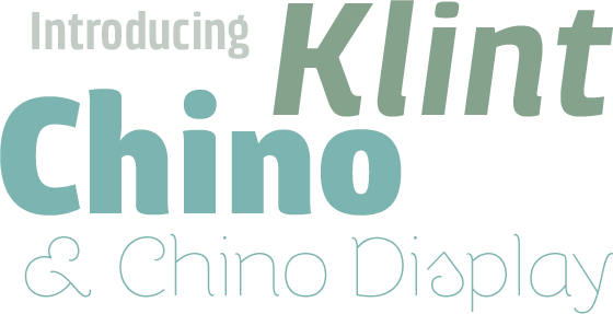
Hannes von Döhren is clearly one of Germany’s up-and-coming typeface designers. In the span of little over a year, Linotype has published five of his creations alone: first Quench®, then Opal™ and Snoogle™, and now the new Klint™ and ITC Chino™ families. We’ve built an entire Micro-Site to illustrate ITC Chino’s intrinsicate details. Visit www.ITCChino.com to learn all about this new font family! |
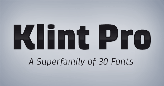
About KlintLooking for a large, technical-style sans serif family? Do you find the field of recent designs too cold and technical? Klint™, from Berlin-based typeface designer Hannes von Döhren, blends precision with subtle humanist touches. The superfamily includes 30 fonts. That means that customers may choose from up five weights, light to black. Each weight comes in three widths, and all weights have both upright and italic variants in stock. |
 |
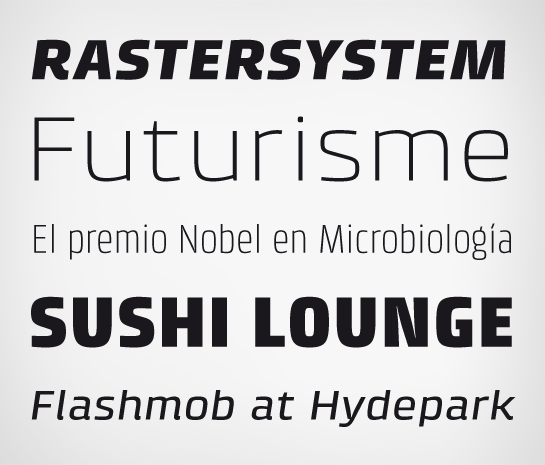
Clean, clear, and open formsIn today’s day and age, design for appliance manufacturers and companies in the mobile phone, Internet, or computer hardware and software sectors is becoming ever more important. Linotype’s Klint superfamily fills the rising need for typefaces with a technical feeling that are also legible in both text and display settings. Klint’s design is reduced, without being too reduced. The form of the letter S, for instance, is very open. The white space moves through the letter, tying together with the letters coming before and after it in a word. But this is not a techno-style squared sans letter. There are still humanist touches: the instroke and outstroke of the S are lightly curved. |
 |
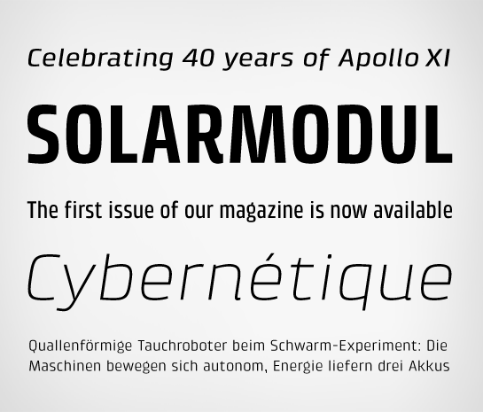
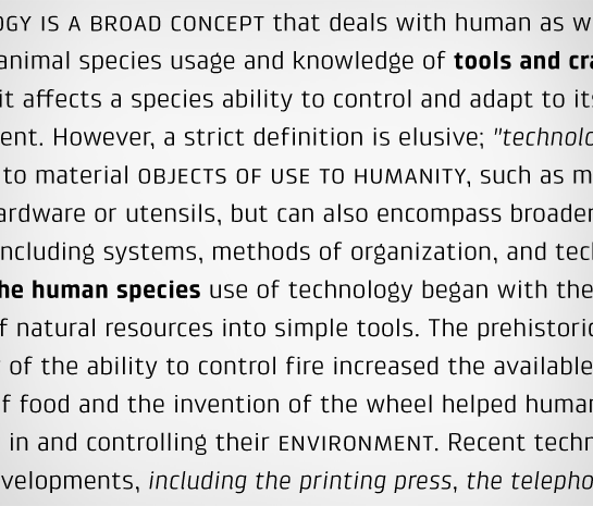
LittleKlint’s design is full of character, not just full of characters. Through conspicuous letters like R, K, k, or g, as well as the independent nature of its Italic, Klint exudes an ethos that separates its ethos from the competition. Observe the word “magazine.” Both the lowercase g, as well as the a, are unique forms that create a lively feeling. Yet they are also common, and familiar forms. This is what makes them both legible and exciting at the same time. |
 |
 |
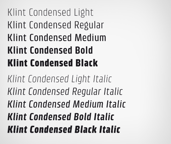
CondensedThe condensed fonts in the Klint family are perhaps the most interesting and the most versatile. Not extremely narrow, they may serve as the best selection for running text under many occassions. Longer passages in brochures, catalogs, or magazines would be well served by Klint’s Light, Regular, and Medium weights. The heavier cuts are optimized for poster settings and headlines. |
 |
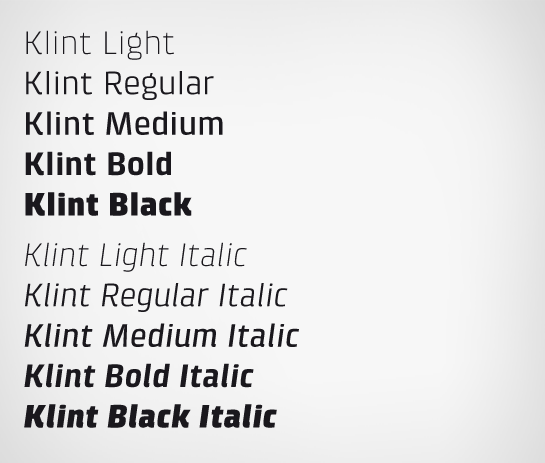
Normal WidthMore traditional typographers may prefer the normal width fonts for body copy, or designers from locales whose languages do not often include very long words. |
 |
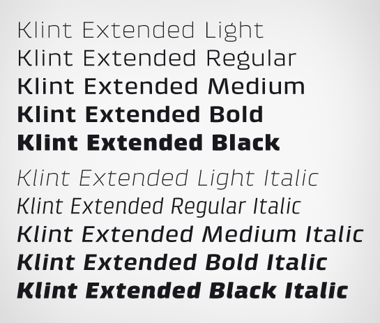
ExtendedRecent advertising campaigns around the world have brought about a renaissance of wide, extended sans serif type in headlines. Klint is right here, waiting for its role in the next big thing. |
 |
Character Set details and OpenType featuresAll of Klint fonts include the same wide array of OpenType features. On offer are small caps (including small cap currency symbols, brackets, parentheses, etc.), fractions, ligatures, and nine figure styles: tabular and proportional lining figures, tabular and proportional oldstyle figures, proportional small cap figures, numerators, denominators, superiors, and inferiors. Each font in the Klint family includes 654 glyphs. |
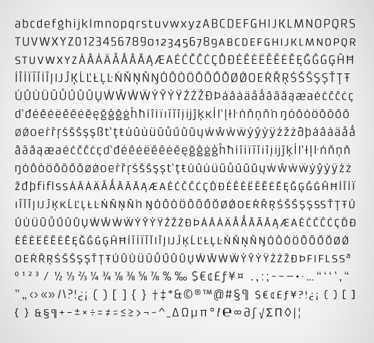 |
Text sampleA large x-height makes Klint especially legible at small point sizes. Like all quality Linotype fonts, all of the typographic finesses necessary for good typesetting are to be found in the Klint family’s fonts. The design system carries itself into every detail of the type. Even characters like the comma, often an afterthought in typeface design, have been styled in a manner that helps them to strengthen the overall intention of the design. Klint is the work of a typeface designer with a vision. A personality with something to say and to contribute. |
more ...